
Craig Molyneaux
I’m a UX practitioner from Greater Manchester who specialises in creating intuitive, accessible, and research-driven user experiences. I blend UX, CX, and service design with design psychology to craft solutions that align with user behaviour and business goals.I’m a creative, insight-driven problem-solver who communicates clearly and works confidently with stakeholders at all levels. I thrive in collaborative environments, bring strong ideas to the table, and advocate consistently for user-centred design.I’m motivated by delivering meaningful, user-first experiences—and I’m excited to bring that focus to a team that shares the same commitment.

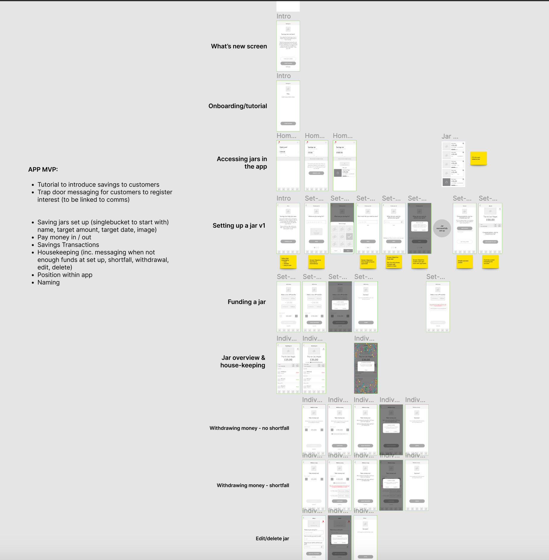
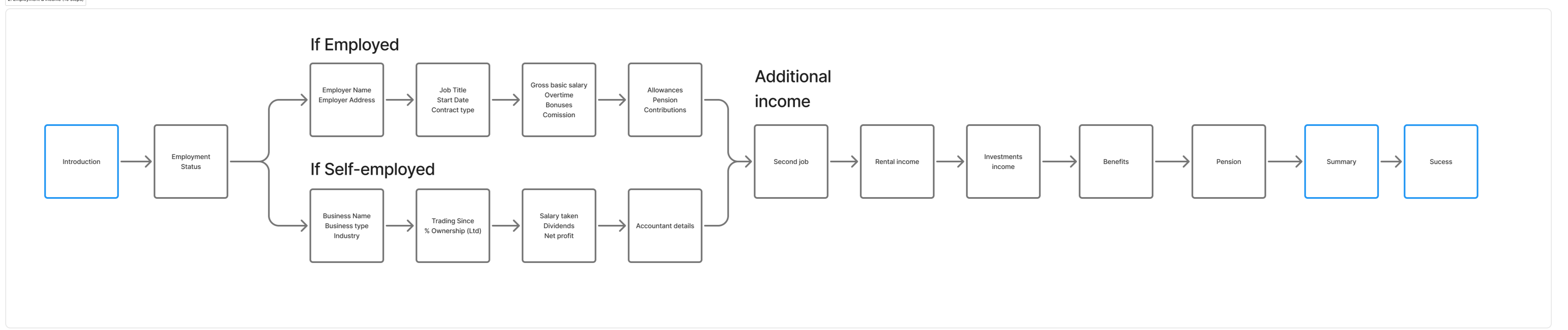
Creating an Anti-money laundering solution
Strengthening GoProposal’s competitive position by creating a solution 74% of users rated as better than their current.

Onboarding overhaul to reduce customer support calls
How I helped move from 0% to 90% successful self serve onboarding

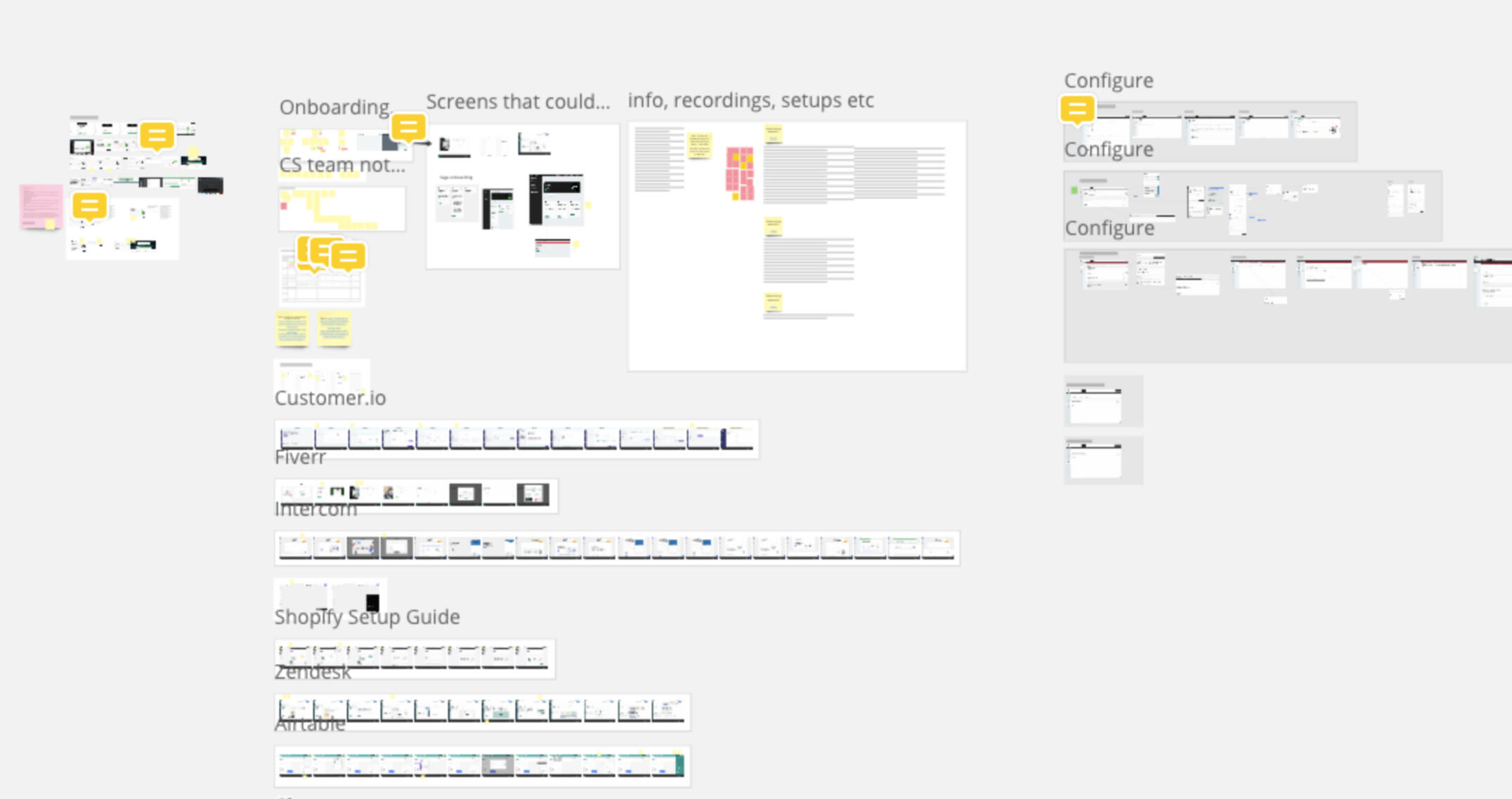
Further projects
A look into some other projects of different varieties
Further projects
A selection of past projects
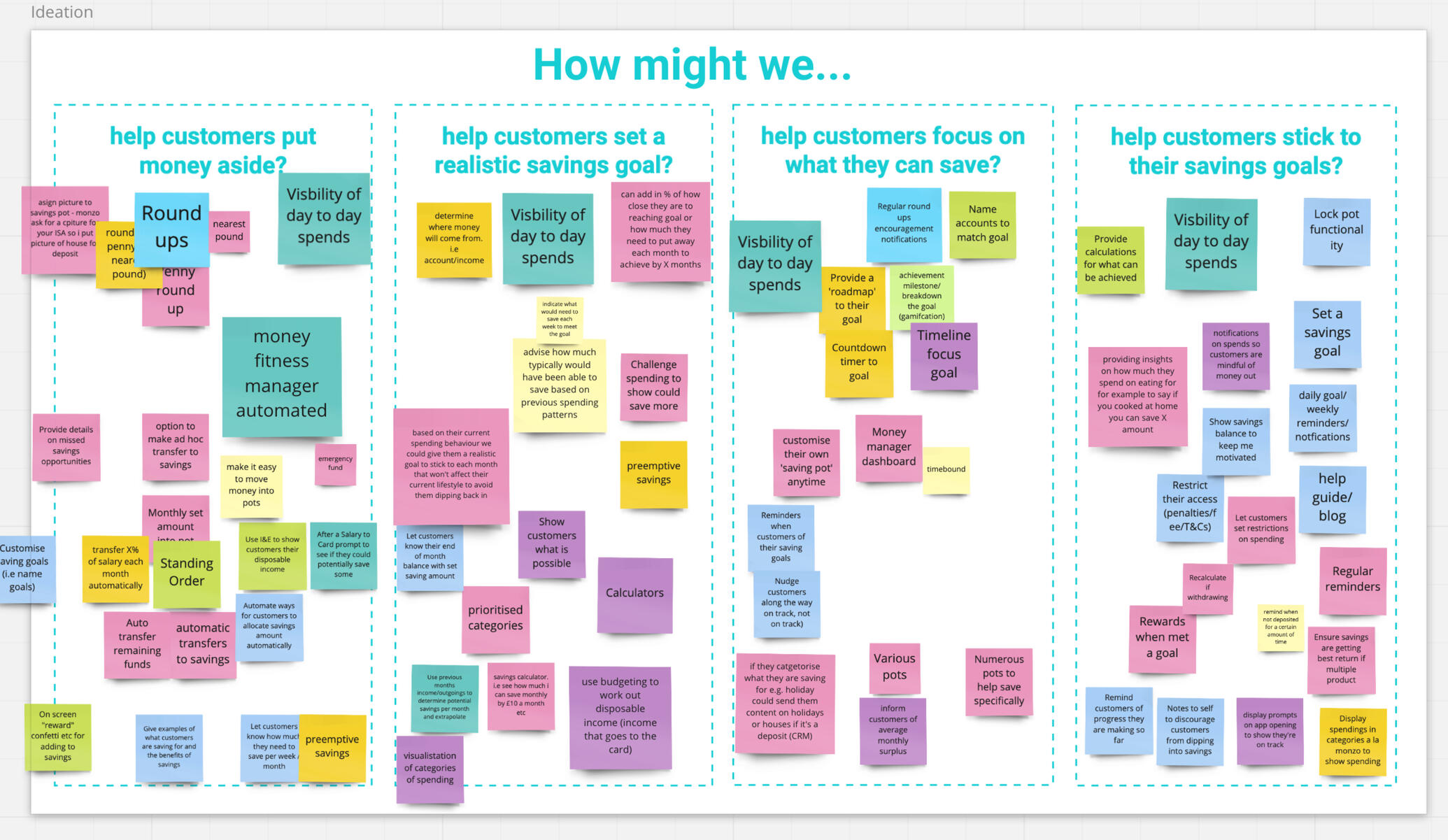
What it shows: Design thinking / storyboarding / journey mapping / prototyping
Introducing electronic ID checks into KYC & risk assessments to create a complete AML experience
What it shows: UI / branding / tone
Creating a unique brand and UI to resurrect a failing application
What it shows: Workshops / surveys / user interviews / HMW / prototyping
Helping customers become better at saving by defining user goals, needs, wants and pain points
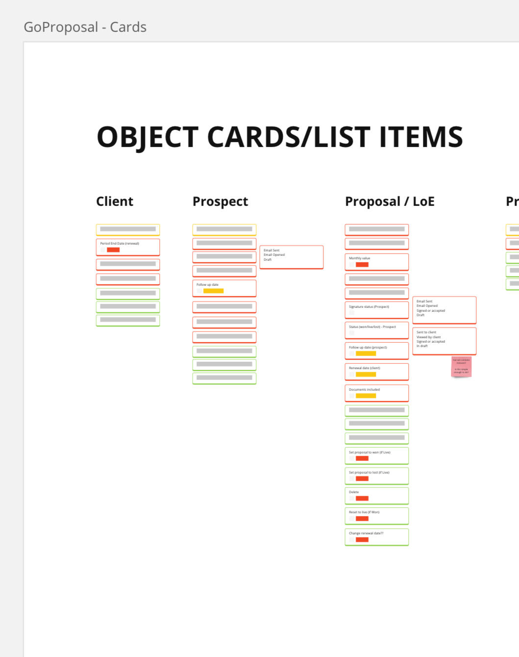
What it shows: ORCA process / noun foraging / nested object / CTA matrix
Delving into Object oriented UX (OOUX) to define mental models and create a cohesive integrated platform
What it shows: IA audit
Redefining the Information Architecture of an acquisition, and its parent company, to enable seamless and sensible navigation on an integrated platform.
What it shows: UX audit / customer service interviews
Creating a more valuable onboarding experience whilst increasing TtV
What it shows: end to end / usability interviews / competitor benchmarking / journey mapping / sentiment mapping / lo-fi design testing
Improving the flight booking experience for an airline
A small selection of created UI screens that may not fit into a case study
For an even more in-depth look at past projects - here is a link to a personal google document file that demonstrates past projects that are not included in these write-ups.Opens in a new window.
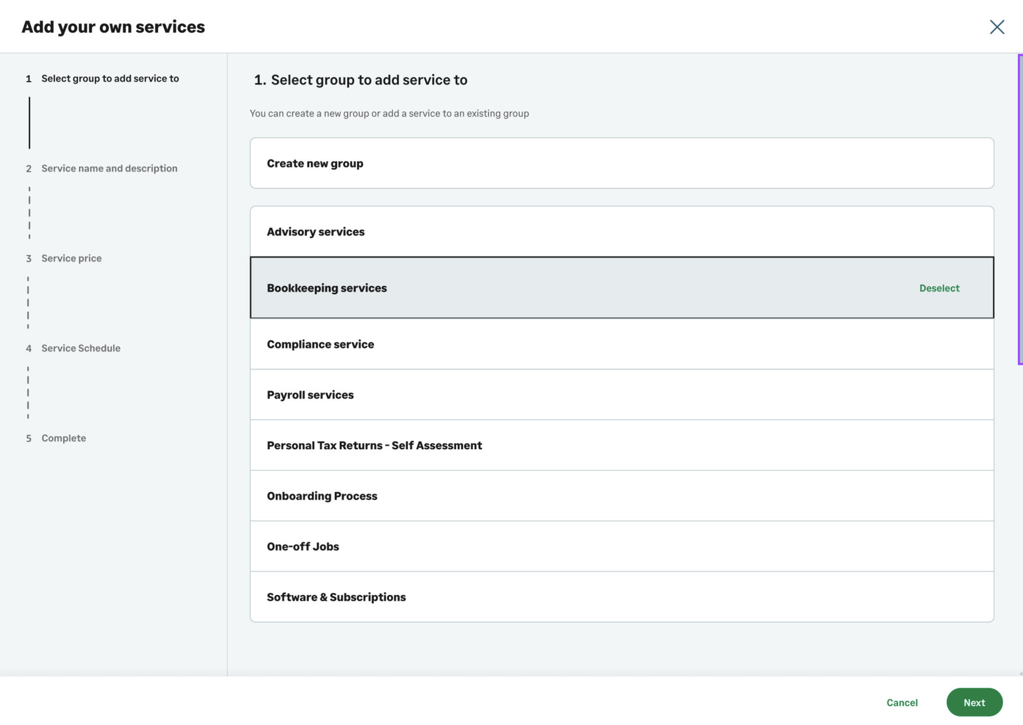
Creating an Anti-money laundering solution
Strengthening GoProposal’s competitive position by creating a solution 74% of users rated as better than their current.

Role
Lead Product Designer (Discovery → UX/UI → Delivery)
Company
GoProposal by Sage
Challenge
GoProposal wanted to replace manual ID verification with integrated electronic AML checks. A partner provider had already been selected, but no user journeys, data flows, or UI existed to support the new feature. My role was to design a clear, compliant end-to-end experience for accountants and their clients using industry best practises and refined with user testing and interviews.
Impact
I delivered a new client-onboarding journey that strengthened GoProposal’s competitive position, with 100% of users reporting it would have a positive impact on their workflow, a 91% positive (excellent or good) rating from early adopters, and 74% of users stating it was better than their current solution. This included creating a new multi-journey framework that adapts to different client types and advisor needs, as well as introducing a major product differentiator: a client portal that significantly reduces the advisor’s workload.


01 — Situation
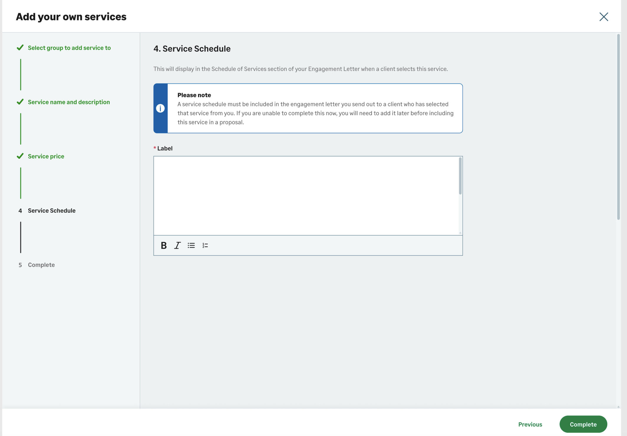
Accountants could initiate risk assessments inside GoProposal, but still relied on photocopied ID documents to complete onboarding. To close the compliance gap, GoProposal aimed to introduce electronic checks—basic, document-based, and biometric—directly into the platform.
02 — Task
Create a scalable workflow that:
Captures the correct data for each check type
Integrates securely with the partner provider
Presents statuses and results clearly without overwhelming users
03 — Action
Partner Collaboration & Technical Foundations
Met with the partner’s product and technical teams to map data requirements.
Built low-fidelity “breadboard” flows to test different journey structures.
Mapped detailed data flows with backend engineers to uncover edge cases and system constraints.

Journey Design
Designed clear paths for all check types: basic, document, biometric.
Proposed an additional option—allowing clients to complete advanced checks via a portal—now a unique selling point in the offering.
Created a simplified two-level status model to reduce cognitive load and improve dashboard scanability.

UI & Prototyping
Developed full UI flows using the design system.
Built a high-fidelity Figma prototype for internal and external testing.
Identified pain points in the Contact Hub and introduced multi-select with an action bar to streamline bulk actions.

User Testing & Iteration
Ran testing with real users; feedback informed UX refinements and content updates.
Designed a “check-type wizard” to help users choose the right AML check based on client behaviour and scenario.

04 — Result
Even without long-term analytics, the project delivered clear, validated improvements:
Delivered a new client-onboarding journey that strengthened GoProposal’s competitive position
A massive 100% of users felt it would have a positive impact on their workflow
91% positive (excellent or good) rating from early adopters
74% of users said it was better than their current solution
A new multi-journey framework that adapts to different client types and advisor needs
A major product differentiator: client-completed checks via a secure portal
A simplified 2-level status model that improved scannability and reduced cognitive load
A more efficient Contact Hub with bulk actions
A guided check selection wizard that reduced confusion and improved confidence

The new AML experience positioned GoProposal as a more comprehensive, compliant onboarding solution within the accounting workflow.
05 — Future
In the weeks after release, I have gathered together feedback, questions, complaints, FAQs, data from user testing interviews, plus new business needs, and ran an effort / impact session with the PM and lead developer. We now have a clear idea to take into roadmap panning for Q1 of the new financial year on how we will continue to make improvements to the system.

06 — What I would do differently next time
The product owner was putting pressure on me from the start to product high-fidelity porotypes. Originally I thought these were being used to test with users, but they were being used in a pitch deck.I therefore spent a lot of time creating the UI and continuously tweaking and updating it before we had all of the details ironed out. This took a big chunk of my hours which I thought could be used better elsewhere.In subsequent projects - I always try to ensure we stay with low-mid fidelity mock-ups and prototypes as long as possible when in the ideation and discovery stages. Quite often the focus can shift too far to the finer details of the looks which can detract from solving the problem at hand.
A more detailed write-up on the project can be found here
Onboarding overhaul to reduce customer support calls
How I helped move from 0% to 90% successful self serve onboarding

Role
Lead Product Designer (Discovery → UX/UI → Delivery)
Company
GoProposal by Sage
Challenge
Redesign the onboarding and setup process to improve Time-to-Value (TtV), reduce friction, and ultimately increase user conversion from free trial to paid subscription.
Impact
Nine out of ten users successfully navigated the new onboarding setup with minimal issues, demonstrating that the redesigned flow was intuitive and user-friendly. Time-to-Value (TtV) improved significantly, allowing users to engage with the core app functionality more quickly. Feedback was overwhelmingly positive, highlighting the clarity, usability, and helpful guidance provided throughout the process. The new onboarding experience is now ready for phase 2 deployment, supporting scalable growth for thousands of users.


01 — Situation
GoProposal by Sage is a SaaS platform for accountants, enabling them to set up their services and pricing efficiently, then generate consistent proposals for clients. Despite a 30-day free trial offering, a significant portion of new users were not converting to paid subscriptions. Data showed that many users didn’t customize the base app or fully engage with the platform. Feedback from forums, customer support, and social channels revealed that the onboarding and setup experience was confusing and overwhelming, making it difficult for users to realize value quickly.GoProposal had in the past implemented a Customer service layer that would allow users to book a call with the set-up team, who would spend hours with them to correctly set up the application. This was deemed as great Customer service when GoProposal was a small startup, but now they were a large scale company, it had become unmanageable.I had also suggested that the application should be intuitive enough to allow users to self-serve. Not only would that instil future trust in the application, but would allow the set-up and customer service teams to really concentrate on specialist circumstances - maybe even charging an additional fee for the service.
02 — Task
Redesign the onboarding and setup process to improve Time-to-Value (TtV) for new users.
Reduce friction in the initial app experience to make setup intuitive and straightforward.
Increase conversion from free trial users to paid subscribers.
Enable users to efficiently set up the pricing tool and line items, which are core features of the app.
Minimize reliance on intensive customer support by making the process self-guided and user-friendly.
03 — Action
Uncovering the problems
Attended various setup calls with the onboarding team to listen to the issues in real time
Grouped notes into problem areas to focus on
Ran through existing journey to identify dead-ends, irrelevant questions and needless steps
Cross-referenced my findings with another project - Line item setup, to find patterns and commonalities
Line item discovery included an in-depth tear down of the current setup method using best practises, heuristic principles and user feedback


Redesigned Onboarding Flow
Replaced multiple modal screens that had no exit path with a task list interface on the main app dashboard
Each task deep-linked to the relevant section with contextual guidance (tooltips, Pendo overlays, or modals)
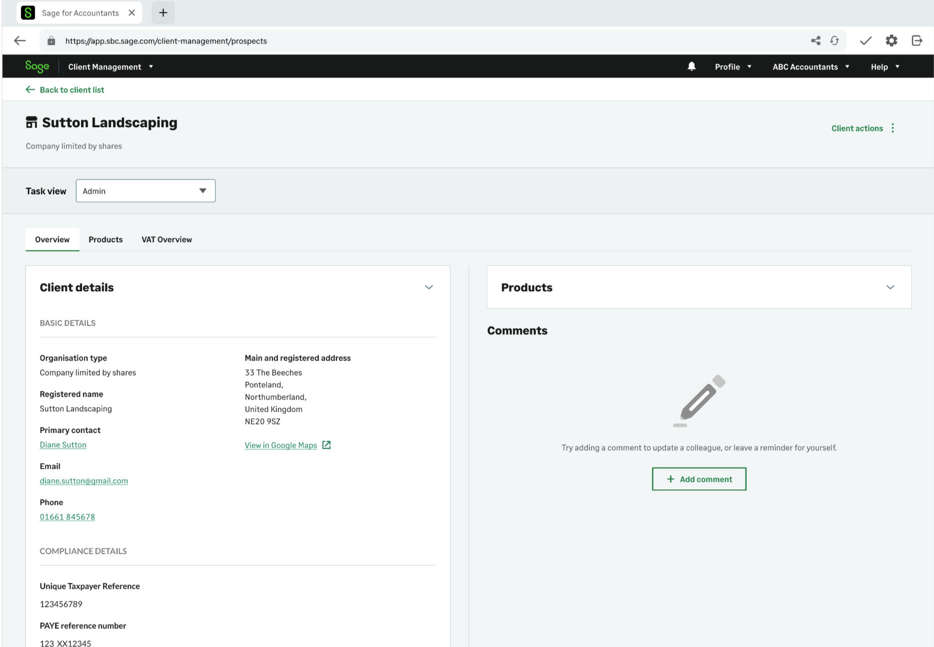
Removed irrelevant screens and “imagine you had x” questions - instead providing a base price (based on a mixture of what other users set as their prices and our in-house expertise) that users could leave, our tweak as they saw fit
Focused on line item setup first - leaving other sections such as branding and email templates as an optional second step, to accelerate TtV

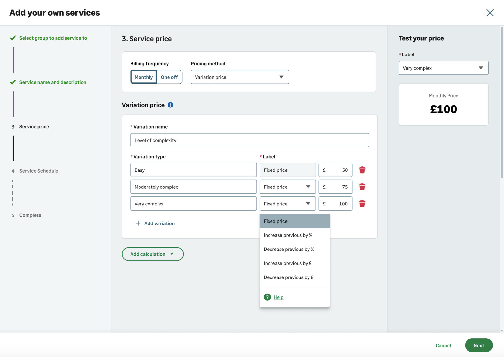
Pricing Tool Redesign
Redesigned onboarding to focus on actionable setup steps using a task-list interface that deep-linked to relevant sections.
Removed test proposal and "imagine" screens; prioritized line item setup over branding and email templates, and provided default prices users could override.
Redesigned the pricing tool to show live, running totals as users updated services, eliminating the need to navigate away or run multiple test proposals.
Integrated contextual guidance via tooltips, Pendo overlays, and CS-created help articles to support independent setup.
UI & Prototyping
Developed full UI flows using the design system.
Built a high-fidelity Figma prototype for internal and external testing.
Identified areas where further learning or customization could be included. The new flow meant we could do this without overwhelming the user

User Testing & Iteration
Conducted usability tests with a mix of new and experienced users.
Observed navigation and comprehension of onboarding tasks, iterating based on feedback.
Adjusted guidance to ensure users could independently complete setup efficiently while understanding GoProposal’s methodology.
04 — Result
9 out of 10 users tested were able to complete setup with minimal issues, while the remaining user required only guidance on pricing methodology.
Positive feedback highlighted the clarity and usability of the new onboarding flow.
By removing unnecessary steps and focusing on the critical line item setup, TtV was significantly reduced.
Because of this - we were able to combine two projects into one: both the onboarding and line item setup, meaning we increased the proposition of the application vastly in a quicker time than we had road mapped
The self-led studies of 'Product led growth' methods ignited the company's desire to introduce similar methods for other areas of the company - enabling scalable growth for thousands of users.
05 — Reflections / what I would do differently
Initially, leadership viewed onboarding as the single high-impact area to improve. This narrow focus risked overlooking deeper issues in the pricing tool setup. By allowing myself to be curious, I prioritized a deep dive into the wider problem before designing solutions, which led to a more effective and comprehensive approach. In future projects, I would like to allocate additional dedicated time for discovery to uncover additional paint points and validate assumptions before moving into design and delivery.
Deep discovery is critical before defining solutions—initial assumptions were partially incorrect
Onboarding must focus on critical workflow tasks, not unnecessary “nice-to-have” screens
UX solutions should enable self-service, reducing reliance on high-touch support
A more detailed write-up on the project can be found here
Improving the flight booking experience for an airline
Creating a new and improved booking flow based on user feedback

The brief
“ Propose a brand new product that improves the booking experience of an airline “
Background
This is an academic case-study whilst studying for my diploma with The UX Design Institute.And yes, I know there are 10,000 examples of boot camp courses out there, but I have chosen to include this due to it's end-to-end nature and the variety of techniques used, and the emphasis on the research stage - something I love to do and be involved in. If nothing else, its a good starting point to tell the story of a end-to-end process.This case study focuses on the desktop version of the application.
The process
These are the following steps I took throughout the process:Research
Usability Testing
Depth Interviews
Competitor Benchmarking
Online SurveysAnalysis
Affinity Diagram
Customer Journey MapDesign
Desktop Flow Chart
Define Navigation
Desktop Interaction DesignPrototype & Wireframe
Medium Fidelity Prototype
Wireframe
Research
Usability testing
At the discovery phase of my project, I wanted to conduct some real-world observations of people using competitor websites. I chose to pick two airlines that was deemed to be at opposite ends of the spectrum in terms of budget and class. I chose Ryan Air and British Airways.Objectives:
Observe user behaviour when using selected websites
Identify typical user goals when booking a flight via airline websites
Identify features and controls that meet users’ expectations
Identify features and controls that user considers are missing
Identify user pain points & frustrations
Consider which of the frustrations and pain points, if any, will cause a user to leave the website before completing the transaction
Identify users’ priorities and what they consider to be the most important features / inclusions when making their decisions
Usability test Script and screener

I would need to create a recruitment screener to gain a clear view of the kinds of user data I wanted to capture, to ensure I covered a wide demographic.It's a good idea to create a script to work from when conducting your usability tests - work from this script to keep you on track, but don’t be afraid to explore other paths with the user to really get to grips with the experience.I would open with some ice-breaker questions to make the user feel at ease, and also to get a feel for their background and experience when booking flights.
Usability Test & Depth Interviews
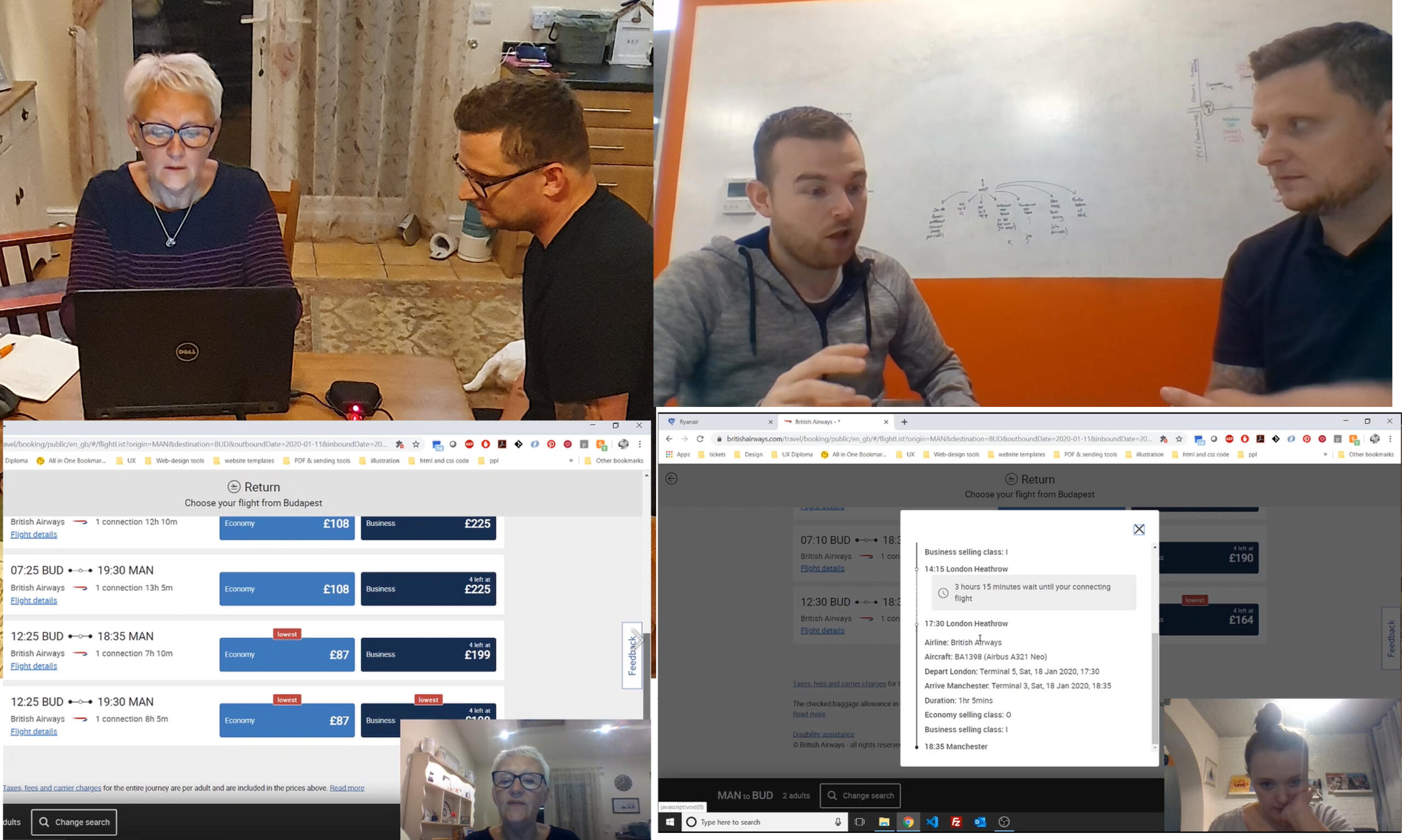
After getting to know the users background a bit better, I asked them to complete a task on both websites: to book a flight from Manchester to Budapest, for 2 people on certain dates, with at least one piece of hold luggage.I observed their goals, behaviors, thoughts, language used, pain points and sucsess points, if any.I had also dived in "a little deeper" with a couple of users by conducting a Depth Interview, I wanted to find out a little more about their behaviors and mental models when booking a flight or searching for a holiday. Usually I would conduct a depth interview along-side the usability test, but for the purpose of this project, usability test users were asked from a shortened script.
Why did they use one type of device over another?
Can we change the negative perceptions of using certain devices?
What could we add or remove from the experience, to make it a more enjoyable and easy-to-use one?
OutcomesMost people struggled with the task, a task they they were pretty confident was very easy. Are users so used to bad design, they don't notice it?It was mentioned a few times that "if this was 'real-life', I would have just left this website and found another at this point.
"Are users so used to bad design, they don't notice it? "
Competitor Benchmarking
I researched competitors apps and web solutions looking for:
different?
What the best apps/websites are doing well to solve the booking process that I can emulate?
What are no doing so well that it can be improved?
What are the established conventions that I need to follow?
I selected a variety of apps and websites:
Ryanair and British Airways - popular sites used in my usability test
United Airlines - a 'foreign' airline, do they do anything different?
Skyscanner to check out an aggregator.


In my benchmarking exercises - I tend to use a RAG status type of approach - or Red / Amber / Green.I use green to highlight any Pros: positive emotions, interactions and UI, Red to highlight Cons: negative feelings, and Amber to call out other interesting points.This helps to collate a list of features to consider, and a list of things to avoid in our own designs.
Online Survey
I created an online survey using Survey Monkey for some more quantitative-attitudinal research to gain more understanding into context of use. I used a mixture of open and closed questions as well as some multiple choice questions. The survey would take around 2-3 minutes for people to complete.
Most people tend to visit these kind of sites to conduct research for a future trip, so they want as much information in advance as possible
Almost 30% of users could not complete the task they set out to achieve, due to either poor design or thinking they could get a better deal elsewhere
Users tend to use a selection of different sites, as they all have different pros and cons


Analysis
Affinity Diagram


Analysing and making sense of the data
Next, it was time to start making sense of the data.Firstly, myself and a friend watched the usability test recordings and took notes.Each point was written onto post-its, and stuck to the meeting board - otherwise known as my dining room table. We took it in turns to spend a minute to sort, and re-sort the post-its into groups. Some clear categories emerged.
Popups / upselling
Distractions
Seat picker
Total cost
Cheaper alternatives
Searching destinations
Invalid routes / searches
Buttons and layout
Offline viewing / sharing
Misc (including paying for large parties, Load screens and miscellaneous)
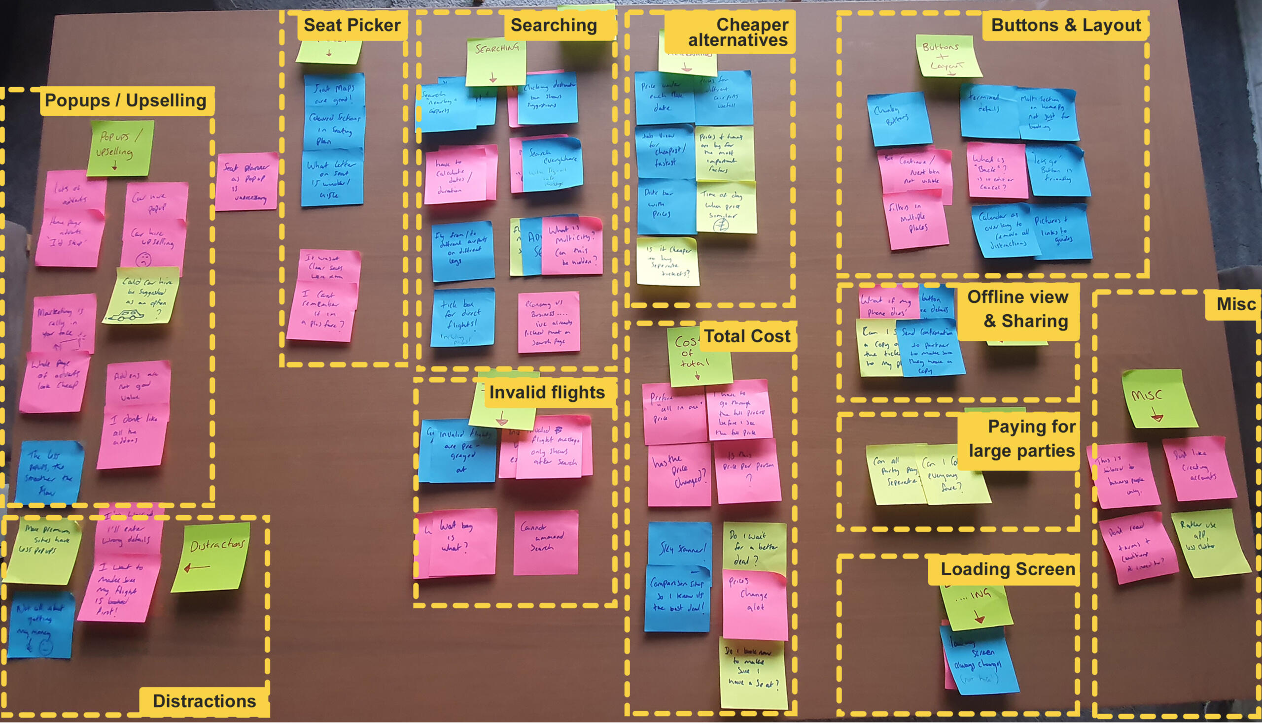
It's clear that users do not like up-selling popups...
And this is something that I took into a future job (on the beach) My knowledge of pop-ups from this case-study gave me the basis and ammunition to persuade stakeholders to not chase selling pop-ups.
Customer Journey Map
I took the information from the affinity diagram and organised it into a step by step view of the journey to show how the users felt at each stage. I also noted their goals, behavior, context and pain points at each step.It seems that there are distinctly more unhappy faces, than happy ones...
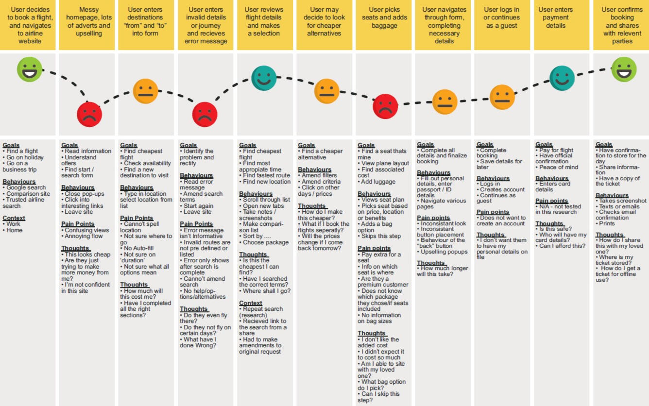
Key Findings:
Users do not like up-selling adverts and pop-ups
Users are distracted by pop-ups and can lose their place and flow, which also takes away from the enjoyment of the site
Users feel the up-selling is a company trying to milk you for money, and cheapens the whole experience of booking a holiday
Users felt that the date picker on these sites were a huge area for improvement. They felt that invalid flying dates / dates that were booked up, should not be made available for selection
Users was never sure of the "total cost" of the holiday. Hidden fees, VAT, and add-on's like baggage, could really drive up the price
Users tend to share their findings with loved ones. They would take screenshots or snips of their view, to share what they had found. Often sharing a URL wasn't possible, as the flight information was stored in local storage - and the other party could not see any results
Design
Desktop flow
I started to map out how the journey could go, taking into account my research. This went through a few stages of change until I felt I had covered the journey for all eventualities.Here, I have only concentrated on the Red-route of the product, booking a flight. In reality, there are many other branches connected to this, including saving research, sharing research, frequent flyer points, profile creation and more!It came to light that, even though this was a great start to help me map out my screens, there would be room to amend this document to reflect the journey as a whole, especially when thinking around error messages. Subsequent variations of the chart would reflect that.
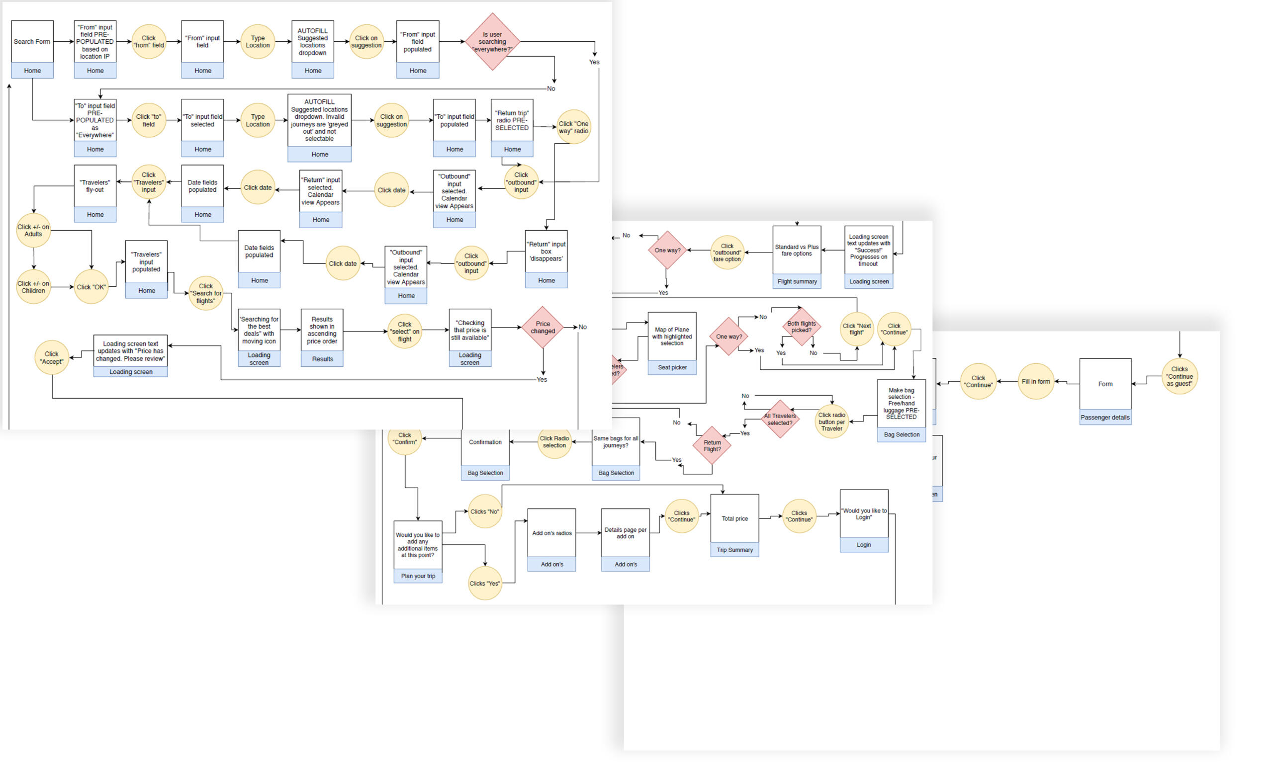
Desktop navigation
In this task, I started the process of sketching the basic navigational elements of the screens as defined in the user flow.For my product, a desktop site, I chose to create ultra simplistic navigation, with the primary nav bar always present, and containing only a logo, home and contact links, plus a log in and help button. A secondary nav bar will be added a certain depth in the flow, but be disguised as a progress bar.The Nav bar will ‘change’ depending on what flow a user is on, and for this example, we will focus on the booking a flight flow only. In the final product, other flows / nav items will be viewable when selecting a ‘tab’ on the homepage screen.


Desktop Interaction Design
I started to think about how each element on each screen would work, referring back to my Flow chart. I thought about how the user could click, slide, open or type in each box, and what kind of feedback the site would give in return.At this stage, the screens are created as low-fidelity / paper mock-ups... allowing me to quickly and cheaply change ideas as they expose themselves.I used these paper-mock-ups, to do additional user testing with a friend, to make sure they made sense to another person. I noted any questions or confusion they had, and adjusted where necessary. In reality, my research served me very well, and there was not many changes that needed to be made.


Prototype
I moved into some prototyping software and created some high-fidelity designs.I linked the designs to create a clickable prototype that I could use to run further testing with my test panel.


Wireframes
After completing the research, analysis, design and prototyping tasks, documentation could be collated for handing over to the development team.The wireframes outline everything from the interactions of elements, the flow of the pages, error states and validation.As this project did not use a style guide or design system, the wireframes would also contain notes on colour, fonts and animation if the application would go to production.


The result
What I learned
It reaffirmed to me that the most important thing about this whole process, is the user and their thoughts/actions, their feelings and emotions, how they perceive our product, and how our product can help them achieve their goals.UX design, at its core, is a problem solving process. It's taking an new idea or existing solution, and delving into the problem, or pain points, that a user encounters - and working to craft a solution that will remove friction and help those users achieve their goals.What a user thinks they will do, what they say they will do, and what they actually do, are very different things.Gathering information directly from the user is an invaluable way of finding out how to start solving problems for them.
UX is a problem-solving and research-based discipline.
Use research data to make design decisions. If you are not doing research you are not doing UX.
The process is not linear. Iteration is key to innovation. Design - Prototype - Validate and then start again.
' I am not the target audience' the importance of keeping your users in mind when designing.
What I'd do differently
Better UI / Visuals:
What I'd do different, is exactly what I went on to do. I felt there was a gap in my knowledge in the UI side of things. So I enrolled in a course to gain my professional Certificate in Visual and UI design.

More Research:
The project really highlighted the benefit of real user research.Speaking to real people, observing them use both our design and other platforms, and chatting to them really can highlight fridge cases, accessibility issues and dislikes, as well as bringing out which parts of a journey a user really enjoys.
I would have loved to have documented the user testing I did on the final UI of the product and compare that to the original user testing of the competitor sites.There is a quote by Frank Chimero - "People ignore design that ignores people". Speaking to actual people is paramount.
Onboarding
Creating a more valuable onboarding experience whilst increasing TtV.
TL;DR
A high percentage of users that sign up to the 30 day free trial do not go on to become a paying member. From this segment, the majority of users do not even set up or amend the base app from what they are provided "out of the box".User feedback and chats with the customer service team lead me to deduce that the onboarding and setup is neither helpful, nor intuitive, and setting up the app becomes overwhelming.I redesigned the onboarding flow and how that feeds into the set up of the app, reducing the amount of information needed all at once, and simplifying the flow.
Background
GoProposal by Sage is SaaS software aimed at accountants and accountancy practises. It enables accountants to set up the services that they provide along with a standard pricing model, so that they are efficiently and quickly able to produce a proposal of services (which is akin to a quote) and have a consistent pricing methodology across all their clients.As part of implementing a continuous discovery process at the company, I had been digging into data and user feedback. Amongst some of the complaints around the complexity of the app, we noticed a lot of churn existing in the new signup base.A high percentage of users that sign up to the app to utilise the 30 day free trial, do not go on to become a paying member. From this segment, the majority of users do not even set up or amend the base app from what they are provided "out of the box".My aim was to find out why.
Discovery
I started the discovery process by looking into feedback from a variety of channels, and whatever at my disposal. We have a forum for users, hosed in Aha, that they can log in feature requests or change requests, we have a chat system where users can speak with customer services, we have the usual emails and phone calls. We also have a Facebook community group that users can ask questions from their peers.
Looking into all of that data led me to the conclusion that the onboarding process was not informative enough to help users get going with their app. If users could not set up their app, they could not use it, and if they could not use it, they would not see the value in paying for it. As a SaaS model - that isn't good news!
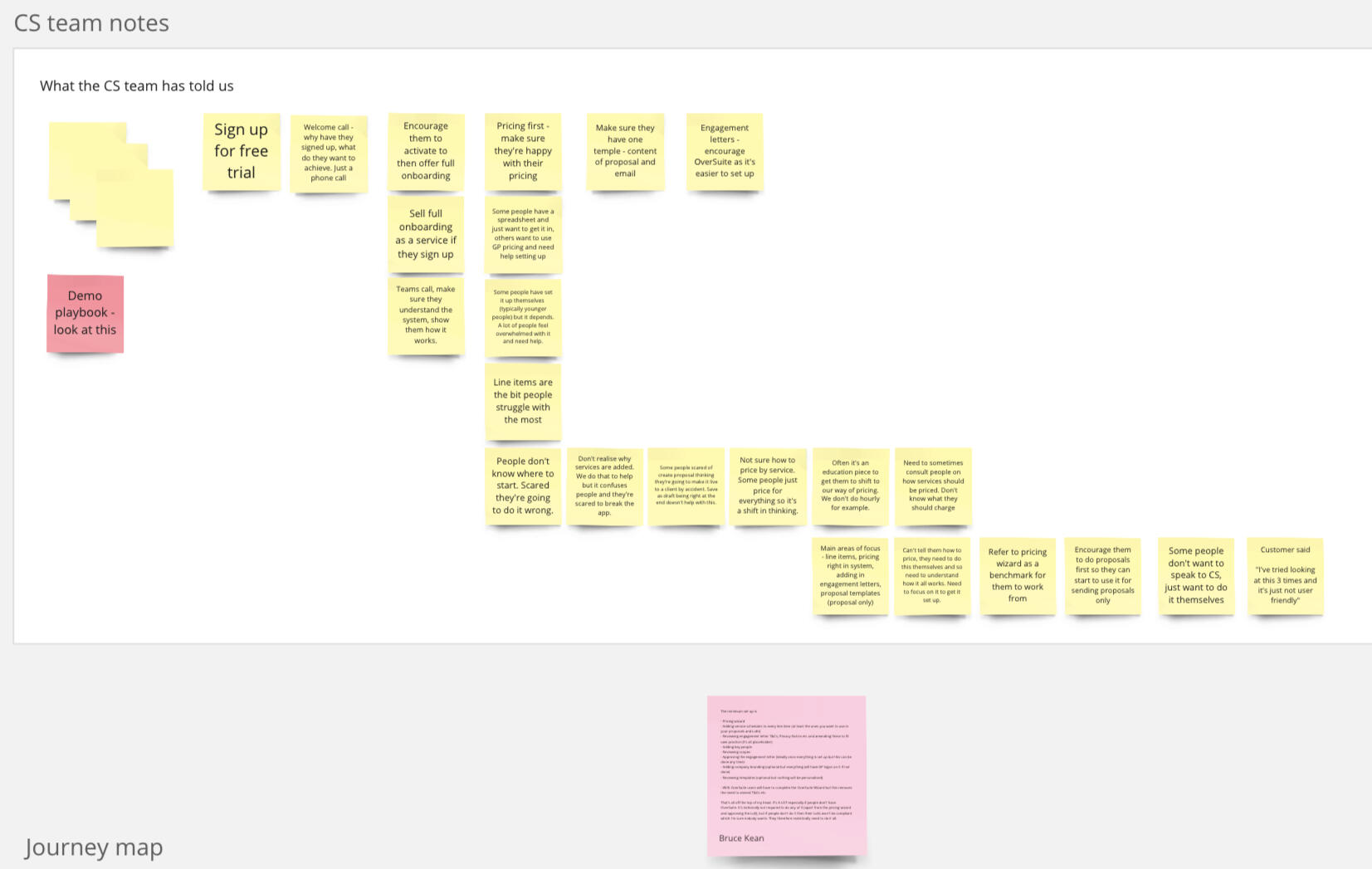
The initial data gathering and ideation, all centred around the information the onboarding screens gave. How could we improve the information, how could we nudge users to the correct sections of the application? Could we utilize deep links within onboarding screens? Could we create a check list of things a users should look out for? How's about an interactive task list where a user could manually check off the sections they had completed?Initial discovery stages considered all these points, as well as looking into the exiting architecture and codebase of the onboarding experience. I had pitched it to the senior leadership team that the onboarding section was the most important element to look at, and had been given the green light to add it to the product roadmap and start to work on the topic more.Whilst continuing in the discovery phase, creating ideas and testing solutions, I decided to delve more in to the customer service setup calls. I ran a session with a few members of the Customer service team, and asked them what areas they think customer struggle with, what they think could be improved, and what kind of complains and strange situations they found themselves in.It was clear at this stage that I needed some more contextual data on the subject.
Maybe onboarding isn't the only issue?
Because of the nature and complexity of the onboarding and setup process, it became evident to me that part of the company's draw and appeal, is its friendly and helpful customer service team. This isn't your typical call centre set up, rather - each user gets a dedicated member of the team assigned to them as a point of contact. This point of contact arranges a phone call with you as a new user, and guides you through the set up process, sharing screens and literally typing in the users information for them.Whilst this is a fantastic CX element and one to be proud of, it isn't scaleable.The acquisition of GoProposal by Sage meant that we could go from a few tens of sign ups per month, to potentially hundreds or even thousands. That, and the fact that the software would become a 'free' part of a larger SaaS subscription meant that on day-1 of the integration, 5 to 10,000 users would potentially have access to the system. Certainly not a sustainable model to ring each and every one of them.I asked the Customer service team to record some set up sessions for me, so that I could make observation on key areas and paint points of the set up process.
Challenge
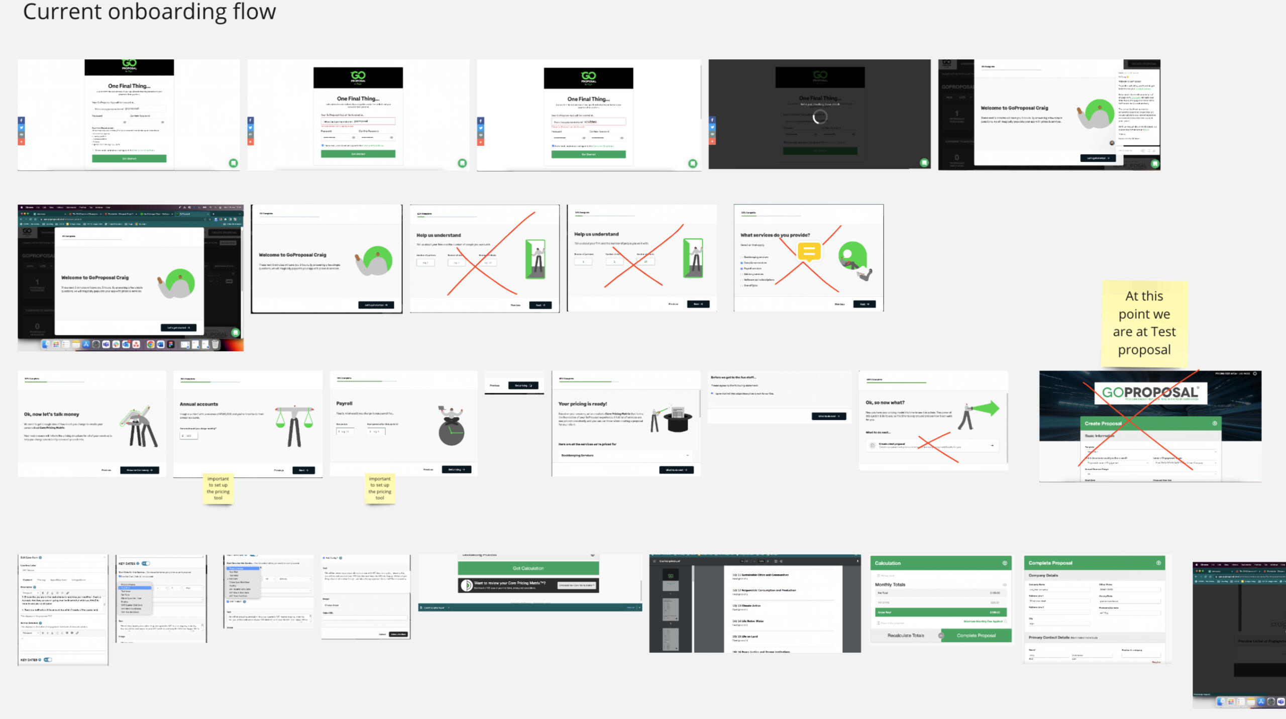
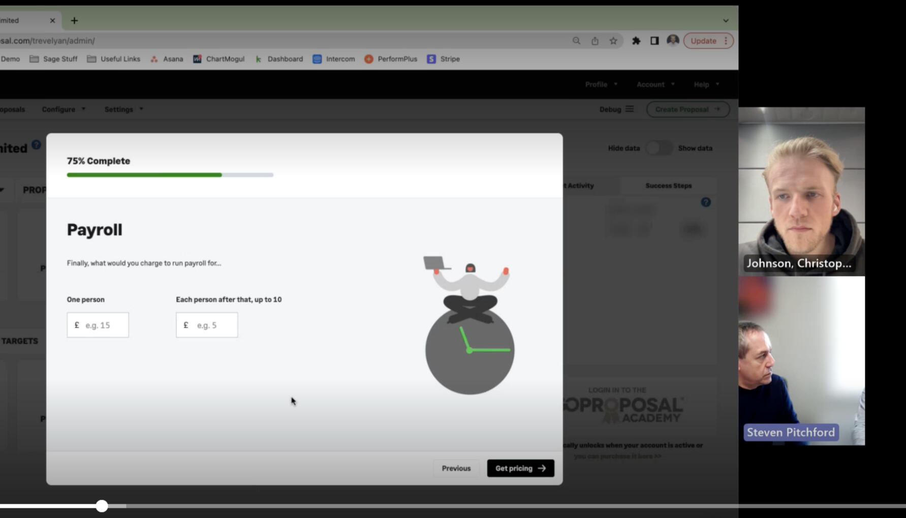
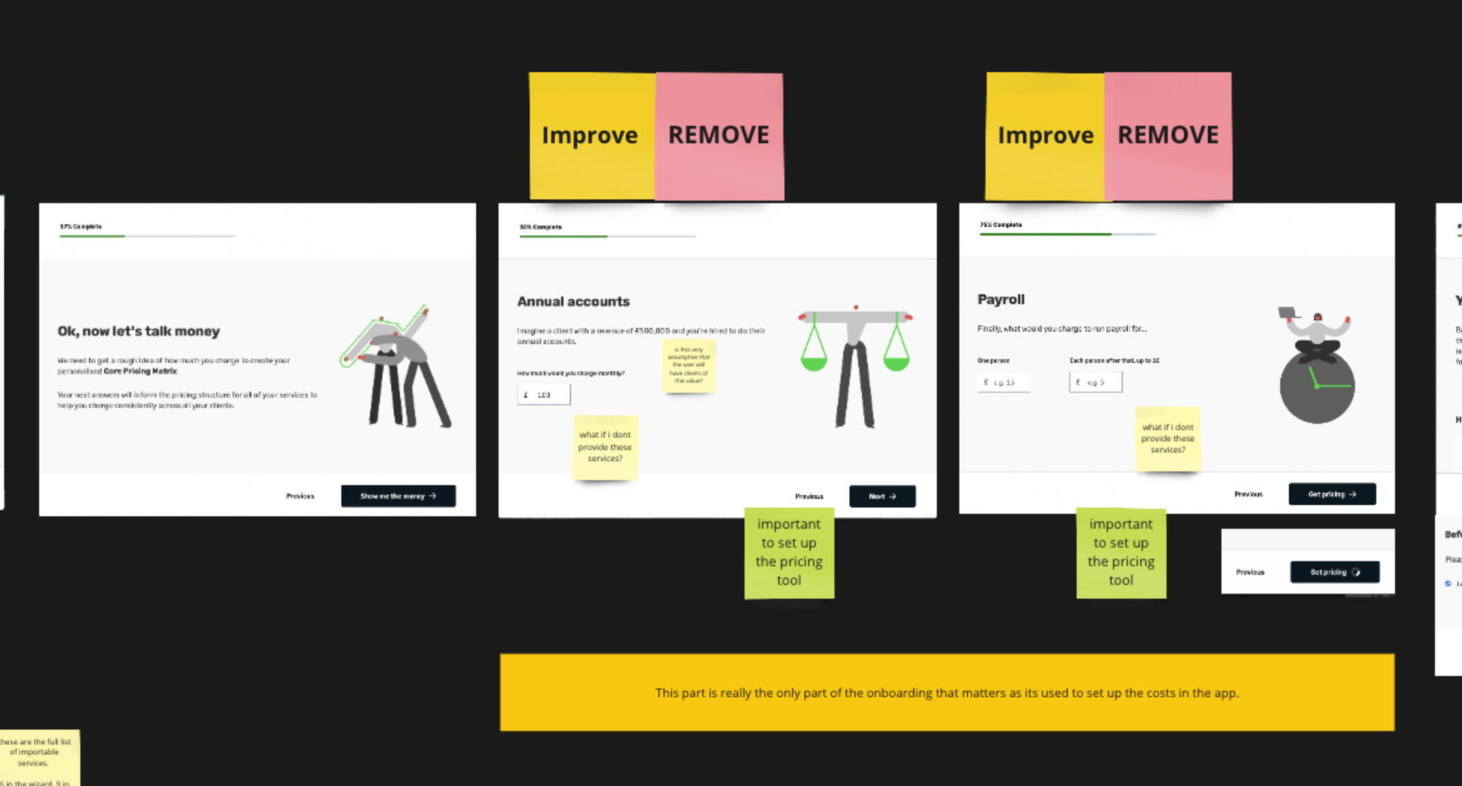
The current onboarding aims to be friendly and easy to navigate and setup.The user is asked a few questions in the onboarding section which are aimed at creating a 'Core pricing matrix' which not only imports a standard set of services, but also sets a baseline pricing for each. This is a key feature of the GoProposal proposition, in that the intelligent software and calculations get the accountant set up quicker.The accountant is expected to use this base pricing / core pricing matrix, and run a test proposal in order to tweak the costing based on their own preferences and needs.The idea of bringing a test proposal into the onboarding, is to attempt to get some TtV (time to value) and getting the accountant in to the 'meat' of the app and see how it works in real time.In reality, this only serves to confuse the user even further. They don't know why they are all of a sudden in a proposal creation page, they are worried that this proposal will be seen somewhere out in the live world, and the lack of real inputted data from them, means they have no real context in seeing how the proposal would work for them.After they have created a test proposal, they receive all the real world notifications (such as an email to their inbox) but then are placed into the app with no further instruction on what to do, or where to go next.
The problems
The problem is, the current onboarding of the app does nothing apart from set these base prices. There is no context or information in to the setting up of their own line items or pricing, and no indication in to what steps need to be taken in order to get the app at a 'working' stage.
Putting a user into the proposal tool at this stage has good intentions, but a half set-up proposal is not useful in the context of onboarding them and getting them ready to use the application on their own.
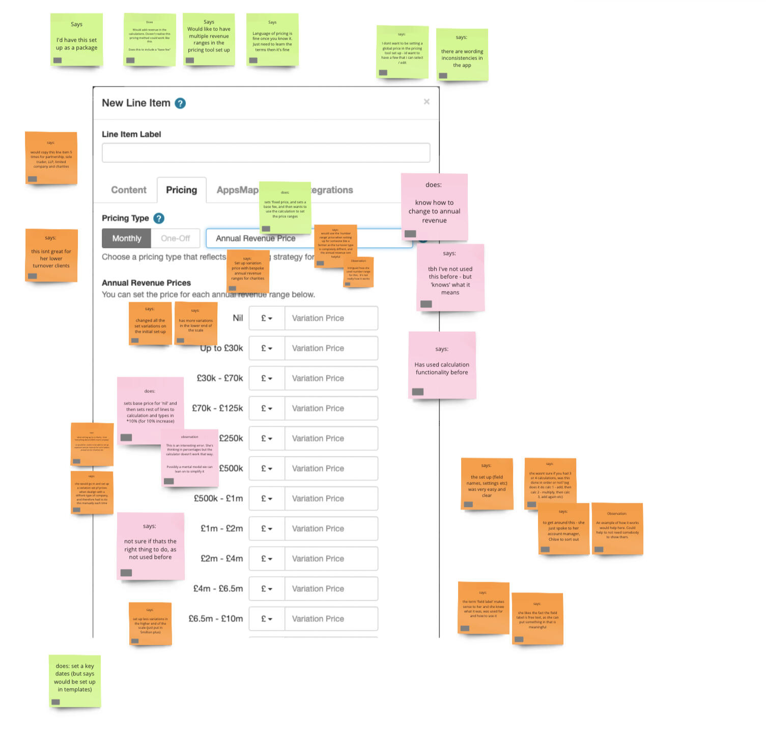
The main areas that need attention when setting up an instance of GoProposal, is the pricing tool and line items areas. These are the parts that the accountants struggle with the most, and the part that they need the most help with. A redesigned pricing tool would be of benefit.
The onboarding screens are an attempt to be 'easy, quick and friendly', but actually seems to provide the opposite affect. Accountants are very methodical, thorough people, and the idea of approximating some costs for their services does not seem to sit right with them. Asking them to 'pretend' or 'imagine' the amount they would charge a client for a service goes against their principles and mental modals.
The onboarding asks unnecessary, irrelevant questions around practise size. These questions do not affect the application and its pricing, but is / was used by the CS team in order to apply some targeting software to increase subscriptions / plans.
Pivoting away from initial hypothesis
My original hypothesis was that users needed more informative help in the onboarding experience. They needed signposting to the relevant sections. They needed to know what was involved in getting the app fully setup. But this isn't the only case.In fact, it seemed that the biggest stumbling block was setting up of services and pricing. Sure, the app made good attempts to streamline this for the user and give them baseline costs, but actually accountants needed to go into these long list of services and check each one, open up its pricing model, tweak and refine it, save it, run a test proposal to see how the costs calculate.... and rinse and repeat until they are happy with their costing on all of the pre-populated services. Then they must go back and create any bespoke services they offers that is not part of the out of the box solution.A very intensive and confusing process.
Process to solution
Based on the problems I had defined, I started to think about how we could address each issue:
Inform the user what steps need to be taken to get the app set up. Give them all the important sections they need to look for, and the other sections that may be considered as optional, such as branding and tweaking of emails / templates. Perhaps even a checklist so the user can track these actions. Keep the onboarding 'light' and get the user closer to TtV sooner.
Remove the notion of going into a test proposal. This is mainly used by both users and the CS as a way to 'test' the pricing structure. Instead, get them to the line item set up sooner.
Ensure the line item setup gives users the means to test out their pricing, without having to create a test proposal.
Remove the 'imagine' screens and instead focus on a way to gather the relevant information in order to set up the pricing tool. Think about providing a 'default' cost that the user can choose to override, or not. This way we are not forcing them to think about this information right now. Let them know that they can edit the pricing at any time, and this is just to provide a base price.
Remove the unnecessary screens. If we need this information, we could consider grabbing it elsewhere, but the general feeling is this information isn't really utilised, and certainly isn't necessary to the clients experience.
Solution
The solution came in the form of a mixture of two projects. One - the new onboarding project, and the other an existing project to redesign the servicing and pricing setup.We had previously conducted research on the pricing tool setup, where we had invited 8 participants to a chat and walk through of the pricing tool. We had given them tasks to run through, and asked them to speak about their thoughts, opinions and frustrations aloud whilst we tracked them on a miro board.

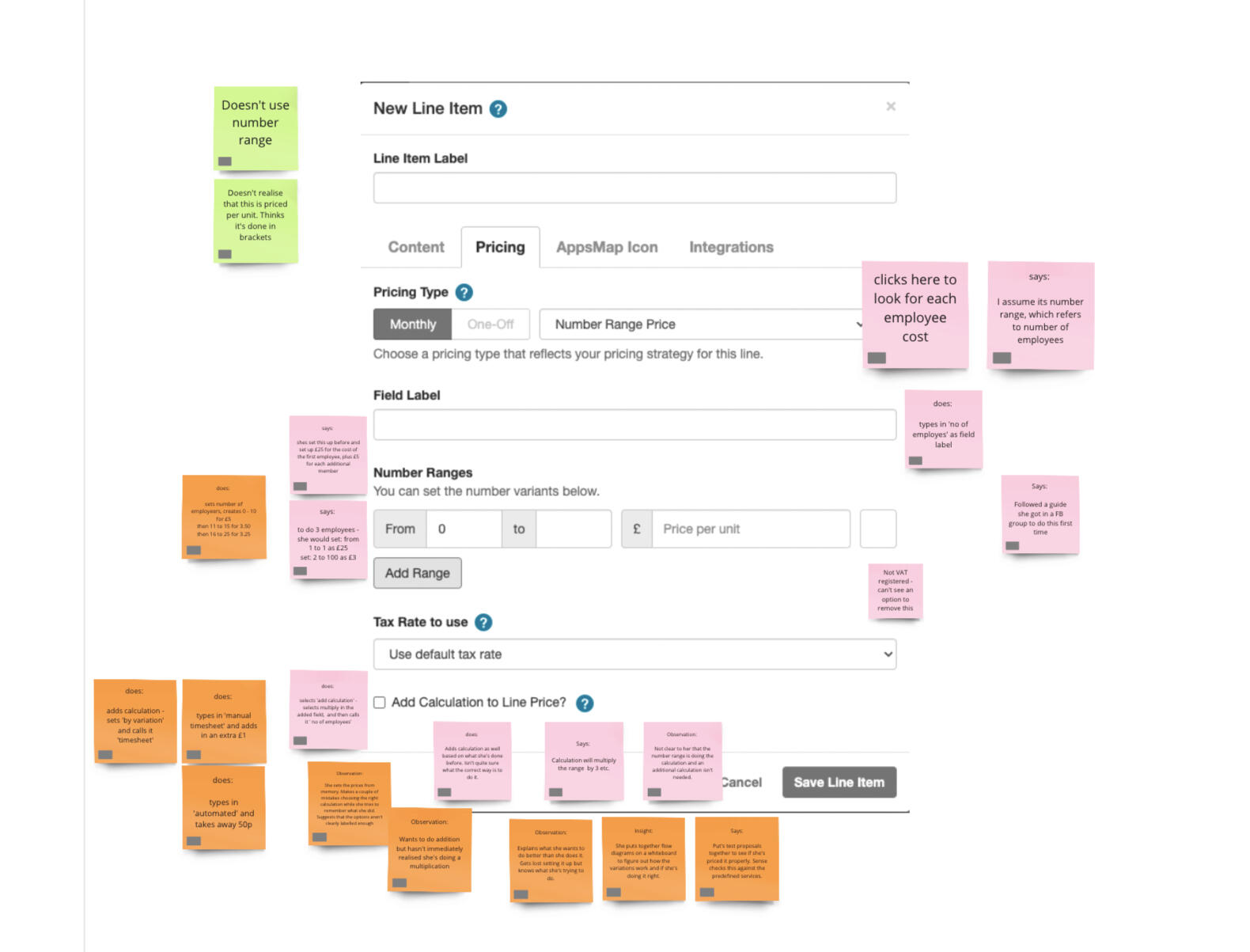
We had a mixture of new users and users that had been using the product for over 6 months in order to get a better feel of the problem areas, and how existing users tend to navigate around these pain points.From this, I had redesigned the pricing tool, in order to not only make it more user friendly, but to also show a live, running total of the pricing as users updated it. This way, we removed the need for users to navigate to and from the pricing tool and allowed them to tweak the pricing as they saw fit, before they even had to think about creating a proposal.
The pricing tool redesign had previously been shelved and put onto the backlog, due to a shift to the integration of GoProposal into Sage software. However, with these new insights, I was able to resurrect the project and include it as part of a wider onboarding piece in order to make the setup easier and more efficient.
Outcome
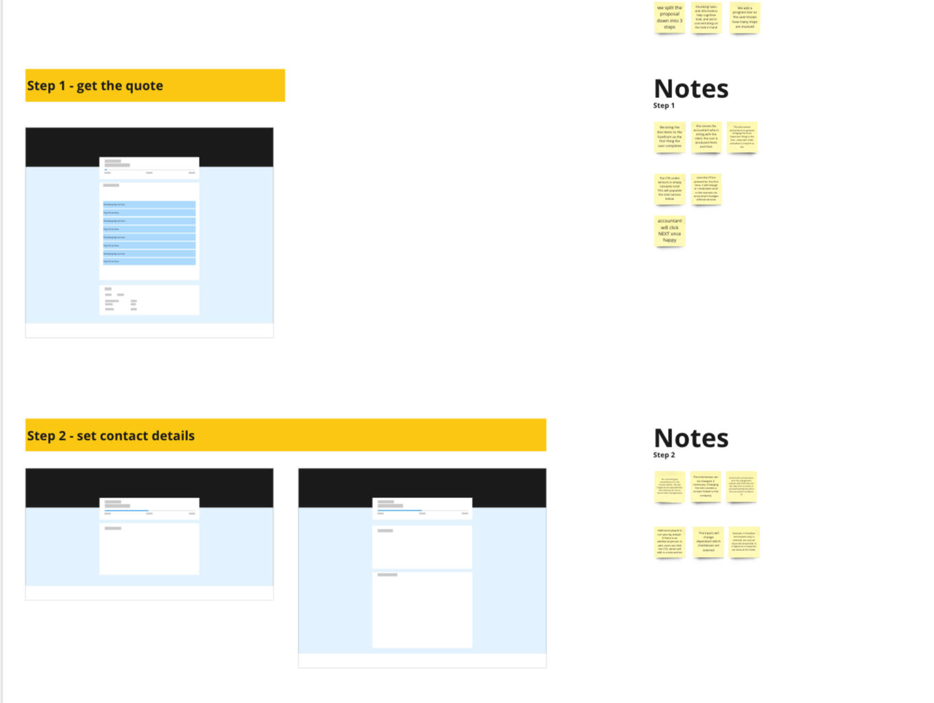
We decided upon removing the modal style of onboarding, and instead utilize the blank space on the day-1 app to introduce a task list. Each tile would deep link to the relevant section, where we could use simple Pendo overlays, or hard coded modals to give contextual advice.
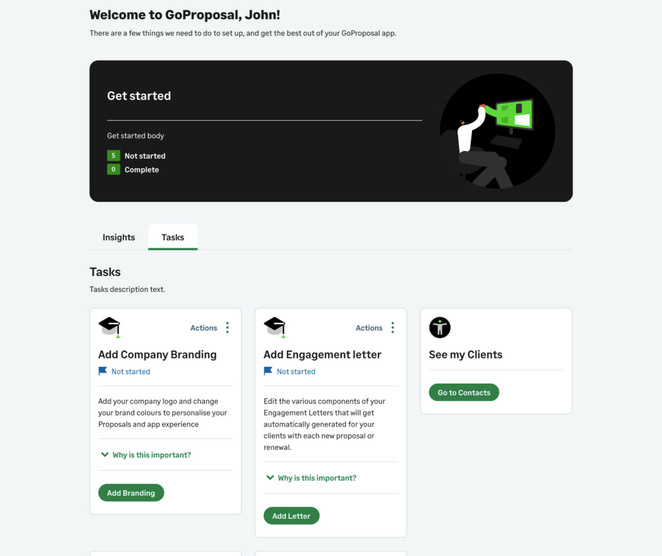

After user testing the new onboarding product, and lots of positive reviews (and one or two tweaks!) we decided to move the new experience into delivery.9 out of 10 of the users tested navigated through the set up with little to no issues, with the remaining 1 user only really stumbling with how they should use the GoProposal methodology and teachings to price their services. We hope by including links to help articles and videos created by the CS team would help with this, and reintroduced some tooltips and links through out the setup process.The experience has been built, and is ready to deploy in phase 2 of the integrated product.
What I would have done differently
The team had viewed onboarding as the most important issue, and it soon become THEE thing to concentrate on. There was a big push to improve metrics and with onboarding seen as a high impact, low effort project, was pushed in front of C-suite too quickly.This meant that C-suite had a defined idea of the timescale and scope of work, and it took a bit of time and effort from myself to steer the ship off course and into a new direction - this time including the pricing tool setup work. I managed my time in a way that I could go and dive more deeply into the matter, and better understand the real issue, and not what we assumed was the issue at the start.Gaining a deep understanding of the problem is what I pride myself on, and is a massively valuable piece of any project before any pen is put to paper. We should ensure there is time set aside for this deep dive for future projects.
OOUX
Delving into Object oriented UX (OOUX) to define mental models and create a cohesive integrated platform
TL;DR
Our app had become a mess of differing words, terminology and information.I used the OOUX process to define and map objects, relationships, CTA, attributes and meta data to create a more logical and consistent approach.The exploration highlighted the need to reevaluate not only this application, but the full suite across the business and start to align process, interactions and terminology.
Background
Inconsistent pricing plagued accountants: haggling with clients over rates, undervaluing services, or giving away free work. GoProposal fixes this with standardized pricing, smart variations, and digital proposals to eliminate the back-and-forth haggling.
Challenge
Initially focused on consistent pricing, GoProposal's feature set rapidly expanded within a legacy codebase and Wordpress backend. This, combined with team changes and inconsistent marketing language, led to a user experience riddled with inconsistencies.As a new UX team, we quickly identified user pain points: confusing terminology, redundant screens, and multiple ways to complete tasks, each with its own issues. The upcoming Sage integration further complicated matters with their own terminology. The application, frankly, was a mess.
Process
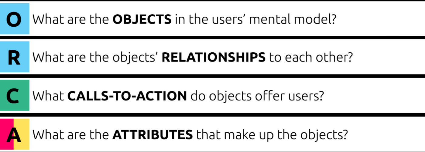
We had both taken some self-study time to lean a new (to us) process called 'Object orientated UX' and decided that we would take the learnings and opportunity to delve into the system.OOUX follows a process called the 'ORCA process'
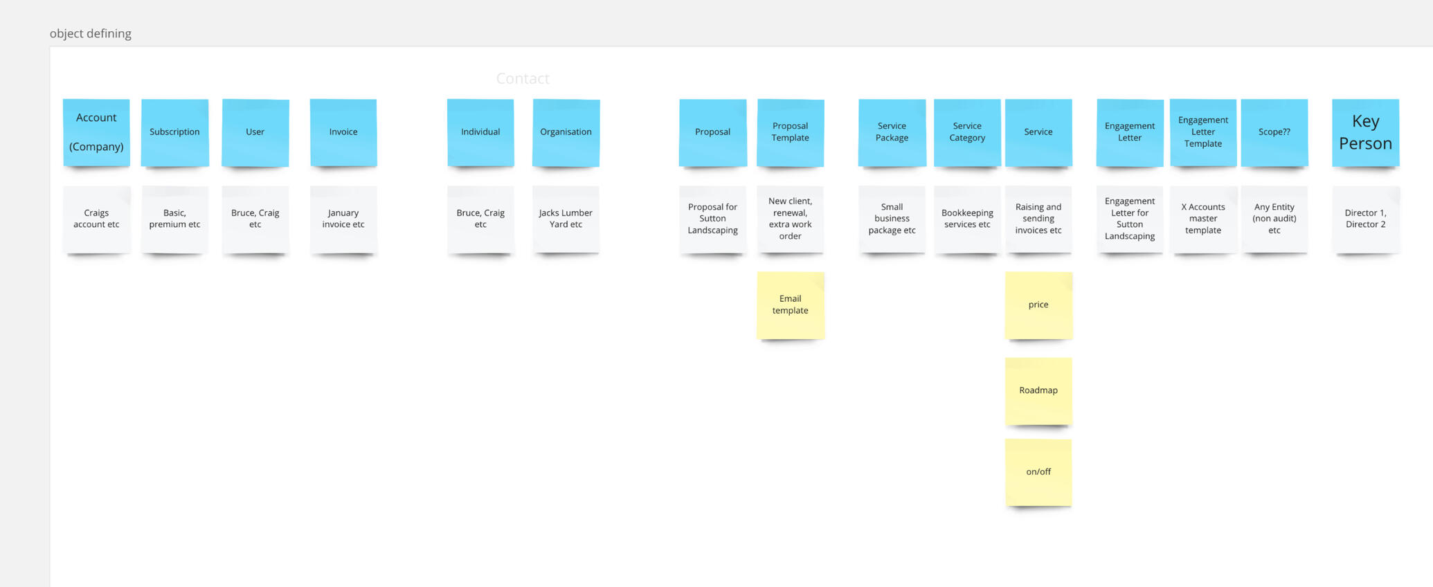
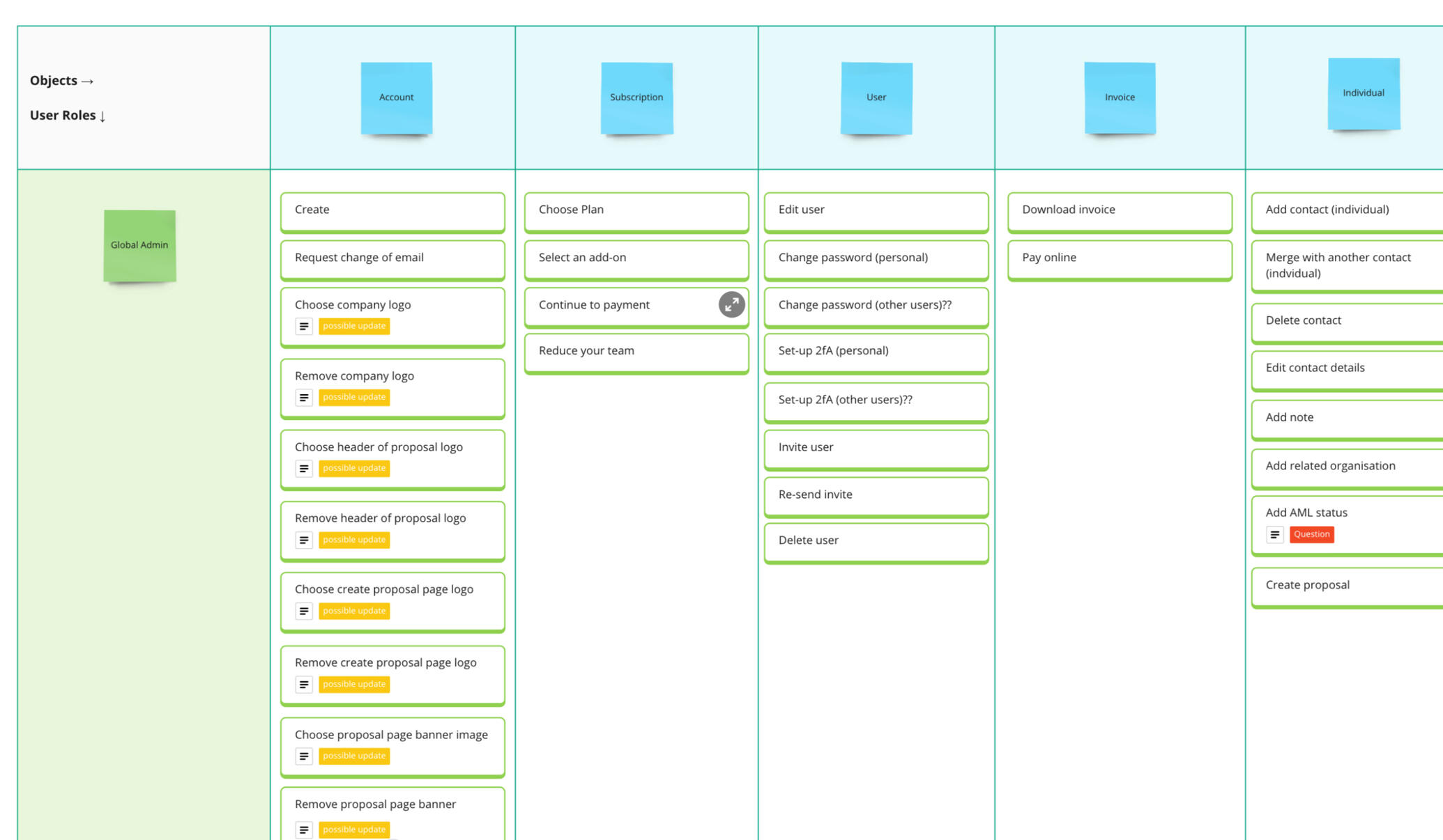
Step 1 is defining the objects, done by process called 'Noun foraging'.In this process, we started by creating a site map of the application, and documented every link on the navigation bar and every page that sat beneath.
We clicked through, page-by-page, section by section... on every navigation item, on every link and button and menu, and documented all the words or nouns we could find.This could be 'cost' when referring to the cost of a service. It could be 'team' or 'person' when referring to the people you work with. It also could be things that are not so obvious, such as 'scope' or 'Line item' - definitely things to dig into more and find out about.
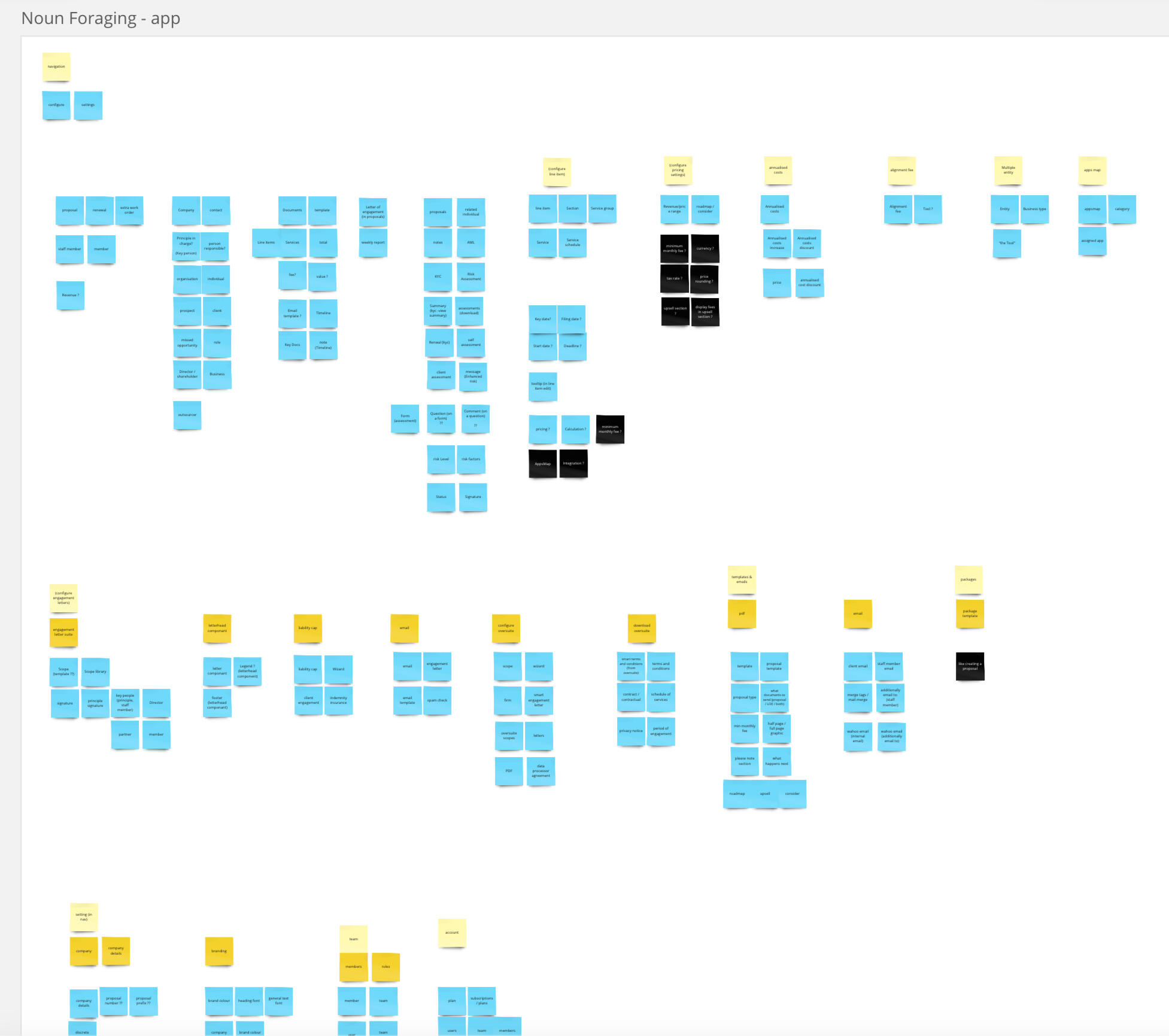
After analyzing in-app terminology, we tackled the GoProposal website. We meticulously documented all nouns and object names used in marketing materials. This ensured consistency between advertised features and their actual in-app names.Finally, we analyzed user feedback to understand the language they used to describe functionalities. Did they call it a "line item" or a "service"? This comprehensive approach ensured clear and consistent communication across all touchpoints.
Once collected, we went ahead and mapped them all in an affinity diagram, clustering like minded words and phrases, giving the clusters a name, and showing where words overlapped and changed.
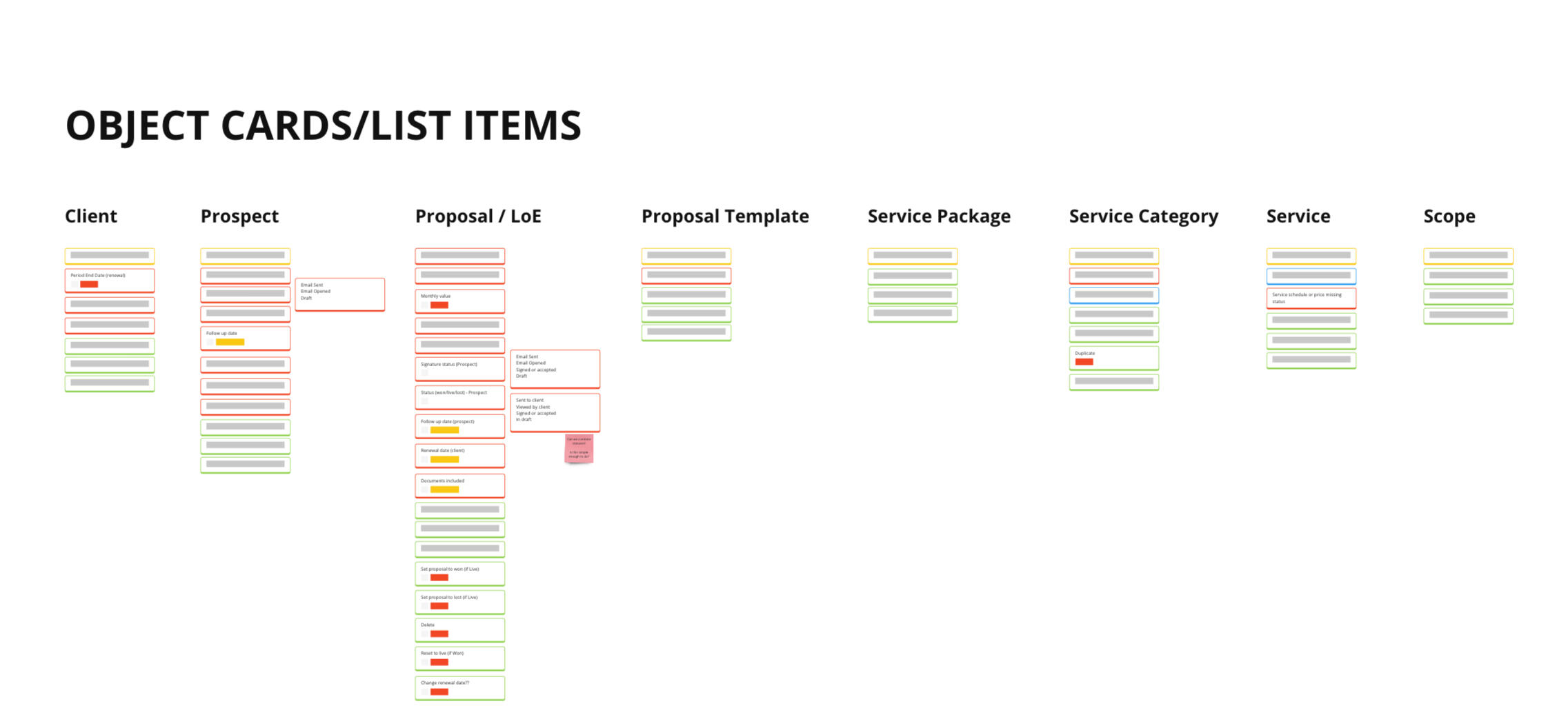
After this, we could define the Objects.What are actual 'things' that users can interact with? 'Things' that have structure, information, data. Which are the building blocks of the application?Once we had defined those, we could draw comparisons to our affinity diagram, and see if any of the objects were referred to by different names by users, and make a note of the big hitters.In the image below, a blue sticky note is an object. A grey note is an example of that object within our system, and the yellow notes are other objects that existed within that object.
Nested object & CTA matrix
The next stage in the process is discovering how objects relate to each other.In the expanded ORCA process below, you can see this is listed in round 1 as 'Relationship discovery'
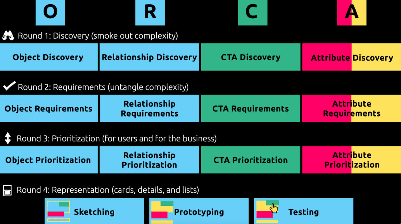
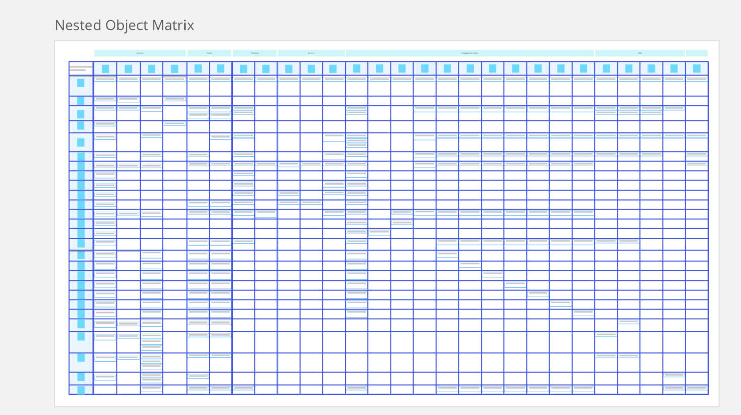
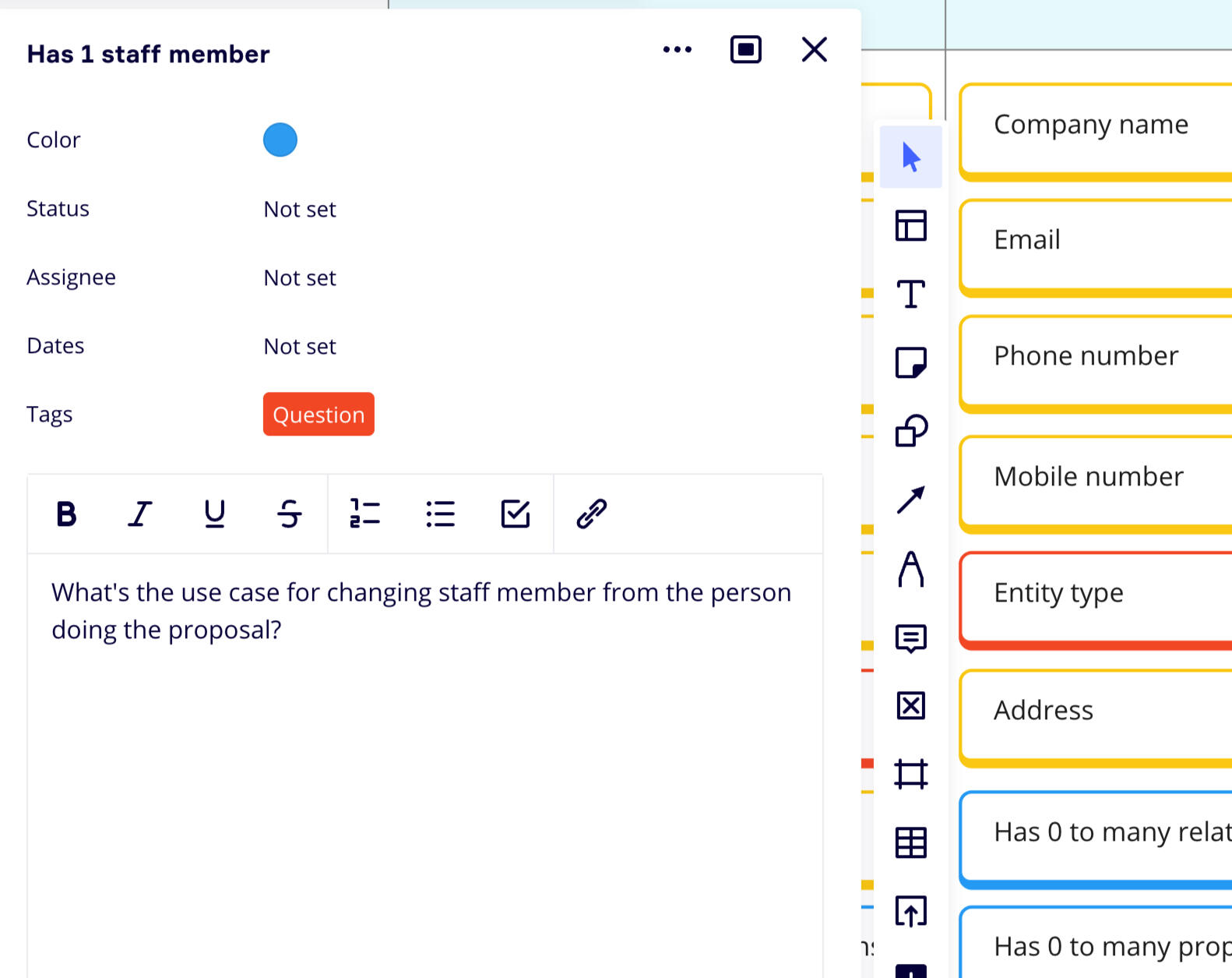
To do this, we work our way through our defined objects, noting the relationships in a matrix by listing each object as a row header, and then doing the same as a column header. At each intersection, we define how the objects relate to each other.For example, in our application, one Client can have many proposals, one proposal can have many services, one service can have one price.The goal here is to start thinking about and uncovering how each part of the system talks to the next. How each part needs to draw information from another, and how we may be able to utilize information and data from other objects. We can also start to spot objects that DON'T relate to each other, but possibly SHOULD. We defined these points as 'possible updates' and put them as action points to speak to stakeholders about.
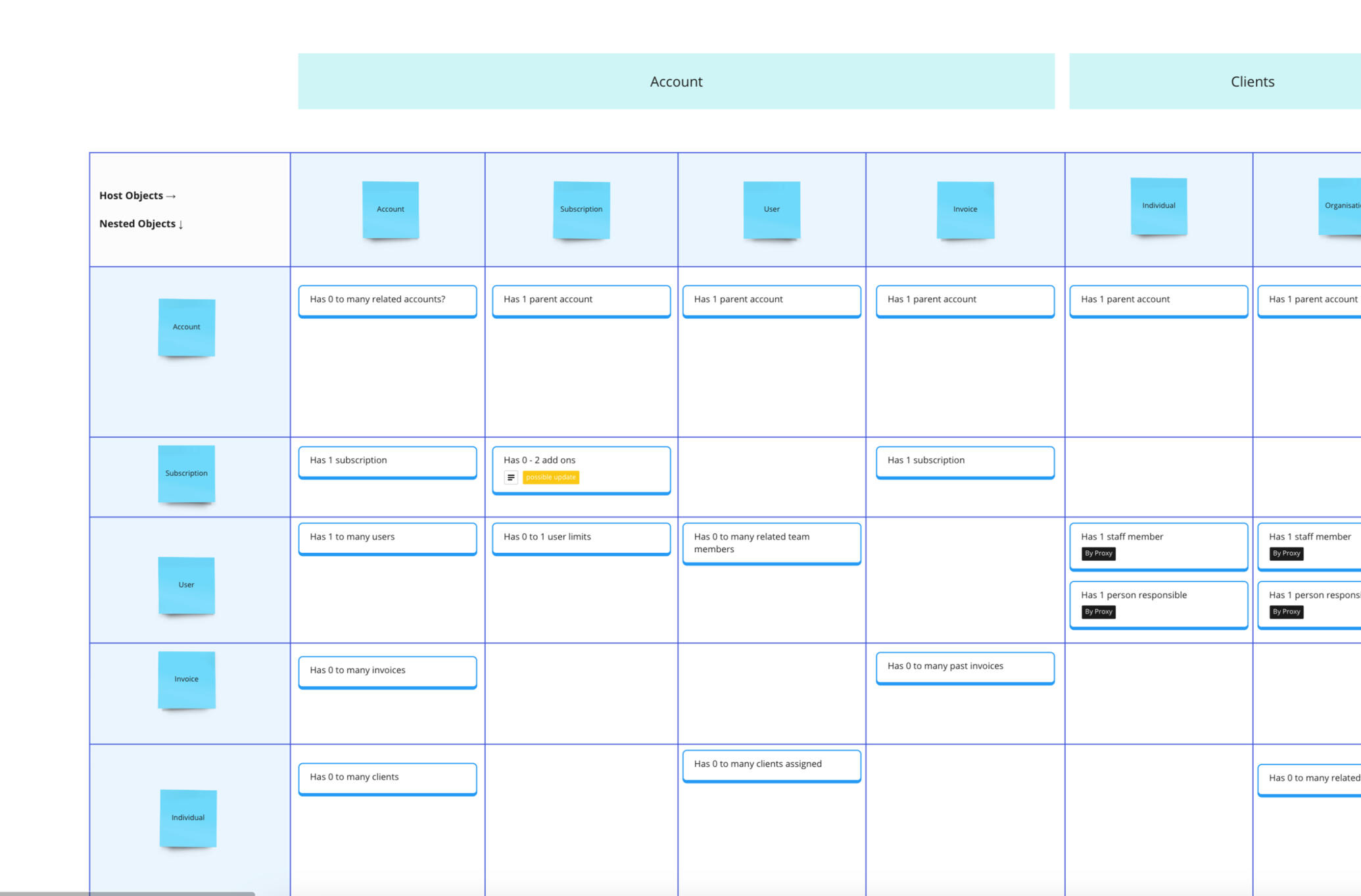
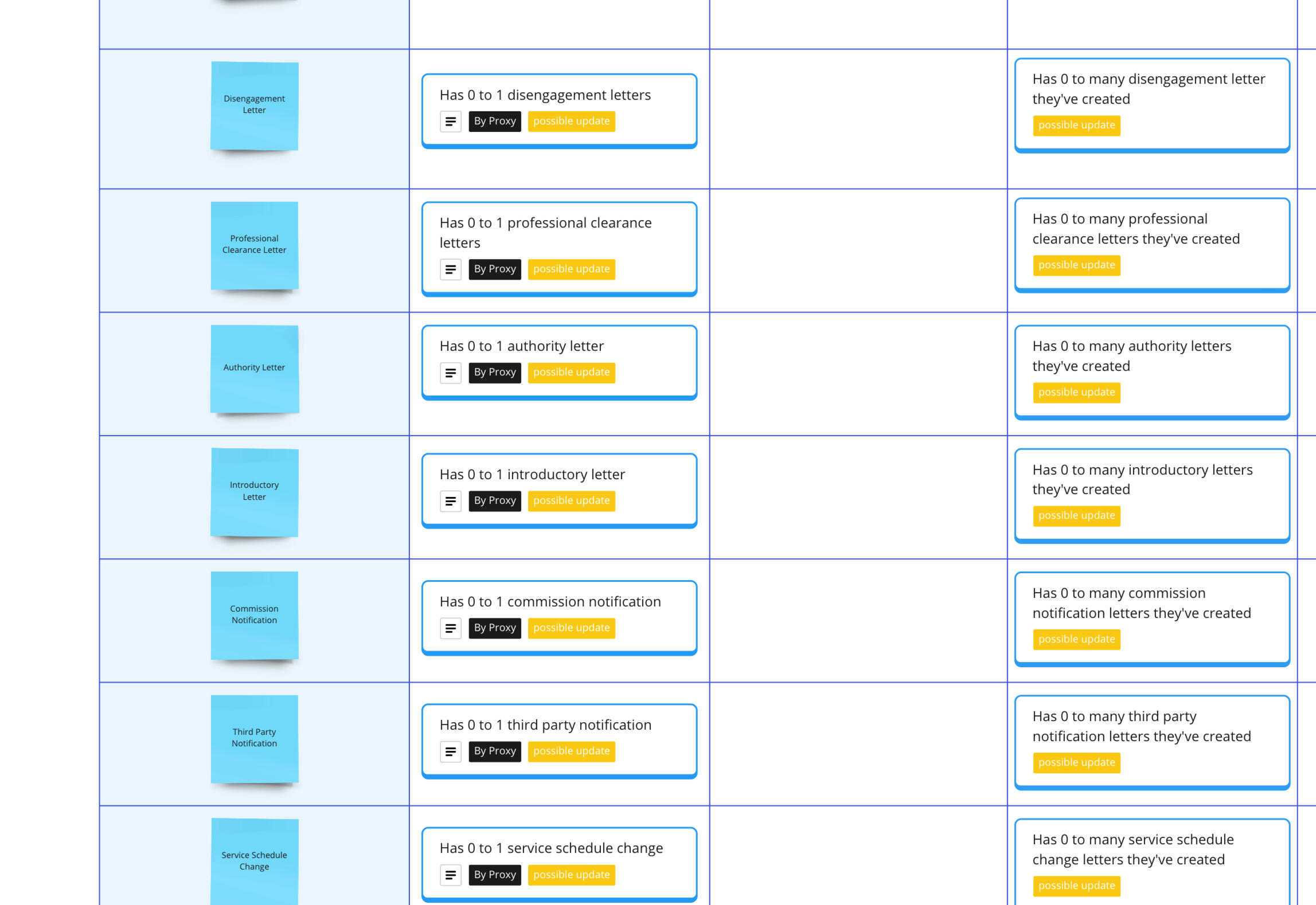
Once all of the object relations are defined, we can move onto listing out the CTAs those objects have to enable a user to interact with them or manipulate them in some way. These are things like Copy, Edit or delete, and not things like zooming or clicking to go back.Through the process of creating these two matrix, we discovered that we could actually do Round 2 of the ORCA process at the same time, maximising our efficiency.In round 2 you would typically define requirements, so, as in our Object matrix, we started to define the CTA's that were not currently present, but would be a good idea, and marked them as possible update.


Nested object & CTA matrix
The last step in the discovery process is defining all of the attributes that make up an object.Attributes can either be described as Core content (yellow) which are things like First name, Last name and email address - or Metadata (red) which are things like title, rating, status and date.Core content is information that can be created and edited, and is specific to one instance of an object, whilst meta data are common attributes that multiple instances could share.We can use these to build up a picture of an object, listing all attributes, CTAs and related objects, to start to form the basis of UI elements.
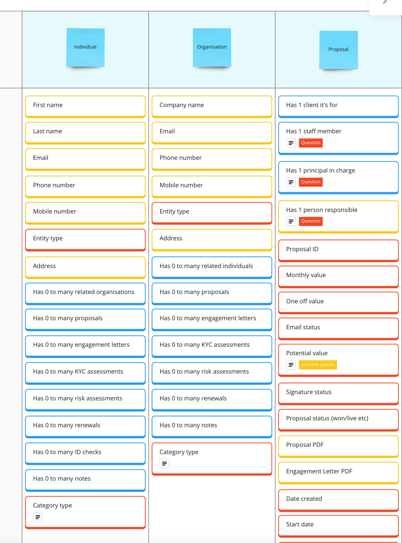
Mapping object data to existing experiences, and prioritization
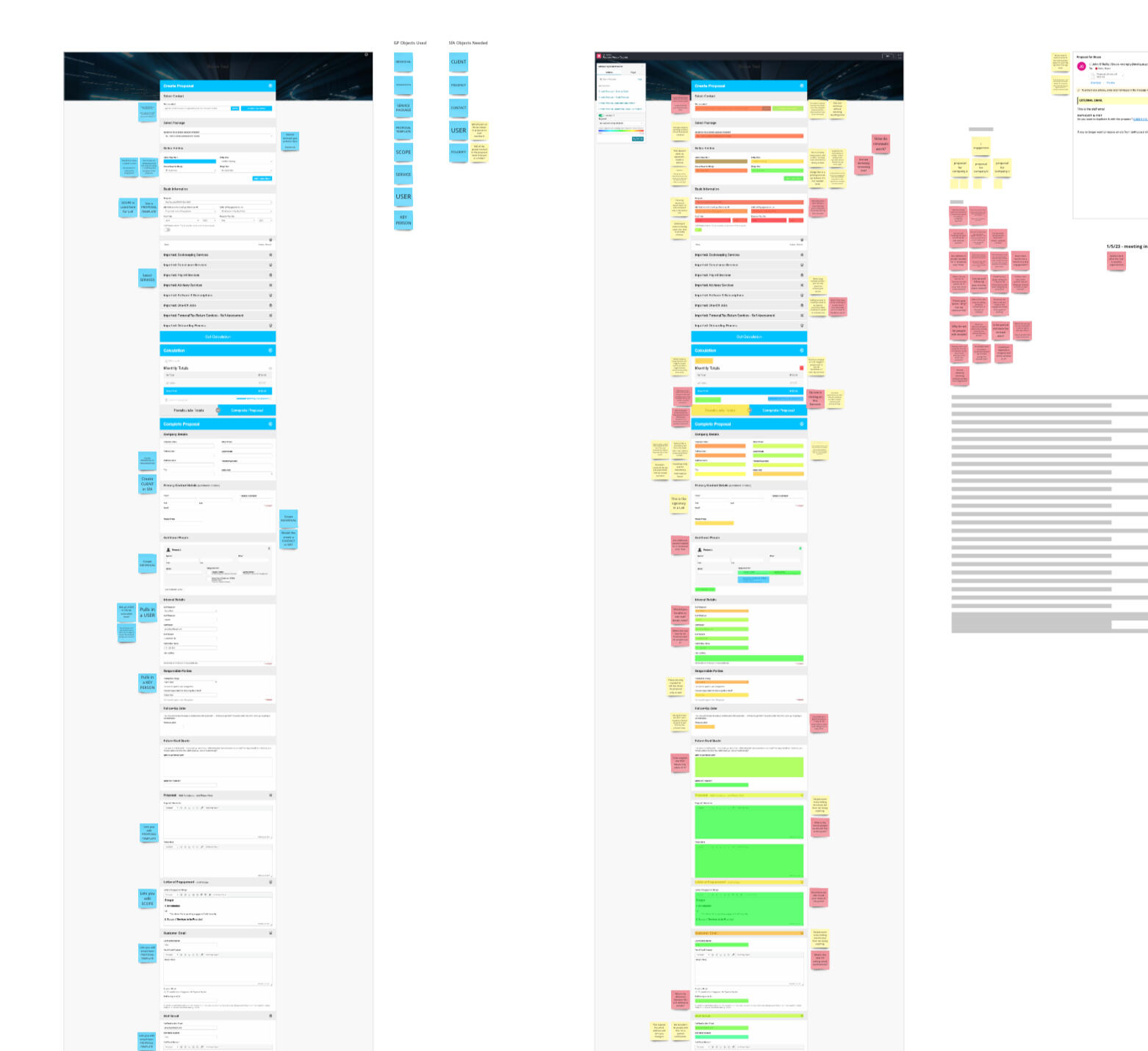
After a week or so of solid noun foraging, object relations and attribute defining, we had a pretty solid look of how the application interacts with its self, how users refer to these objects, how we refer to these objects internally, changes we need to make, areas of confusion, and a list of questions to ask and suggestions to make.Doing this process uncovered a lot of areas that we either didn't know enough about, or simply didn't know about, full stop. It allowed us to more deeply understand how the application was structured and what it was made of.We used this new found knowledge to map our object and attributes to the existing experience.In the image below, you will see where we have defined where various objects sit and what data is pulled in. I also overlaid this on top of a heat map from the app usage, to start to prioritise the objects - what was being used and what wasn't, where the confusing information was, where the parts where that had multiple names.
Outcome (OOUX)
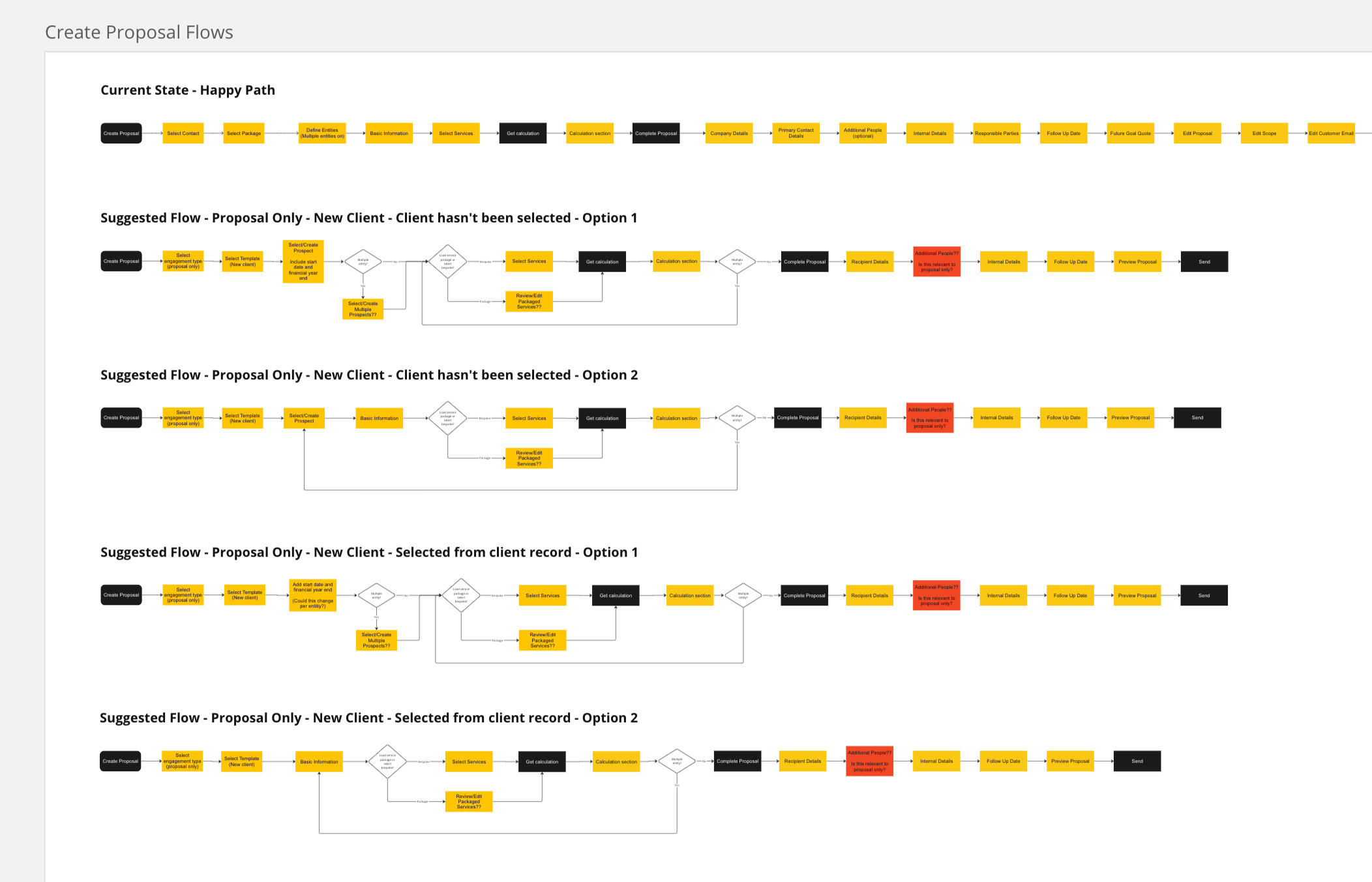
This work was of amazing benefit to both us as a UX team, but also the incoming parent company Sage, and existing members at GoProposal. It highlighted the fact that the departments are mis-aligned and do not use the same terminology as each other, and that not every part of the system that should or could relate, did.From here I could create new suggested flows that reduced screens or interactions:
Define simplified and streamlined objects:
Create wireframes for the suggested flows:
and go from this:
To this: a much more streamlined and easy to read version of the old screen. The new screens surfaced all of the important information, used all of the recognised terminology, and didn't show any unnecessary data when it was not wanted.
The launch was done in stages, firstly with the redefined wording released, with a view to the new UI being released in a future phase of the Integrated platform. Feedback was mixed at first, as existing users had gotten used to the varied naming conventions. However, new signups found it much easier to find their way around the system and understand context.After the feedback from existing users, I coached the Project manager through a launch video to release, explaining the changes and what it would mean for a future release. This only served to drum up excitement, and users new and old both quickly agreed that the new naming conventions were much better.
This work served as a precursor to the Information architecture work, and can be found on this page
Information Architecture
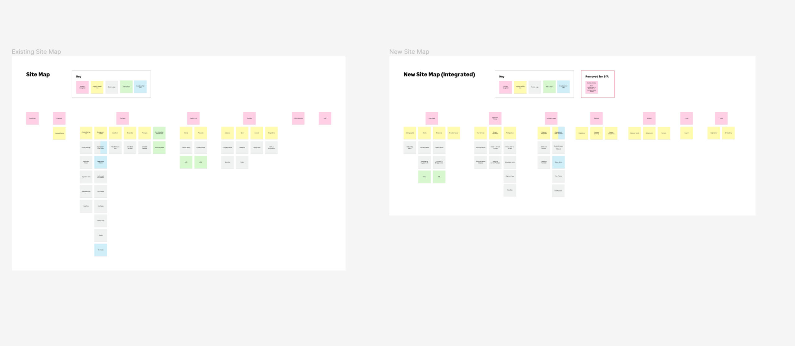
Redefining the Information Architecture of an acquisition, and its parent company, to enable seamless and sensible navigation on an integrated platform.
TL;DR
GoProposal was a small market-leader acquired by a much larger company.Along with other acquisitions, it's navigation was different to its parent company, and the idea of a cohesive suite became mis-aligned.The nature of the various applications meant that a one-size-fits-all navigation would not cut it, and so the team developed the notion of task based navigation, where the user selects and changes the task in hand to reveal changing navigation items.
Background
GoProposal is a company that was created as a platform to allow accountants to price consistently and fairly. After an amazing few years of leading the market, they were acquired by the giant Sage, into their Sage for accountants business unit.Along with the product, the whole team, that included myself, was moved into the larger Sage world. There was also a plan to integrate the GoProposal software into the larger Sage platform as a built in tool, contributing towards the vision of a Suite of tools at the accountants disposal, all under one subscription.
Challenge
The problem with integrating software together is two fold; not only does the architecture and code base need to speak to each other and align, but different products have different users, and different users have different needs, and different needs require different mental models.Different products built on different mental models mean that two products simply couldn't just slot together. Similarly, we was keen to not just to 'shove' all of GoProposals settings and functions behind a new Navigation item, or within the existing settings page.Not only would this be a dreadful experience, but it isn't future proof. The team and I discussed how other acquisitions (two of which were to be integrated soon) would also need a robust IA that they could utilize.
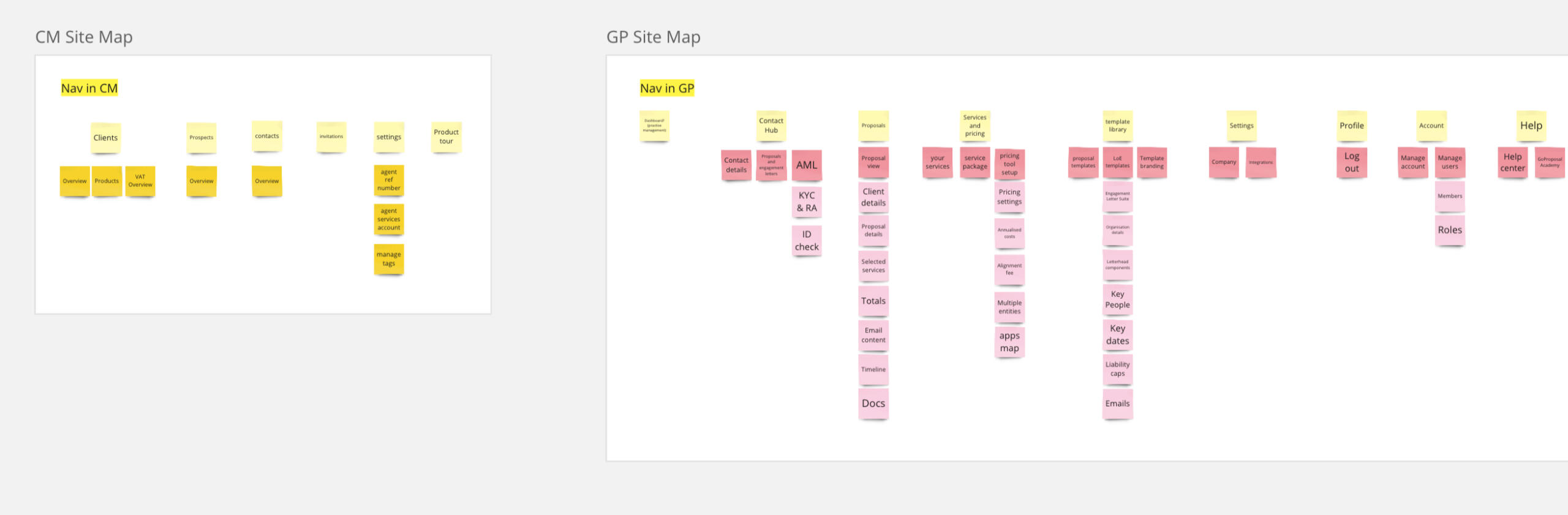
The existing GoProposal Nav
The existing Client management Nav (parent product)

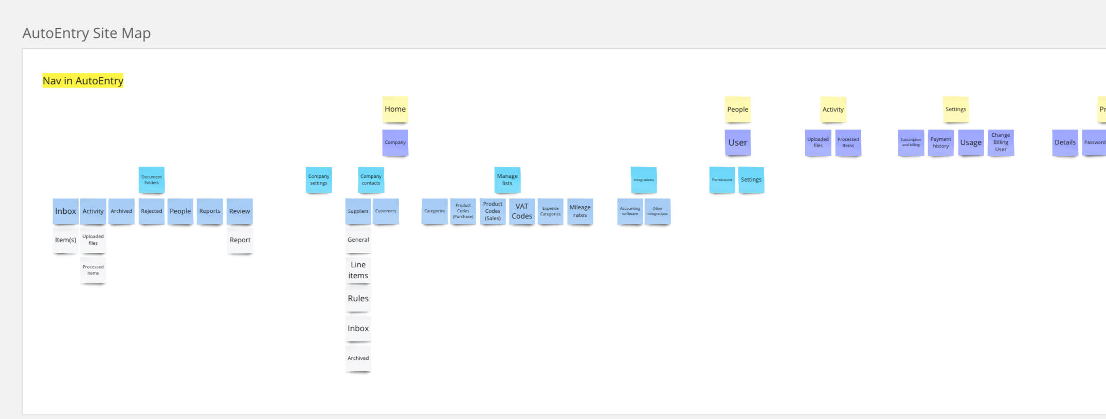
The existing Autoentry Nav (future integration)

Process
The process started with a deep dive into the current IA of each application. I mapped out each page, sub page and tab.As you can see, the parent product (below to the left) actually has a much smaller IA than the GoProposal product (below to the right) This was the first indication that it would not be as easy as 'slotting' the GoProposal IA into the parent product.
I started to go through the site maps and draw comparisons and crossovers within each application.Places where like minded information could sit, new sections that were needed, and sections we could delete or cut down.I then did a 'tear down' of the applications pages, marking the various bits of information that sat on each, so I could build a picture of the logical structure of the navigation.
And made a list of all the various statuses our applications could display, so that I could see if multiple 'types' of information could like in one place, or if they needed their own specific areas.
We ran some quick card sorting exercises with a handful of remote participants to confirm our thoughts.
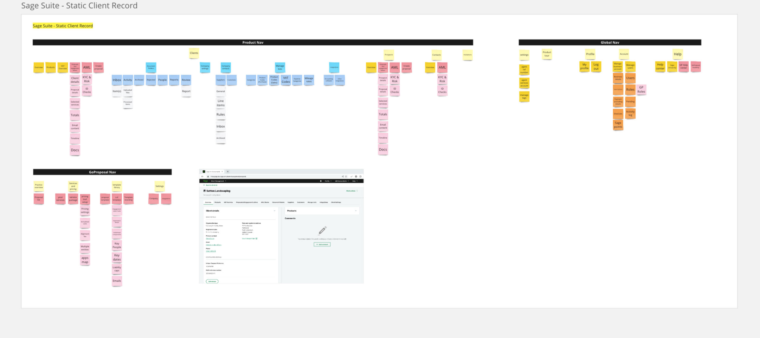
I also knew that there would be future integrations. We had 2 to come, and who knows how many acquisitions in future.Without having knowledge of the Autoentry software, we got in touch with the UX team from over there to organise a walk through, and then requested a login so we could click around.The site map was then created.
Going through the site maps and drawing comparisons to how each application views the notion of a 'client' - it came to our attention that the systems actually live in very different worksteams.The Sage product (client management) and GoProposal, was both tools for the accountant to organise their clients, to start the proposals (quotes) for work - to get the contracts (letters of engagement) signed, to conduct the AML checks.Autoentry served a tool for that Accountants clients - where as they could upload receipts and documents for their accountant to check and file.Thats two very different types of worksteams.
Solution
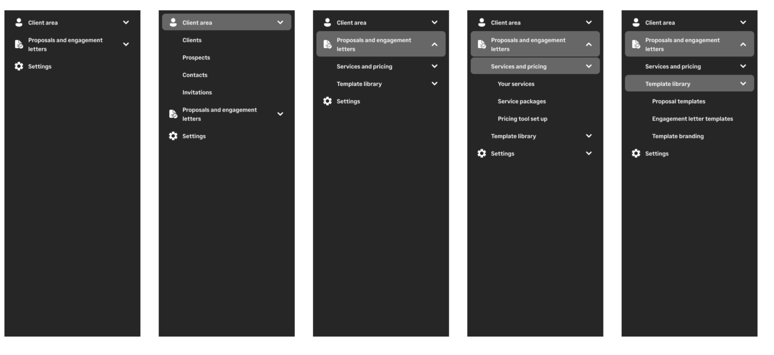
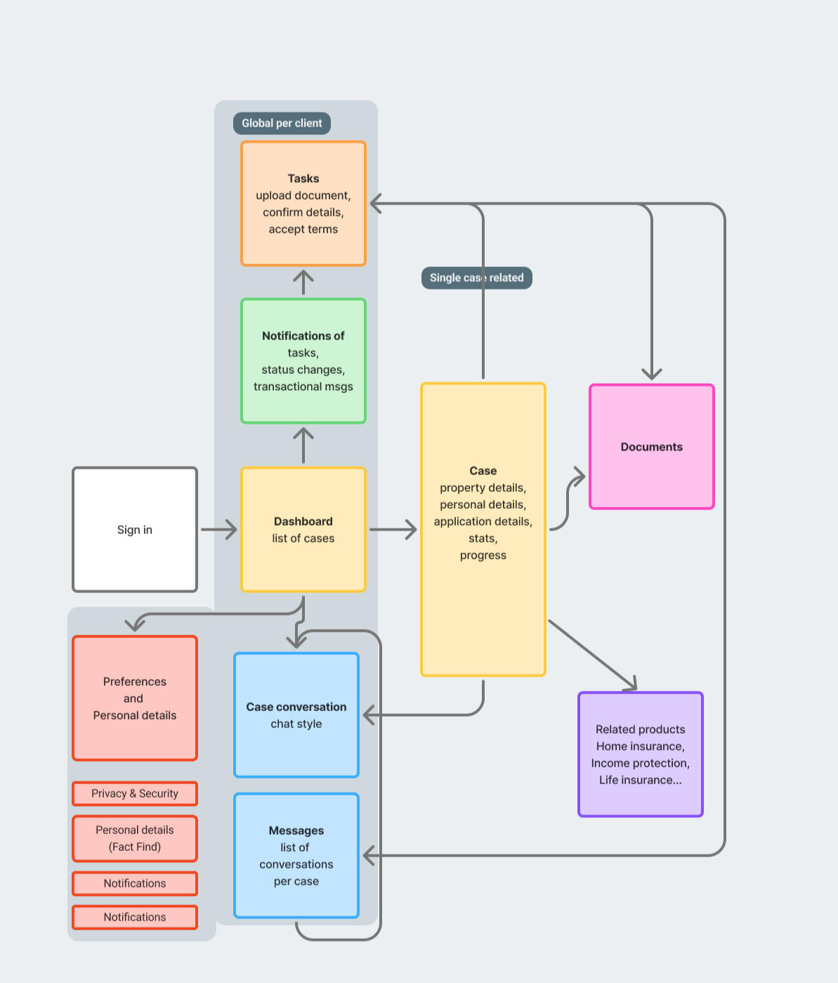
I had defined the traditional navigation to capture the high level areas that a user would need to navigate around the system, but with the mixture of task types, I had to think outside of the box.It came to me that an accountant would be in different mindsets, be conducting different work, or 'be wearing different hats at different times'.How could we combat that? How could a navigation dynamically change and adapt? Would it make sense for a navigation to change? I thought not - so the solution was: workflowsWorkflows are a set of like minded tasks an accountant would want to do at anyone time. They wouldn't need to both onboard a client AND upload receipts. One could only come after the other. The idea therefore was not using the navigation bar at all, but having a 'view switcher' that dynamically changed the content within a client record. That was a user would only see the screens important to them, at the time they needed them.
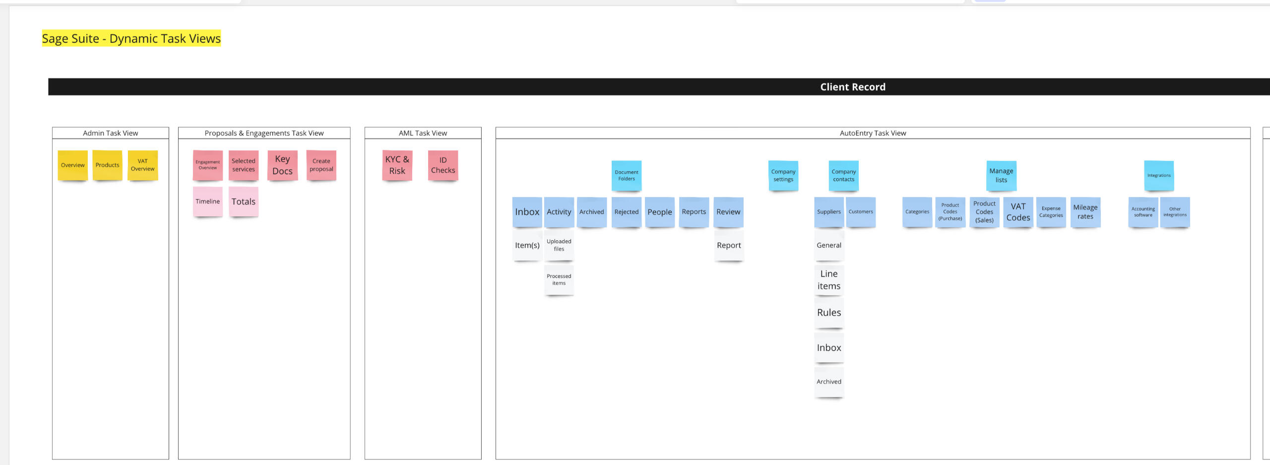
The task view switcher was a simple drop down box in the client record. The User could go from an overview / admin view, to one relating to AML checks, receipt entry, or onboarding and proposals.
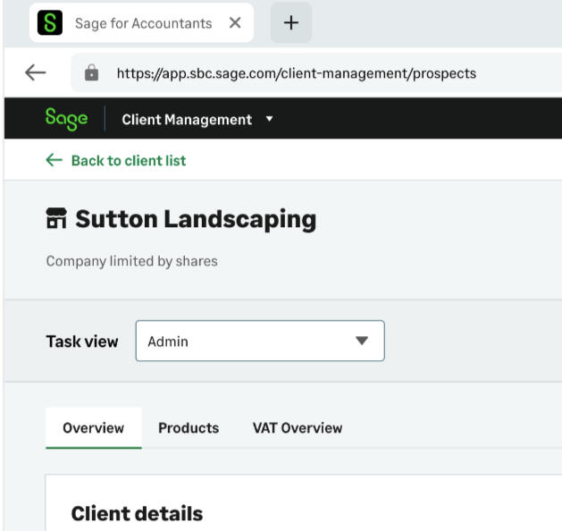
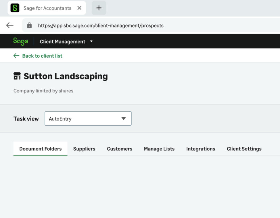
This, coupled with the new side navigation and its simplified IA, meant that we could future proof the application to take more integrations in, and allow for quicker views of various pages and subpages.
Outcome
Early user testing was very positive.Users noted the way the idea of switching task flows made sense to them and loved that there was not endless pages of links in the navigation.This actually sparked a discussion in the wider team, and the parent software, Client management, is now undergoing a redesign project as a result.The workflow idea has been taken on board, and augmented with the idea of users being able to create bespoke workflows and groups - not only grouping tasks by their logical nature, but grouping sets of clients and applying custom filters based on the specific accountants work flow and requirements.Whilst I cannot disclose the designs for this - below is a shot of the ongoing research that is being conducted on the new lists, that I am sitting in on as an observer to the User Researcher.
Anti Money Laundering
Introducing electronic ID checks into KYC & risk assessments to create a complete AML experience

TL;DR
Onboarding a client is a long and laboured process. Accountants had to change between our application and other offerings to complete the various parts of onboarding their clients.I lead the discovery design and shipping of the Anti-money laundering offering to enable our users to complete client onboarding all from one place. Our application.
Background
GoProposal expanded into providing the tools and expertise required for accountants to run Risk assessments and Know your Client checks on their clients. Users could simply access their clients existing GoProposal record and start a check, all from the same place.However, this is not the only necessary task required to fully onboard a client and ensure they are fully compliant. Clients must also undergo an identification check, usually by having their passport or driving licence photocopied and verified by a certified professional, along with verifying a proof of address.
Challenge
GoProposal saw a gap in the market and wanted to bring electronic checks into their software. Preliminary explorations had taken place before I had joined the company, so GoProposal had already found partner to run the background checks. We now need a way for users to get their client's information to that partner, in varying levels of detail, depending on which of the 3 checks were to be performed.
Process
The first step was to meet up with the team over at the partner company. I had made some very basic flows based on my understanding of how the system could work to present to them and bounce ideas back and forth.I spoke with the technical head, and asked for lists of exactly the parameters needed for each check type, so that I could ensure we captured the right data, in the right formats.

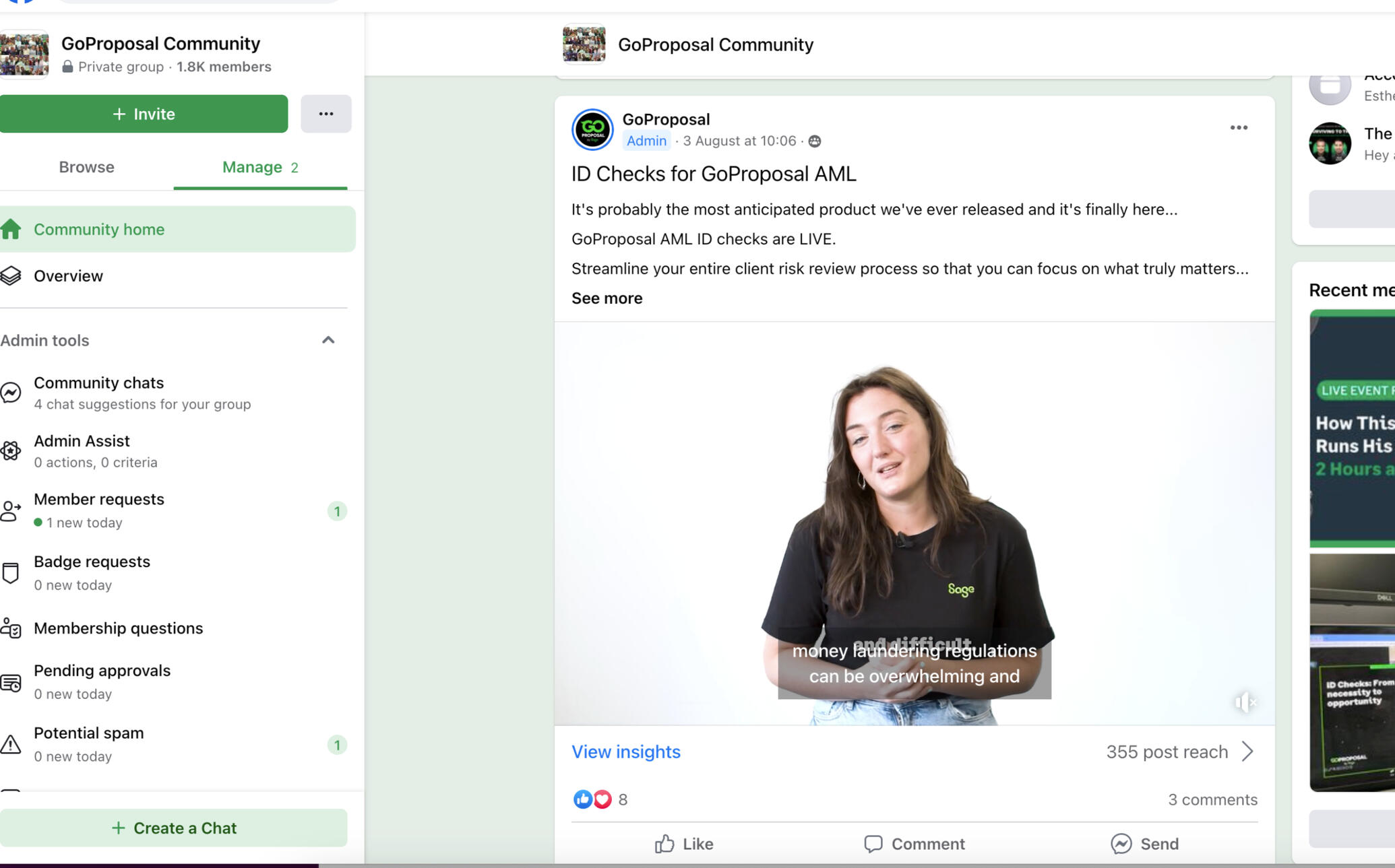
Ok, full disclosure - this isn't me and the team! I didn't get a picture of that (wouldn't that be weird, to whip out a camera in my first couple of weeks of joining a company!)
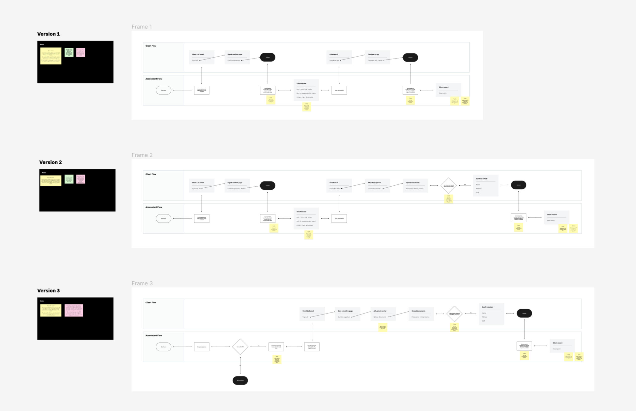
I had created the flows in a 'bread-board' style, a technique often used in the Shapeup methodology. This simple approach strips out any content and UI, leaving only each step's main function and CTAs.We discussed 3 different versions that had slightly different paths.This process had lead me to pitch a new idea: 'If accountants can upload their client's information and photocopies of documents, why not allow the client themselves to do the same?'
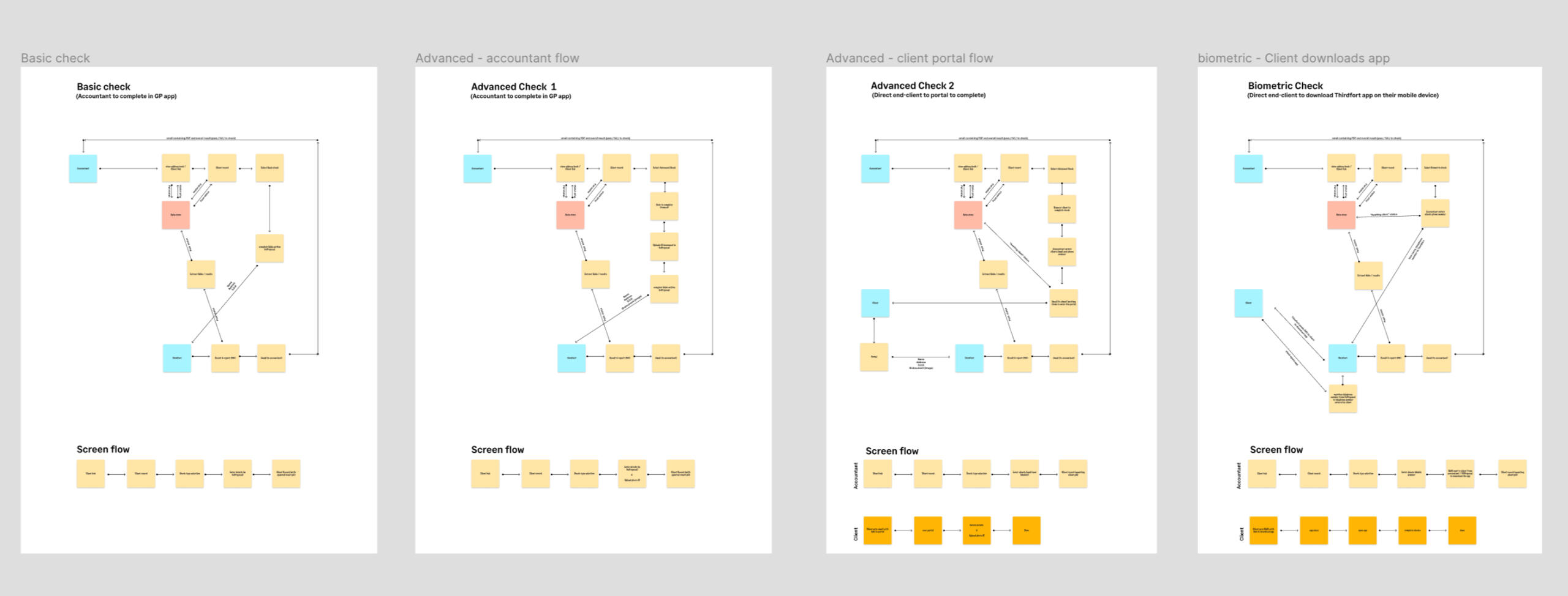
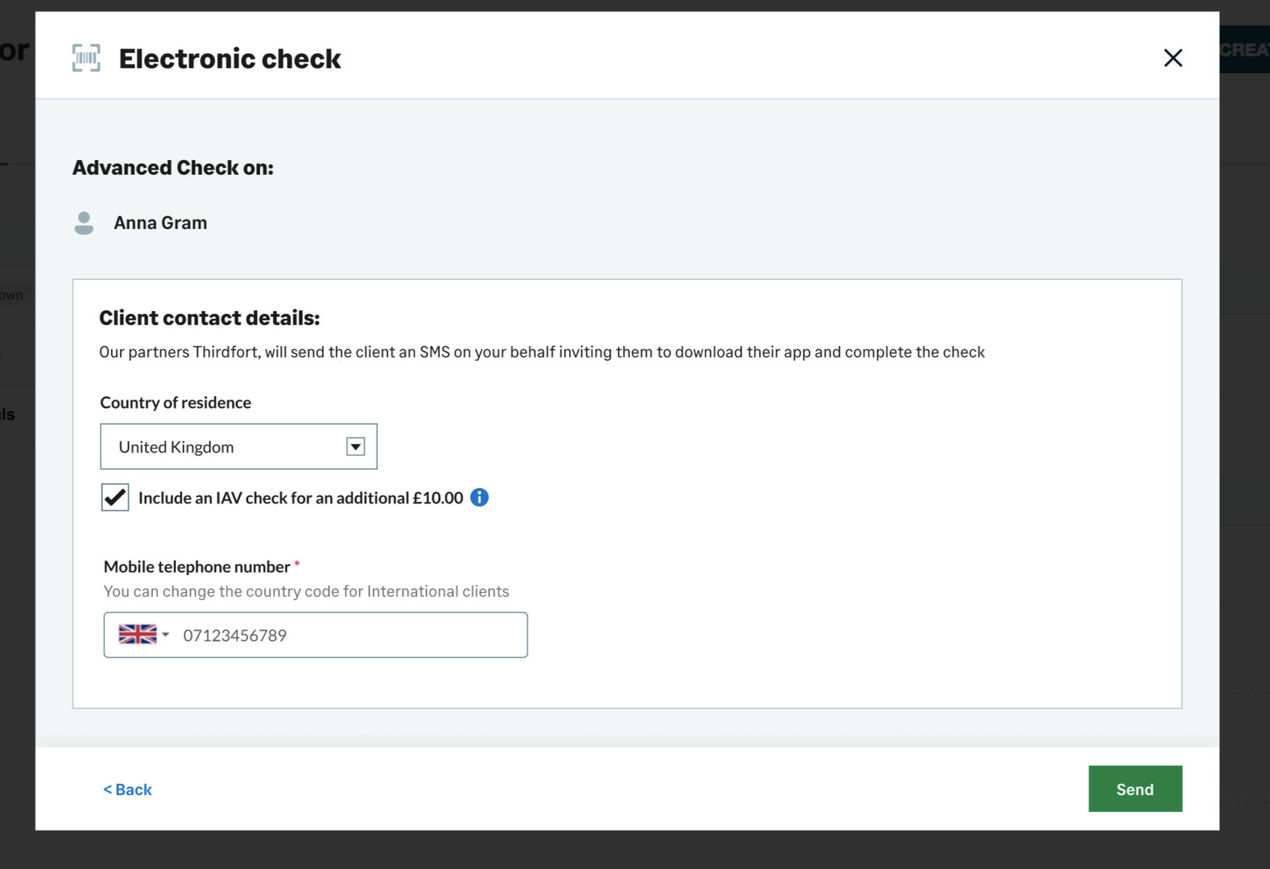
This lead to what is now one of the USPs of the GoProposal proposition, allowing the accountant to decide who would be best placed to connect the check.We had identified 3 journeys:
* the accountant using the most basic data (a basic check)
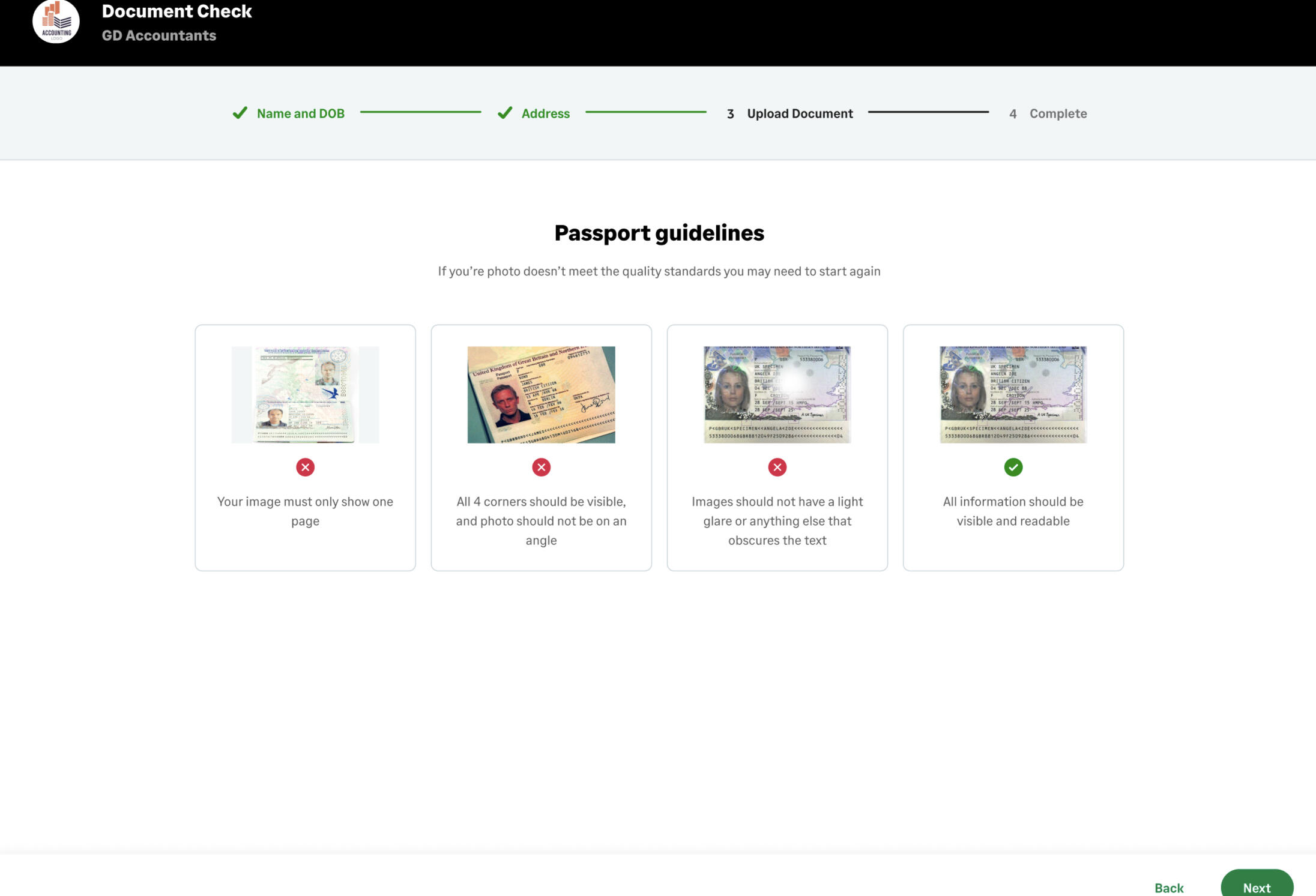
* the accountant - uploading client ID documents (an advanced or document check)
* the client, by directing them to a portal (a biometric check)My idea called for a 4th journey, allowing the accountant to forward the advanced check to the client to complete, by using a portal page that we would build.I stepped through each stage of the journey with the partner team, gathering comments, ideas and required data.
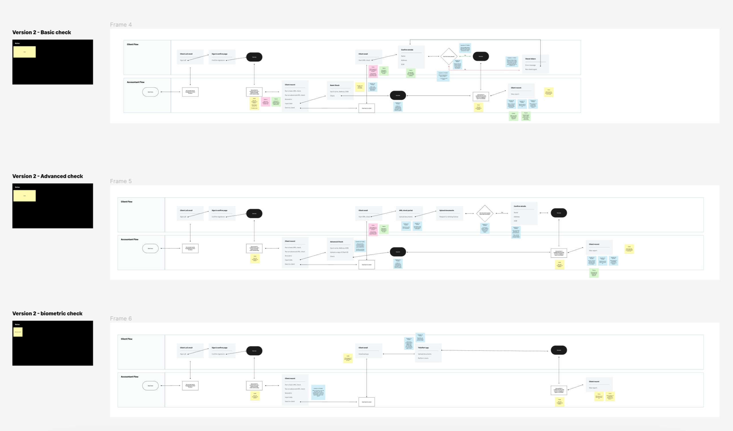
Working with the development team on data flows
After the meeting, I sat with the lead back-end developer and discussed the flow. He had asked if we had any 'data flow' documentation, which I was happy to create for him.The data flows listed all the different screens, which ones would require users to enter data, which times data would need to be sent and/or received from the partner company, when we would need to update statuses, and at which points we could send users emails and update the local store with the results.This step became key in identifying some problem areas with our 'biometric check' as in that flow, an end user would be directed to the app store to download an app. We had to match up the users telephone number, with a record pre-created with our partner company, and then match the users app login with his record, allowing the partner company to return results to us, and allow us to direct the results to the correct accountant.
Creating the UI
Once the basic flows had been created, I moved onto creating the UI using the design system. This UI flow was used to do some internal peer testing, with content designers and marketing teams getting involved to tweak the copy.
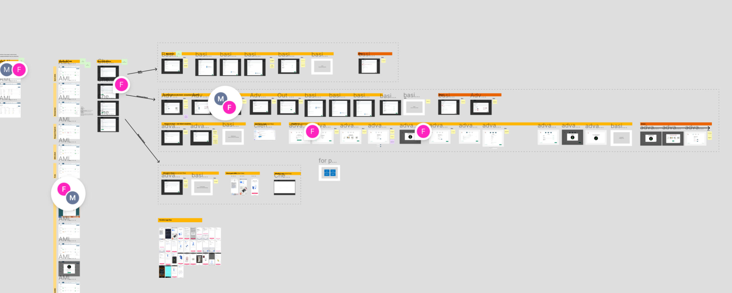
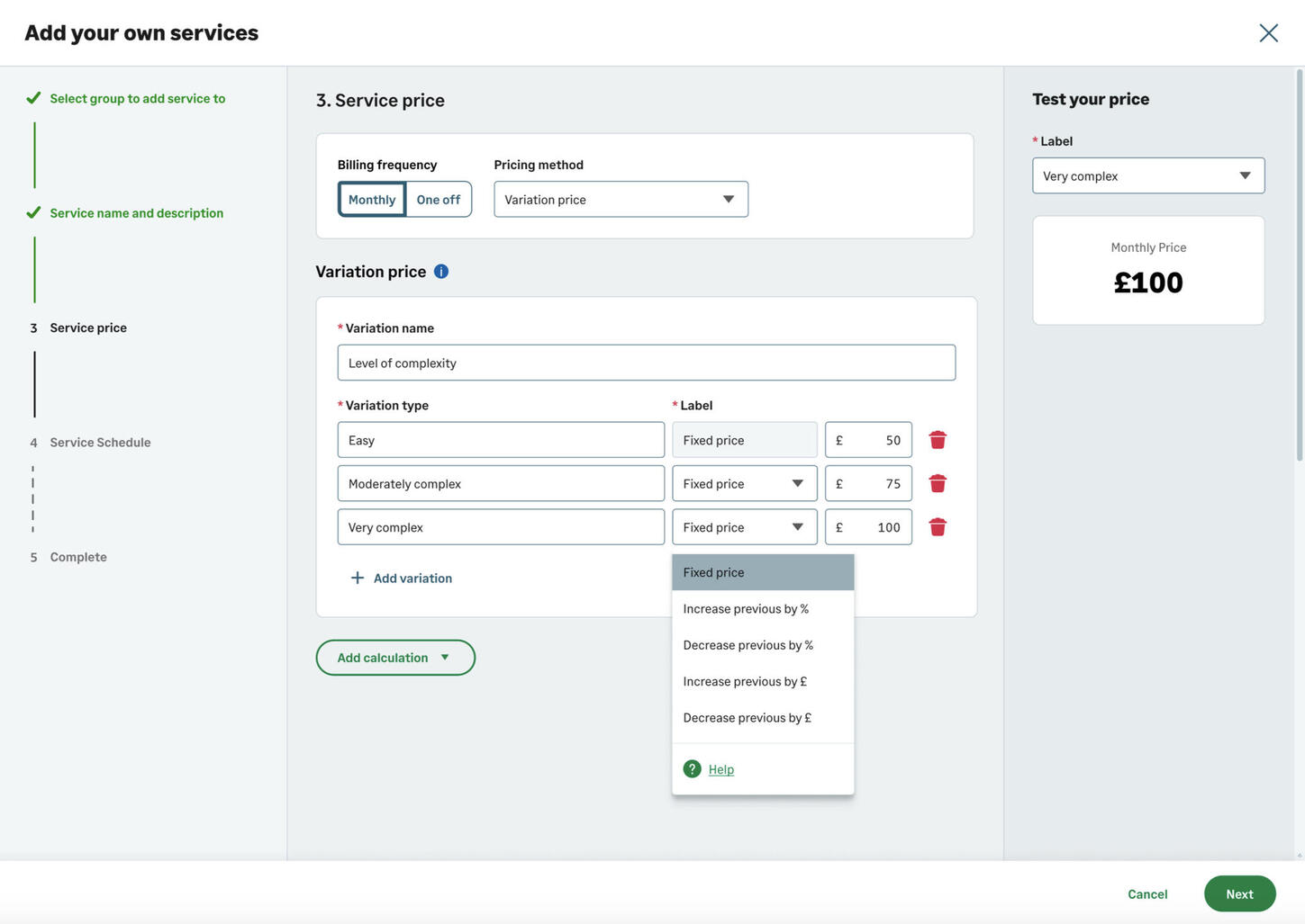
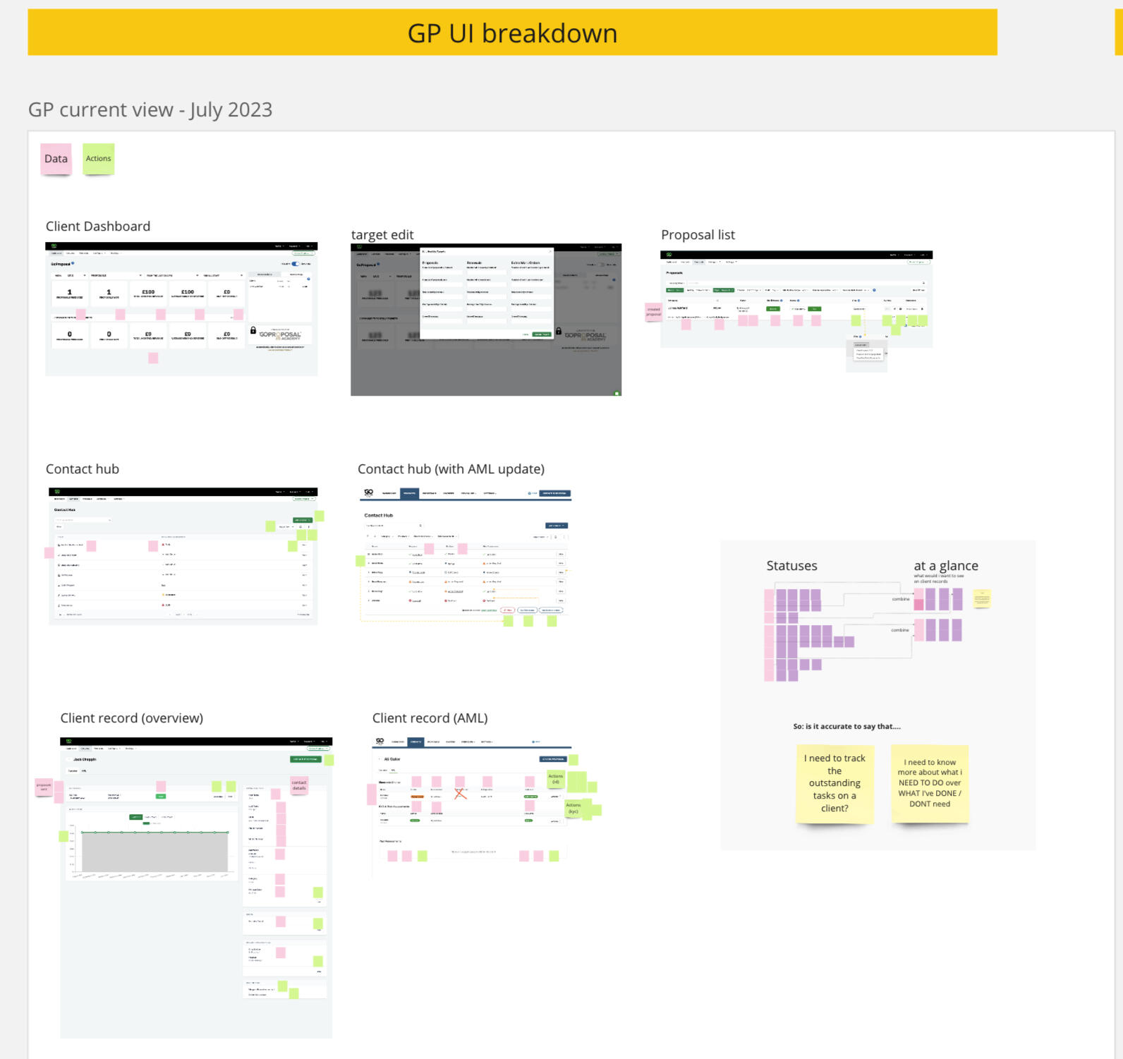
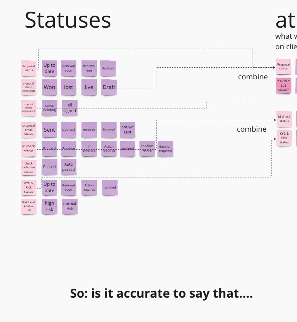
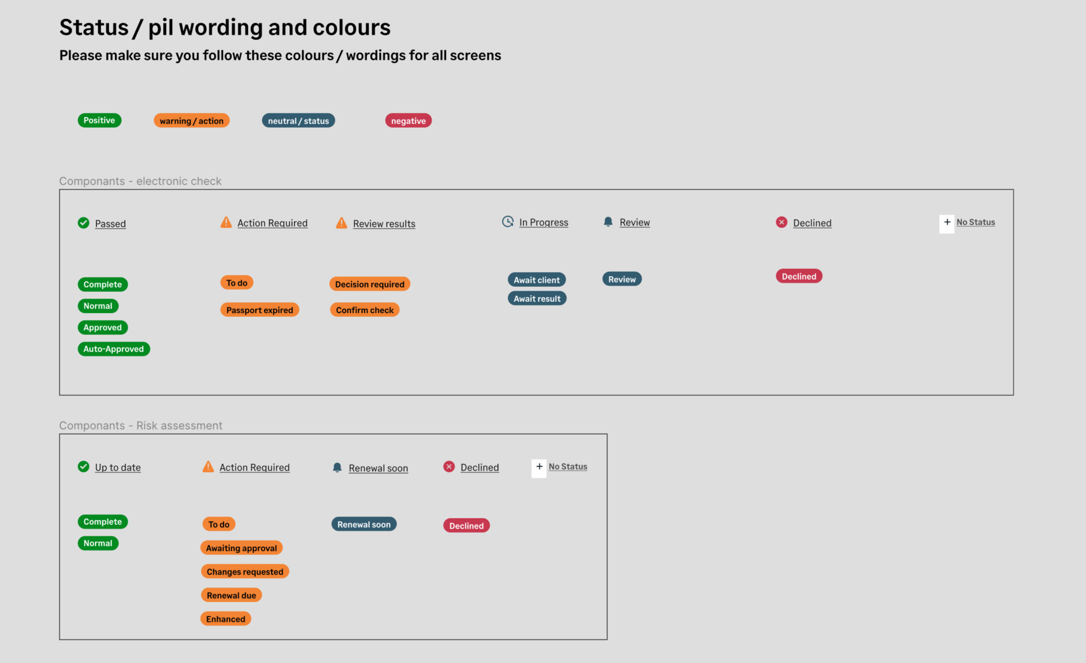
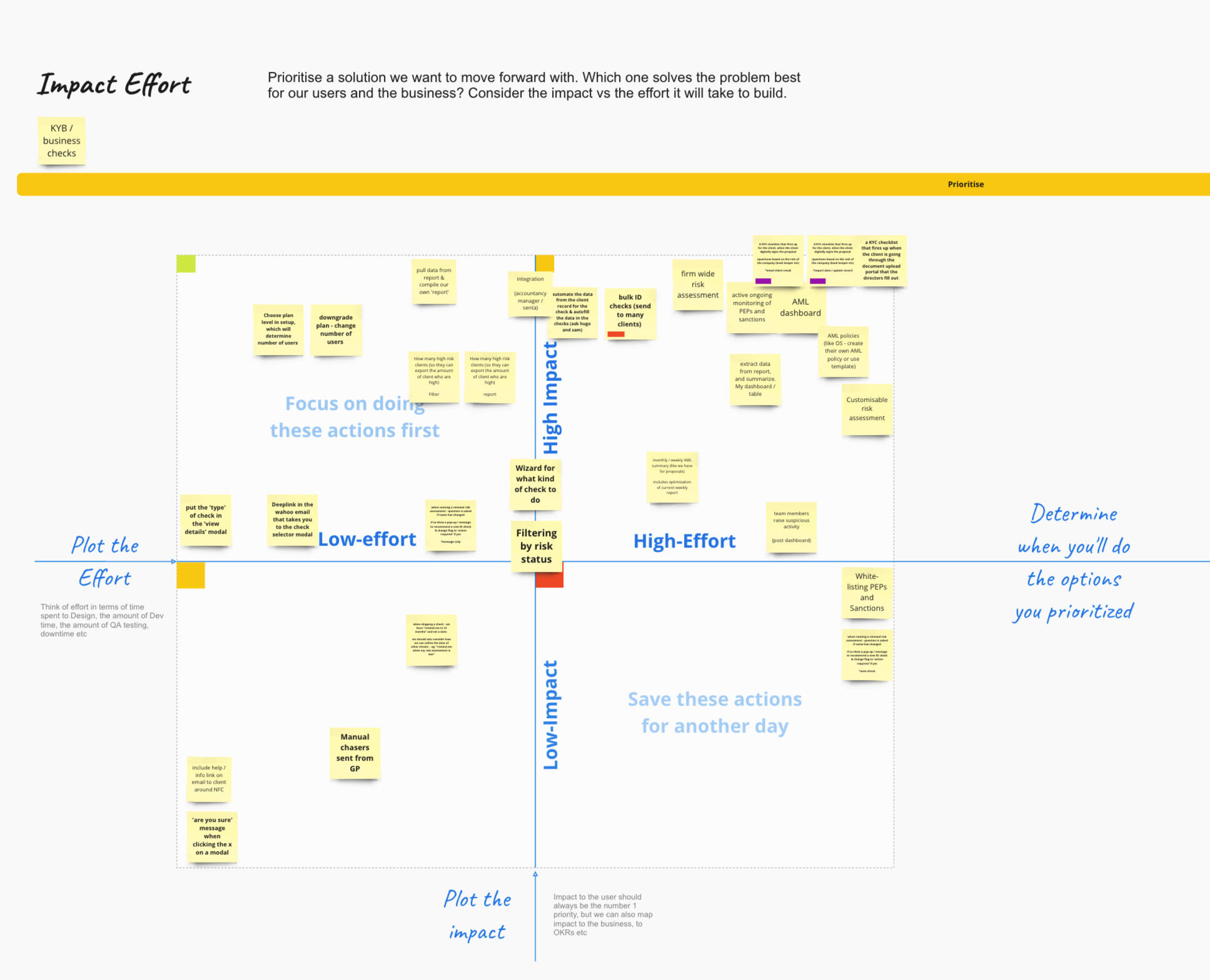
I had noticed that there slowly had become lots of requests for lots of different statuses (that we would show via a small pill on the client record).I decided to head back to miro and start to plot the various statuses so that I could workshop them with the teams.At this stage, I thought up the '2 column split' idea, where instead of having 20 different statuses appear on the client record (which I thought would cause far too much mental load, and would be awful for scanability) - we could group batches of statuses that could be headed by a sort of parent status. This became known as our Level 1 and Level 2 statuses. Level 1 would show on the dashboard, whilst level 2 would show once the accountant had client into a client record.

These tables were added to and tweak multiple times throughout the project, until I got to a stage I was happy it was robust enough to head back into figma and create the master components.
Alpha testing
Once all the UI had been finished, I created a prototype in figma that would allow us to go and test the flow with real users. Up until now, I had only created based on assumptions and tested with internal peers and stakeholders.

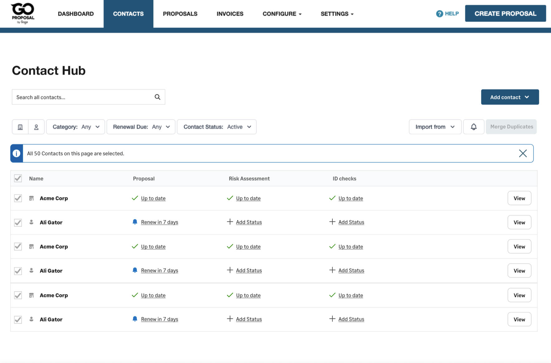
The contact hub
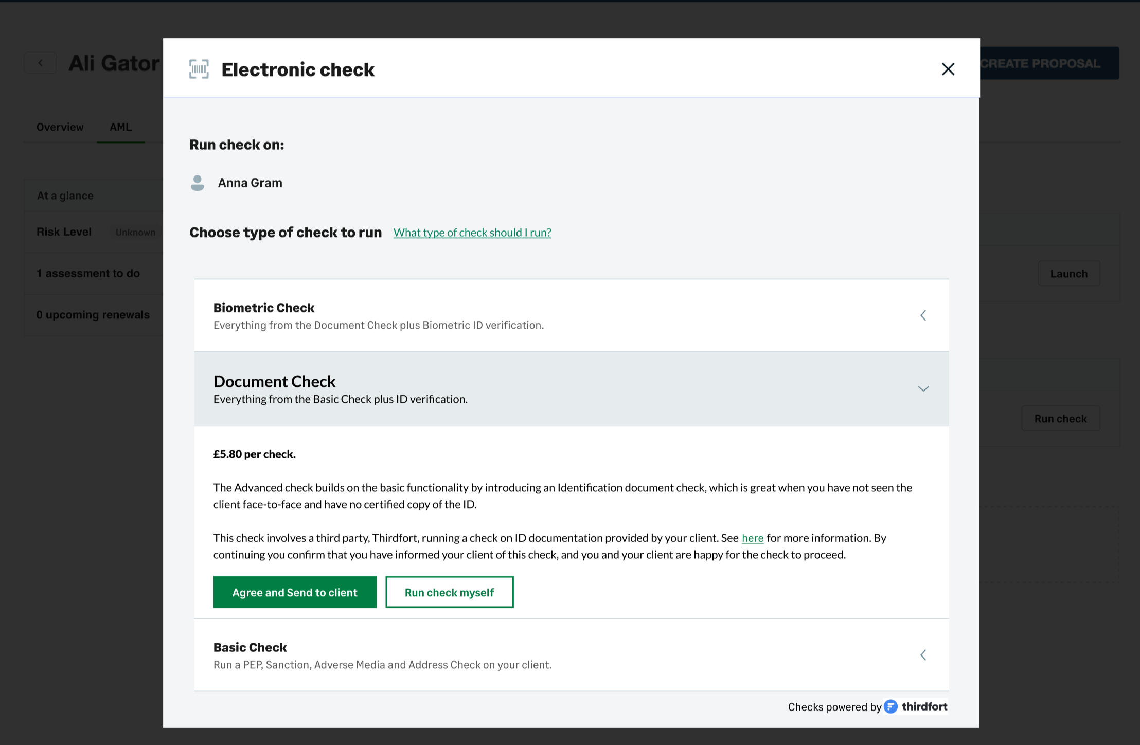
Running a check
Contact record
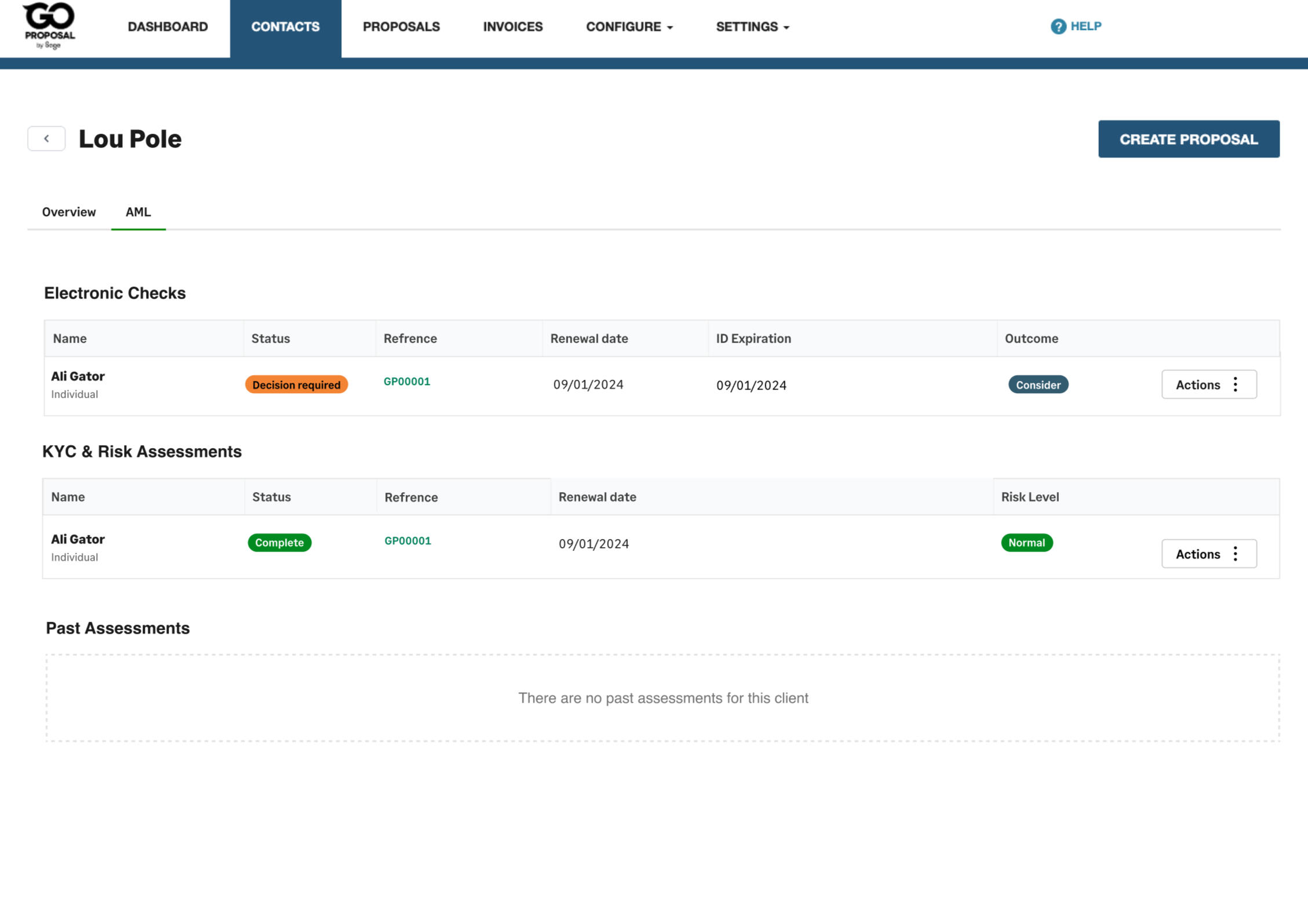
Batch import wizard
Client portal
Biometric check invite
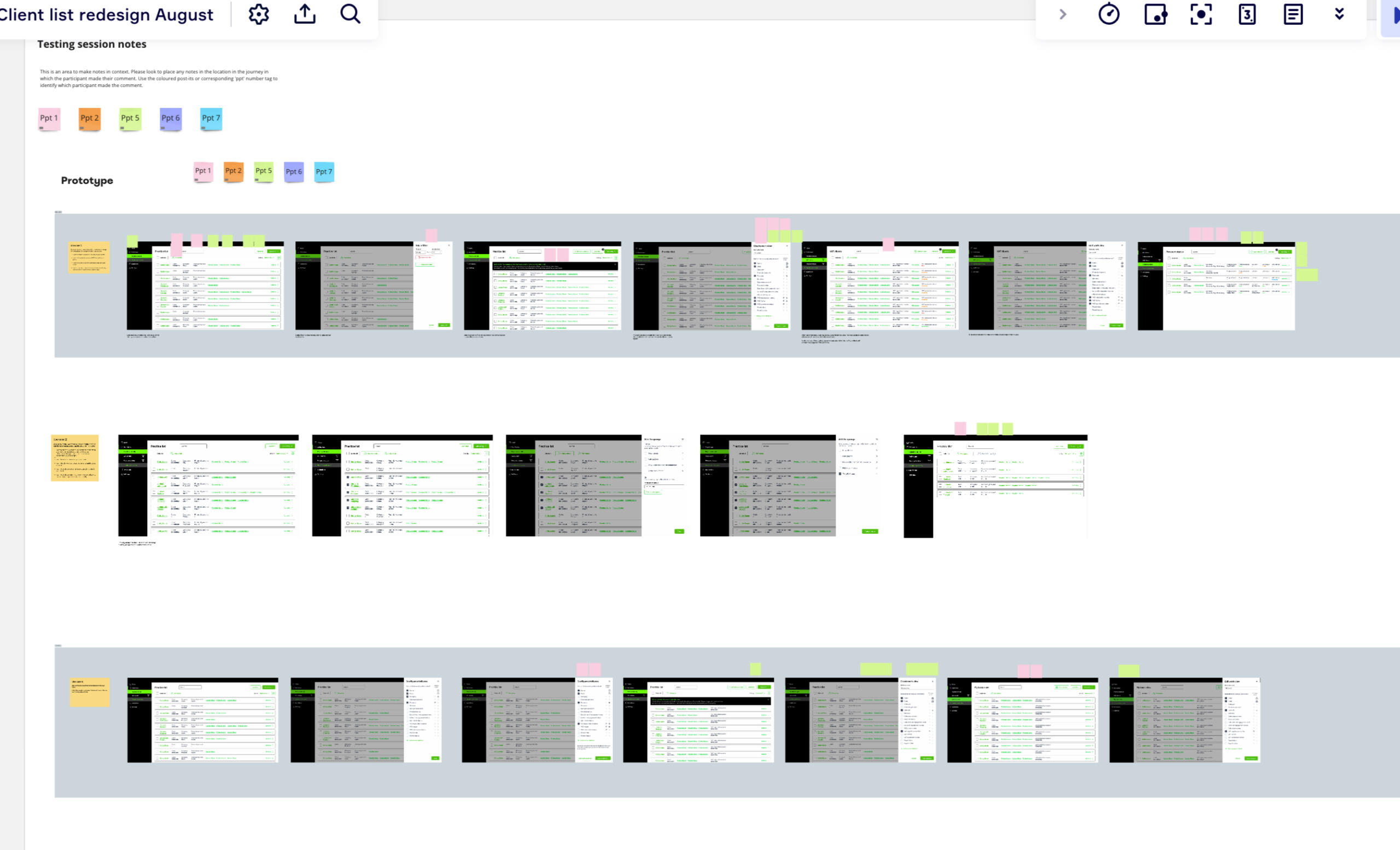
Testing came back extremely positive, and provided some valuable feedback from users.Some users were concerned that the contact hub would now become hard to keep up to date, as the current implementation meant that only once client could be selected at a time in order to set a status or delete / archive them.To solutionise this - I ran a workshop with the developers to see how feasible it would be to introduce checkboxes to the contact hub records, and if it was at all possible to perform a delete / archive or status setting action on multiple records at one time. After the developers stress tested and came back to me with a 'yes' I came up with the actions bar.Users could now muti-select many client records, and either hide them, or set a status. I chose hide rather than delete, as user interviews brought to light that sometimes a contact may be deleted, but return to the practise, and any records that a check had been done on would need to be kept for 6 years for data protection and integrity. Hiding a contact makes it easy for the accountants to go and clean up their contact list at any time, either 'unhiding' or deleting contacts as and when they wish.

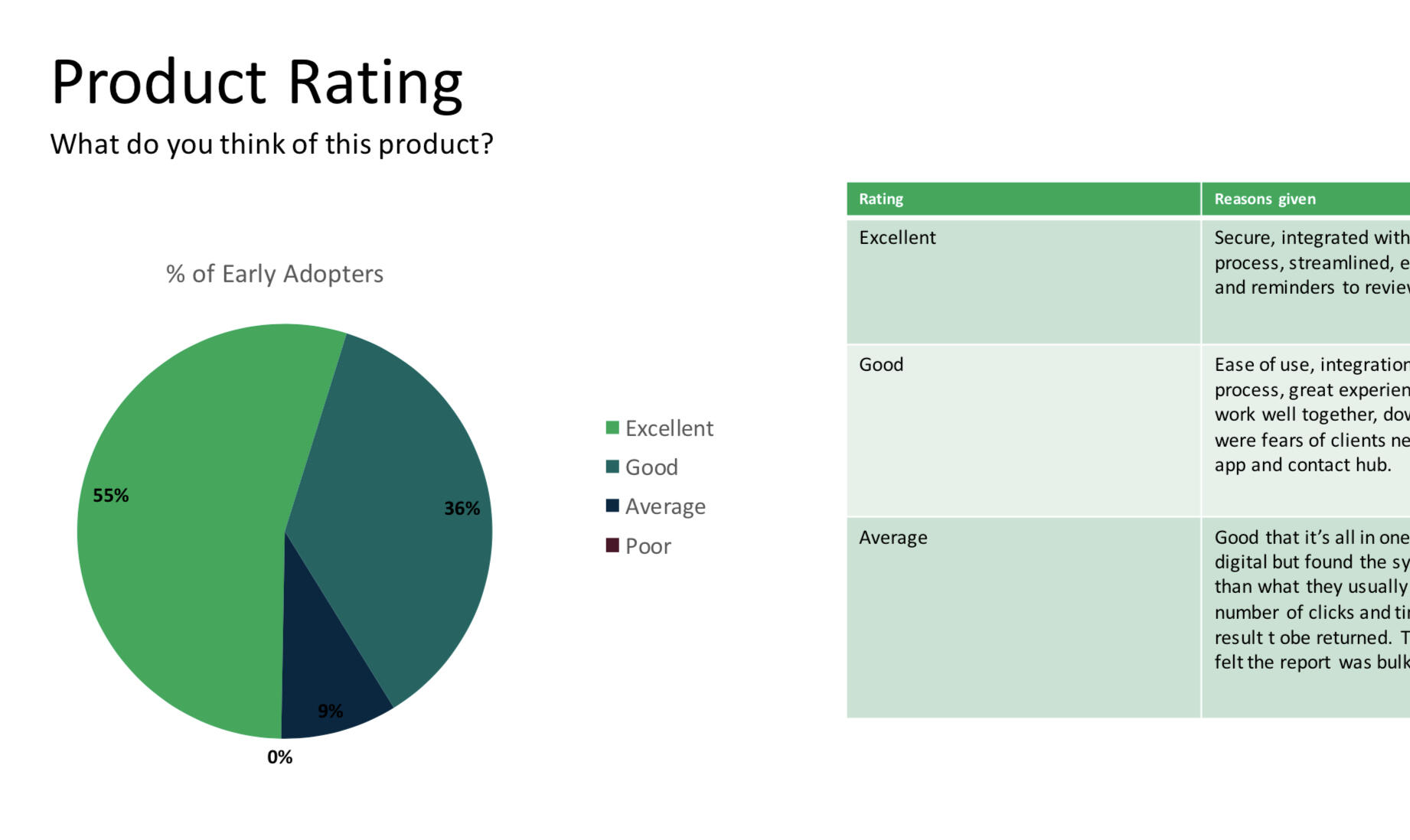
Beta testing and release
It was time to get the solution fully coded and tested in a real world environment.The new AML solution was released to a selection of early adopters, who were grated 5 free tests in exchange for their feedback.All in all feedback was very good. 55% of users rated the solution as excellent, whilst another 36% rated it as good.Just 9% of users rated it as average, with the only comments being about the amount of time it took for a result to be returned (which was out of our hands) or the complexity around biometric checks and worrying that their elderly clients would not be on board (again, valid points we aim to address, but out of our hands in terms of user proficiency)
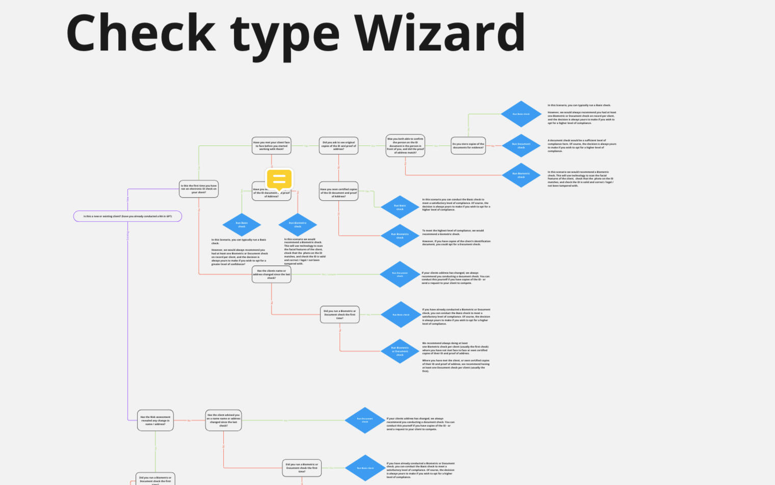
To address these concerns immediately, I devised a 'check type wizard' that would be embedded into the check selection modal. When the CTA was clicked, a wizard would appear and ask a few questions from 'have you met the client face to face?' to 'would your client be happy to download an app from the appstore / apple store?'The wizard would guide them to a solution - either the best type of check to run, or helpful guidance on how to deal with difficult matters.
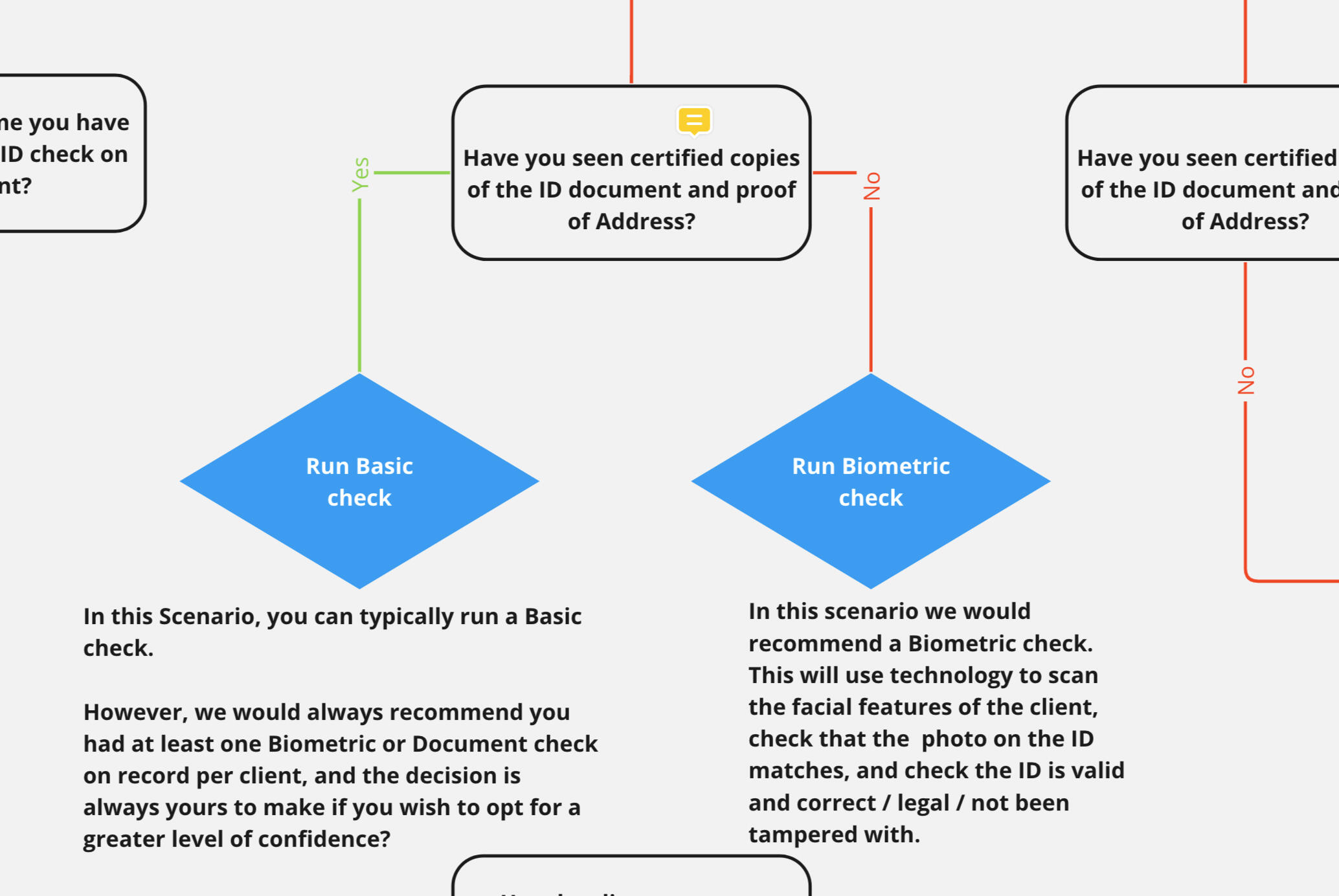
Our Project Manager had gathered testing feedback and collated some of the stand out results.
The future
In the weeks after release, I have gathered together feedback, questions, complaints, FAQs, data from user testing interviews, plus new business needs, and ran an effort / impact session with the PM and lead developer. We now have a clear idea to take into roadmap panning for Q1 of the new financial year on how we will continue to make improvements to the system.
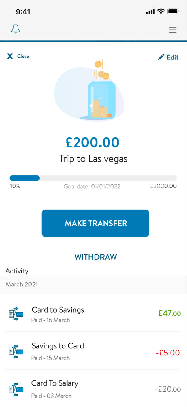
Customer Saving
Helping customers become better at saving by defining user goals, needs, wants and pain points
TL;DR
The banking application was not seeing its full potential of fully-paid returning users.Exploration and research uncovered the fact that users did not see the benefit of paying for the account, as there were little features offered.We implemented a new savings feature based on the needs of our users, to not only help them realise the benefit of the account, but in turn to help the business achieve its retention goals.
Background
Around 60% of thinkmoney customers didn’t use their accounts within the first month. In the next 60 days that number is still as high as 40%. 70% would close their accounts down within the first 3 months without using it. The thinkmoney model works by charging users £10 a month to its users.It was a theory (backed up with data) that users decided that they didn't get enough from the account in return for the fee - so we decided to look at what features we could introduce to increase the desirability of the product.
The Goal
Explore the users wants and needs of a modern bank account, and establish features could be introduced to improve their day-to-day banking.
The process
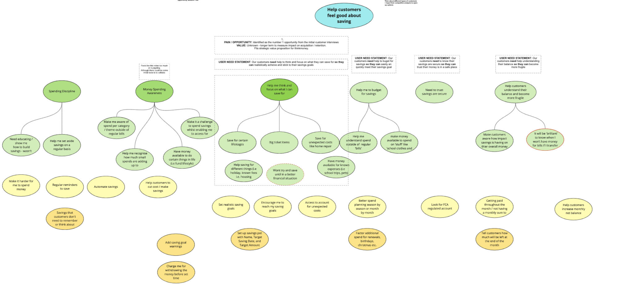
We referred to our Opportunity solution tree, where we had been tracking ideas and opportunities that has been derived from user research and feedback around saving.
We constructed flows for a questionnaire to send to current users, and those who had closed their accounts in the last 3 months (with a hope to capture some detail on WHY customers didn’t use, or closed down their accounts)We invited 4 of the respondents who had recently closed their accounts - to speak with us in a moderated interview, where we would delve into their savings habits a bit further.

Moderated interviews
Our moderated sessions were thought provoking. We had not previously realised the struggles our users may face on a daily basis. We had been fed data from another team - outlining the personas that had been created - and they did not match the people that we were speaking to. We knew we had a duty to realign our stakeholders in how they THOUGHT our customers used the account.We found out that the customers who closed their accounts, were often poor at managing their money and needed some help - so they looked elsewhere once they found our account did not perform this well for them.
After we collated the notes taken from our moderated interviews, plus the data gathered in the questionnaire responses, we plotted and grouped the data, and started to derive different circumstances and scenarios our users face on a daily basis.We turned our data into a set of How might we’s - with the help of the wider teams: POs, Devs, customer service and c-suite.We went out to our different delivery teams and ran through the HMW questions to generate thoughts and ideas.
We sorted the ideas into groups, and referring back to our HMWs, Solution trees, and data, dot-voted on the areas we thought we could contrate on - those that would benefit the user in the most dramatic way.Key themes emerged: savings pots, goal settings and help via automation.
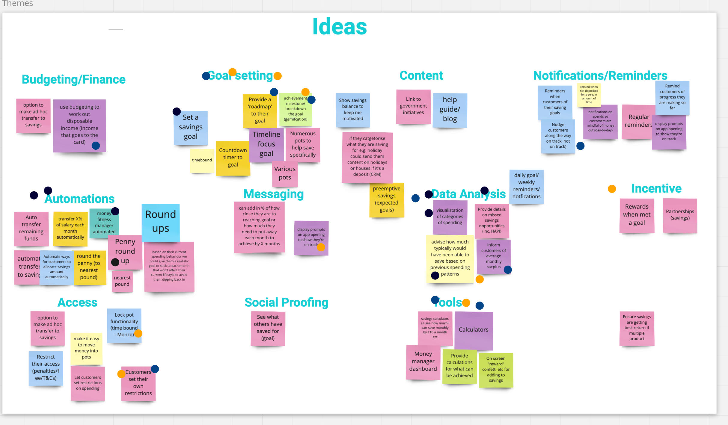
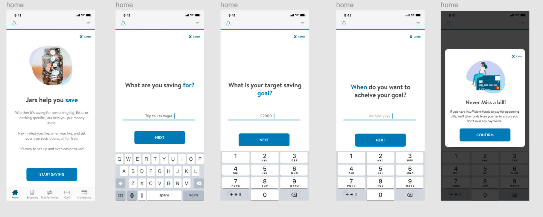
Savings pots
Using our focus of savings pots - I started to map out a flow of how a savings pot could be used - paying attention to the gathered data and feedback.How could we aid our users? How could we encourage them? Is there anything we could do to promote them saving money?
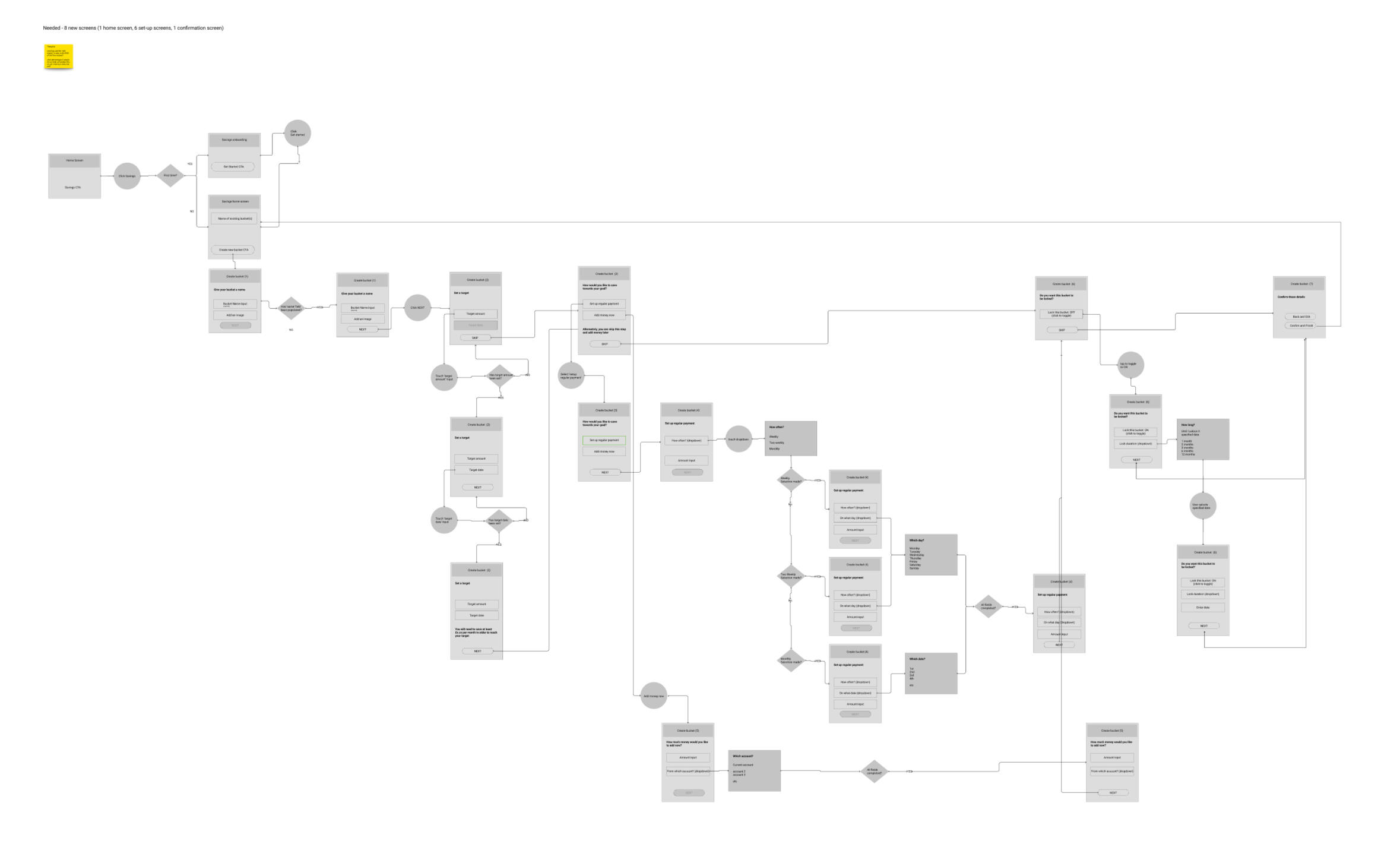
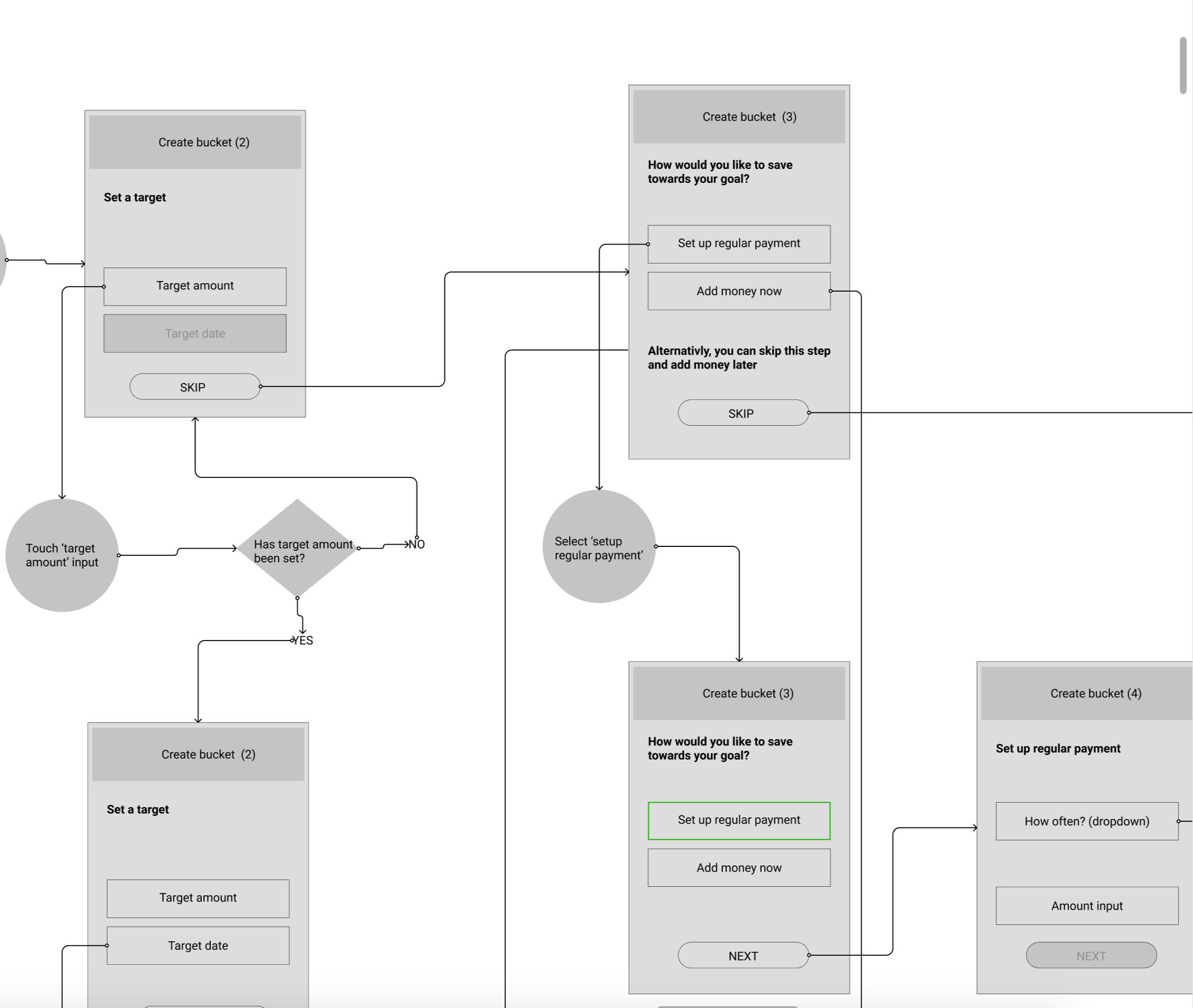
Ideation
Creating low-fidelity mockups of screens to aid discussion and discovery.These screens can be used to create clickable prototypes to run through with both users and stakeholders, including legal teams and technical architects to ensure validity of the ideas.
User testing & High-fidelity mockups
UI design isn’t something I usually like to concentrate on, but in this project we would be seeing the deliverables through to shipping, and after the thought provoking nature of the moderated interviews - I personally was invested in this project and wanted to ensure that it was perfect before it was built.What’s more - the High fidelity mockups helped us gain buy in from the CEO - who previously wanted to push his own version of the savings flow.

Outcome
The screens were a HUGE success both internally, and with our customers that we beta released too. They found the flow exciting, friendly and helpful, and acknowledged that they would certainly use this feature in future.Unfortunately - this is one of those times in a designers life where he must swallow his pride and choose his battles, as savings pots were put on the back burner and taken off the roadmap.
I however keep it in my portfolio as an example of how we can take customer intent and innovate.

Creating the UI of customer portal
Creating a customer portal requires a unique set of designs
TL;DR
Helped to redefine and relaunch the client portal that had become stale, obsolete and unused.This section focuses on the UI that I created as part of the process
Background
Twenty7tec already had a client portal in place, but it was dated, it was clunky, and worst of all - the users (our client's clients...) hardly used it, rendering its intention obsolete. It had become a glorified document upload facility.Not only was I responsible for rethinking the journey and interaction of the portal - helping redefine its usage and USP, but in creating its unique brand and UI.
The Goal
I had spent the 12 months with Twenty7Tec defining its first design system which used MUI as a base, but changed and modernised to both follow accessibility standards better and to create more widely accepted and tested interactions, whilst giving it a 'life' and a 'brand' of its own. Working closely with the Lead developer - I had taken Mui from out-of-the-box to something that would become synonymous with the platform.However - during a few rounds of internal meetings and workshops led by the Product Owner and myself to 'sell' the new vision to the CEO, it was decided that the portal should have a life and brand of its own, together with its own design system and code.I had persuaded the team to still build off the back of my design system created for the standard applications, but by tweaking colours, fonts and styling: we could help both the development and design teams by removing the need to maintain and update multiple systems.
Defining flows
The first step was to define the user flows - both in terms of the overall application, and for distinct journeys such as onboarding and fact finds. The existing portal feel disjointed and disconnected, and users would often drop out and exit setups, instead relying on our customer support teams to aid.Of course, we always start with these areas before we jump into UI - intricately working and re-working flows and ideas until we are sure we have hit the business brief and user's jobs to be done.For the benefit of this case study however, we will concentrate on the look and feel.
Design DNA
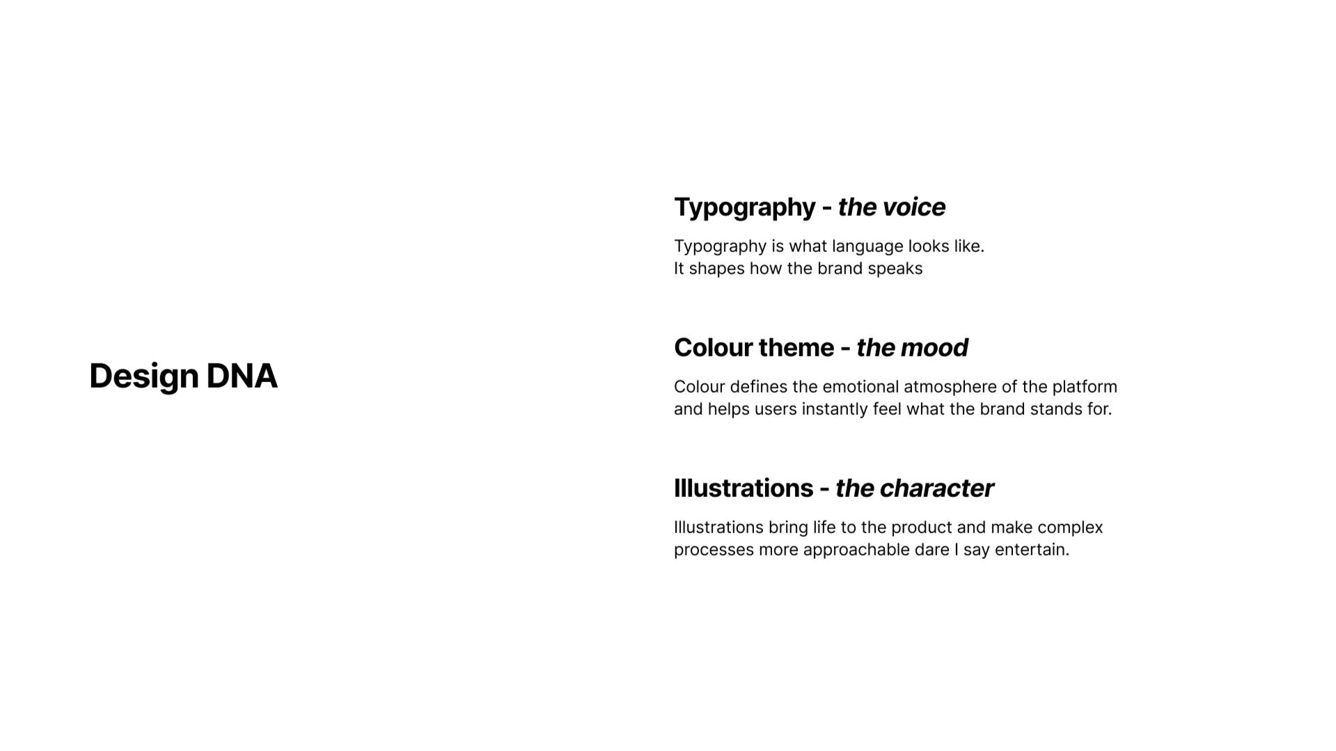
An experience designer at heart, I've always concentrated on solving problems, addressing best practises, and creating experiences that solve jobs to be done.Part of creating a delightful experience for the user also means creating and refining the UI, the language and the tone - and in the age of the product designer - the UI takes an equal prescience with UX in your daily tasks.Not only did we decide to create a distinctive UI, but in an attempt to gain users trust and repeat visits - how could we create an experience that not only works well, but is a delight to use daily.
Design concepts and UI layouts


Agreeing on a style
We did a lot of work looking at colours, tone and styling - feeding off the various logo ideas we concepted.We decided to play with 'cool' colours that would nod towards our main brand identity, warm colours that would be totally removed from what was known as our brand, and a neutral palette - removing all colours and retaining basic fonts.We initially thought the neutral style would be the way to go - as it was decided early on we would also look to white label the product to sell on to other companies to style as their own.After presenting the different styles and looks to the C-suite and CEO - one winner stood out....
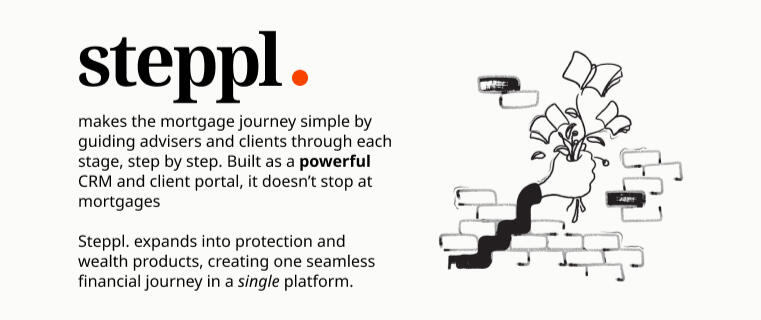
Welcome to Steppl
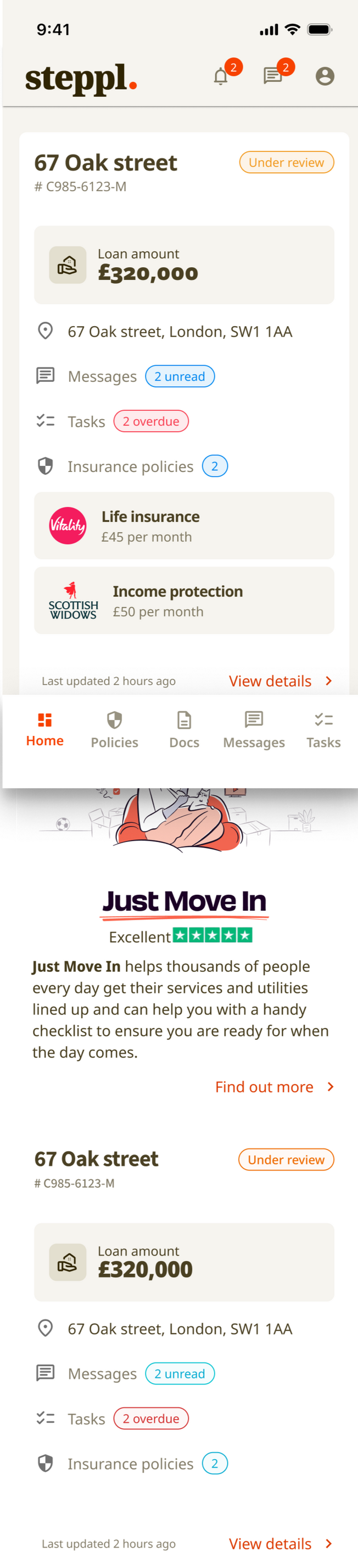
Onboarding & setup screens


Dashboard and workflow screens
As well as our own 'warm' branding - we have the option to white label the portal allowing customers to apply their own colour and tone to bring their own brand and personality.The simple, clean interface means that this becomes a breeze


The customer portal was branded as 'Steppl' and the design was chosen for its warmth and inviting tone.The portal is under construction at the moment, with the development team building all the background interactions and databases.Early user testing and feedback proved positive. We had spoken to 10 users / firms: 5 that had used (or had a client use) the client portal in the last 3 months, and 5 who had not used the portal in over 6 months.Firms applauded the new direction, and said they would be happy to look at integrating the portal as part of their workflows again.Of the 10 users, 4 were deemed as 'gold tier' - ones that would pay more for a white labelled customisable version. 2 out of those 4 actually said they would prefer to now use the new branding rather than a custom version - with the gold tier benefits instead being used to market the portal as "Steppl x {company name}"
Miscellaneous UI
Traditionally focusing much of my career on the UX side of things - I had always thought of the UI as a necessary piece of the puzzle, which means I never had a big bank of UI shots on my projects to show that 'string to my bow'.This section aims to demonstrate, in no particular order - some of the UI screens I have produced over the years.
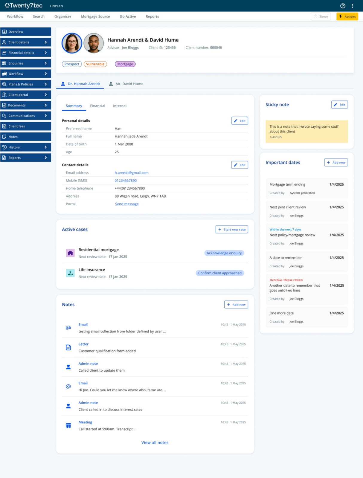
Twenty7tec - Old
Twenty7tec had acquired a company called 'bluecoat' many years ago. Not only had the tech stack not changed for 8 or so years, neither had the UI.The UI and flow had been conceived and built by developers. It was a mess of inputs, no structure or organisation, no chunking, and modals upon modals. I aimed to fix that.

Twenty7tec - New
After 5 user interviews and many mockups and prototypes, I delivered the new Client overview page. #The most important details are now located in the top 'card' along with the clients name(s) - the contact details are front and centre with less used information (such as NI number and job title) on different, but still accessible tabs.Each section is housed within its own card, with its own edit button taking you to the relevant parent page, rather than a mess of modals. with the extra real estate, I was able to also introduce active cases, important dates and a notes repository for easy access - all areas that were previously either hidden away and hard to find, or lost in the sea of inputs.
Thinkmoney
At thinkmoney I was part of the onboarding team, meaning that I dealt with all screens prior to 'day-0'I had a hand in redesigning the flows of the Current account switching service, the 'pay it' integration and the Jar (pots) feature.thinkmoney had a loose design system in place, but I constantly was reworking the colours, font size and spacing, and the inputs to better fit WCAG 2.1 AA standard accessibility.


Autorek - Old
AutoRek is a reconciliation, data integrity compliance platform based in Scotland.I had agreed to do some ad-hoc work for the company and started by looking at some of their data entry flows. Users would upload receipts and csv files of transactions - but AutoRek had always had complaints the UI looked out of date and hard to navigate.


Autorek - New
Only working on the screens for a week, I had requested and studied feedback from users - and together with performing a heuristic evaluation of the screens, I presented a modern, updated UI that utilised colour, pattern and status indicators to better aid the user navigate the long list of uploads.I had used reskinned versions of material UI components to ensure scalability, and redefined the upload flow in to new sections.AutoRek was a little unsure about changing the flow that had been in place for the last 5 years - and only expected a reskin. After reviewing the screens with their users, they praised the new direction and embraced an overhaul of their AI and user journeys.


The Co-Operative bank - Old
Whilst working at the Co-Op bank, I sat across 2 squads: 'forms' and 'online tools' - containing such things as their affordability calculators.Not only did each system / screen have different brands and styles, but the general execution and structure was dated and not user centric.Information was asked in random orders, with multiple clicks, screens and sections being banded together and added onto over the years.


The Co-Operative bank - New
I completely refreshed the forms and tools, firstly ensuring that the flow and structure was more helpful and required less cognitive load.I chunked relevant questions and sections together, and placed them in the context of individual clients. From speaking to advisors and how they gather information - it was clear that they speak to their joint clients on an individual basis, that is to speak to client 1 first and gather all of their information before moving onto client 2.I had then updated the design system to include new inputs types - expanding on the help text, hints and validation.Finally - I ensured that both sections inherited the same styling, meaning the experience felt seamless across all pages at all times.This exact design is still used on the Co-Op bank site 5 years after I left the company.


About me
Tell us a story.....
I'm Craig, a User Experience designer from Leigh, Greater Manchester.I'm married, with 2 children - 3 if you count our dog (and we do!)I play the guitar, love music from the 60s and my favourite TV show has to be QI......
My career so far...
I've spent the past number of years in my true calling; Experience design, leading teams, mentoring others, working in squads, working as a solo Senior designer and working as part of large XD teams.I say its my true calling, as I spent the first 11 years of my professional working life in IT, where I started as a desktop technician, through to becoming a network admin and finally 'retiring' as a System Administrator. It was as this time, and at that company that I volunteered to help with some graphic design work. I was creating posters and logos in my spare time, so I lent my skills to them, creating web graphics and illustrations.Soon that progressed me to splitting my job 50/50 between IT and Graphic design, before I went 25% IT, 25% graphic design, and 50% web design / coding. I had studied IT and coding in High school and at A-Level, so a quick refresher of HTML and Css, plus teaching myself how to write in Jquery, and I was off.
How did you get into UX?
Before long, I was coding full websites for clients, taking specifications and requests, and delivering fully fledged, but perhaps not amazingly stylish or useable deliverables. The company that I worked for specialised in creating platforms and websites for councils across the UK to enable them to provide social care budgets to those in need.As I sat in a focus group with one of these councils, showing a group of users with disabilities, the amazing website that I had built, but spent most of my time creating graphics for.... I heard the complaints roll in.
"Those buttons are too small""I can't see the difference in those colours""When I use the tab key, the focus jumps around the screen""I don't like the way that navigation floats out from the side of the screen and then sticks there""Accessibility""Usability"
Something in my head clicked. There must be a better way of doing things? Of allowing users to navigate, find the things they need, reduce the complexity of the words we are saying, reduce the complexity of the actions we are doing.I researched. UX. UX is the answer.This unknown phrase to me lit a fire in my heart that has never gone out since.Creating experiences that solve real user needs, that strives to build an empathy and understanding, that removes complexity, that creates that 'wow' factor... that's what I should do with my career. That's what lights my fire.
Industry experience categories
FinTech
High street banking
Travel
SaaS
Local Government
Retail
Professional Experience
CV available on request
Skills
Leadership
UX strategy, design maturity development, team strategy, stakeholder management, mentoring & coaching
User experience
User research, Usability testing, Interviewing, analysis & synthesis, A/B testing, Journey mapping, wireframing, iterative prototyping, Information architecture
Interaction design
Accessible design, inclusive design, responsive design, application design, High & low fidelity prototyping
Software
Figma, Miro, Hotjar, Google Analytics, LogRocket, Adobe creative suite
Knowledge
WCAG, A11y, HTML, CSS, Javascript
L&D
UXDI (2020) Professional Diploma in User Experience Design (UX)
UXDI (2020) Professional Certificate in Visual Design (UI)
Object Oriented User Experience Design (OOUX) fundamentals
Various accessibility courses
Wide library of UX & Phycology books (Design of everyday things, Thinking fast and slow, Design for how people think, Great customer experiences, Human Powered, Think like a UX researcher etc)
What people are saying
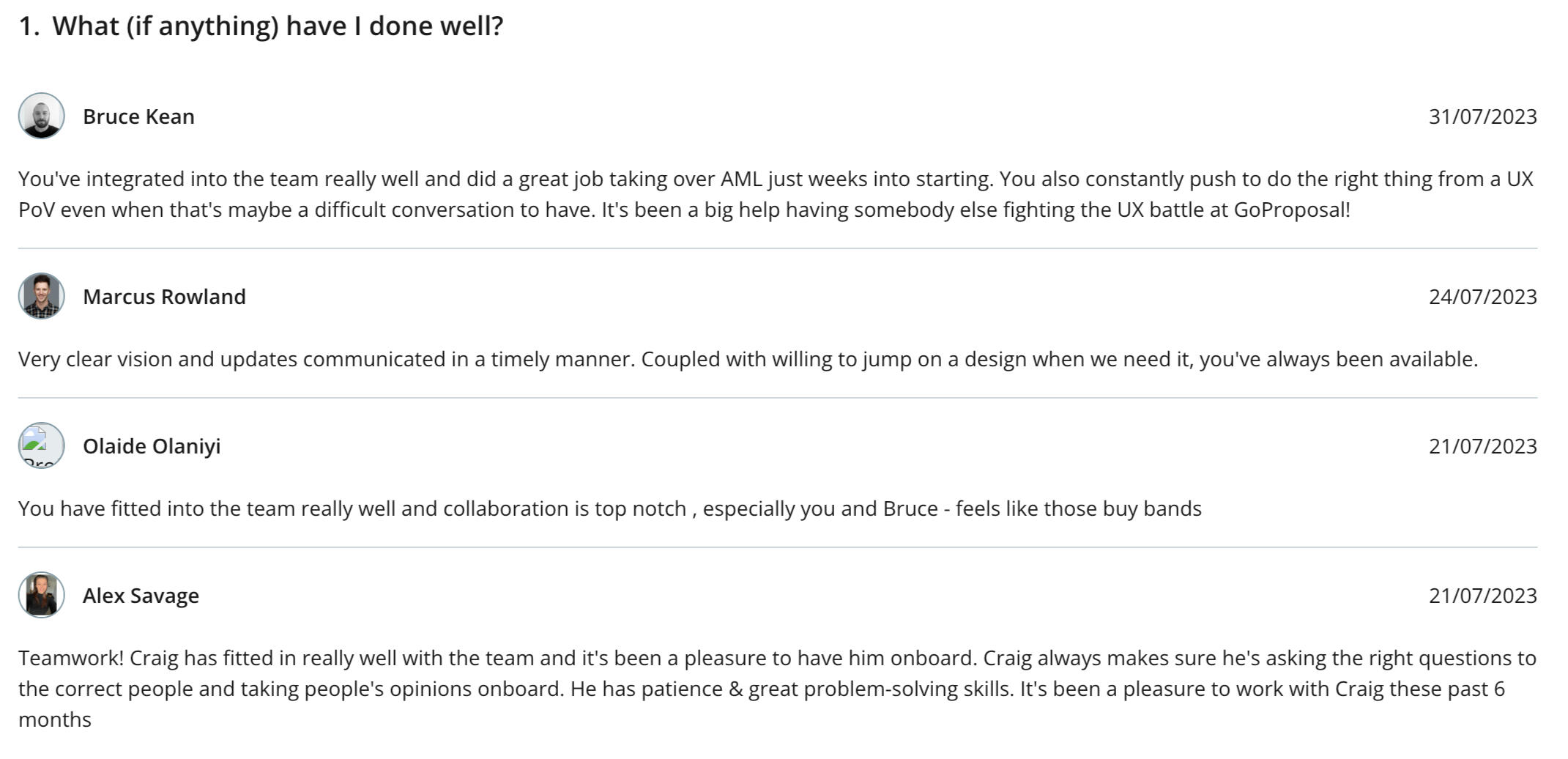

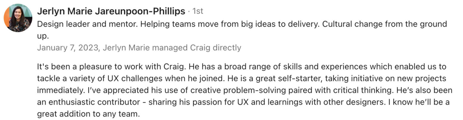

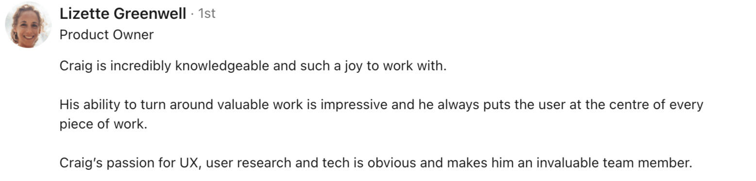
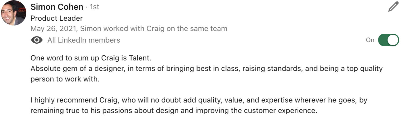

The ramblings of a UX designer
The blog that's not a blog, blog
So I started to write posts in LinkedIn. Not often, just when I had something to say.More often than not it's really for my own benefit.... so I can get something off my chest when I read or see something I don't like, or have an experience at work I didn't like.I probably want some sort of validation to my thoughts, but often would delete the post a couple hours after posting it if:a) I didn't get a lot of comments / likes
b) I thought it looked like I was just moaning or
c) I just got too anxious how I came across or if I said something not quite factual.Anyway, as of today I thought I could log these thoughts here. May be good for me to look back on one day. May be a good read for someone else. Either way. This is my blog thats not actually a blog. More just a rambling of a UX designer*('fun' fact I actually bought the domain name "ramblings of a attempted UX designer" when I first started out UX with the intent of starting a blog. Never happened)
UX is dead....
23 June 2025
You heard it here first!! or second. Maybe third. Actually, you've probably heard this 100 times over now.I used to really enjoy LinkedIn... learned a lot, connected with people, chatted to new people, commented on posts from people I don't know and wouldn't talk to in any other walk of life.Then the 'influencer' wave came in and I went off it.Starting to come back over the last couple weeks I see the 1000th post about AI and how its going to rule the world and take over. Just this morning there seems to be another new influx of 'UX IS DEAD' posts and 'AI MEANS THE BEST UX WILL BE NO UX' 🙄I'll be honest I don't like the new AI world. Probably in main because it scares me and my future career. Not so much because I think it can do what I can do, but more so that companies will soon start to listen to this same noise and not employ UX designers.It's a bit like a few years ago where suddenly everyone decided that POs and PMs could do the UX designer / interaction designer / UI designer / researcher roles......But here's how I try to keep myself grounded in the covno. I always try to convey that I'm not employed for my Figma designs or my flows and diagrams in Miro. I always hope to be employed for my brain, my experience, my attempted empathy for user struggles, how I think about problems and what kind of solutions I suggest to fix them.And I think a great example (for me) is a project I'm currently working on in which we have just concluded a round of user interviews. We would ask them to talk through how they would approach a particular problem or workflow, ask about their experiences on the current screen, show them a first draft mock-up of a new design, and have a convo around how this new design may, or may not - suit their expectations and needs.I'm not sure AI could ever do that? I could be wrong. I hope I'm wrong. But these convos sparked new routes to take, new discussion points, elements we or the user hadn't previously considered.And you know what I did when user A said "I want a blue button at the top of the screen that shows x when I click it" ? I didn't just put a blue button at the top of the screen that shows x when you click it.Instead I thought about what the user was asking for, and asked WHY they were asking for that. I put that together with my own experiences and knowledge of the job to be done. I put it with the info I collected from other users, from internal stakeholders and suggested a solution that wasn't a blue button at the top of the screen that does x when you click it.The point is.... AI may do some great things. It may help in amazing new ways. But its does not replace our ability to not think in 0's and 1's and black and white.